Extra! Extra! Read all about it: “New study suggests coffee could literally be a lifesaver” (CNN Wire, 2015).
This is a real headline about a study published in the journal Circulation. Now, I’m as big a coffee fan as the next guy, but literally a life saver? Here’s what the study authors wrote in their paper (Ding et al., 2015):
Higher consumption of total coffee, caffeinated coffee, and decaffeinated coffee was associated with lower risk of total mortality…Relative to no consumption of coffee, the pooled hazard ratio for death was 0.95 (95% confidence interval [CI], 0.91–0.99) for 1.0 or less cup of total coffee per day.
This finding comes from a pooled analysis of three large prospective cohort studies of health professionals in the U.S. (95% white) followed for up to 36 years. Participants completed a food frequency questionnaire every few years that described their coffee intake, and researchers searched national and state death registries to gather data on deaths throughout the follow-up period.
“Associated with” tells us that there’s a relationship between mortality and coffee consumption in the observed data. The sort of people who drink a cup of coffee daily have a 5% lower risk of dying over 2 to 3 decades. (This is a 0.7% absolute decrease in the incidence of mortality according to my back of the envelope analysis.) Does this mean that coffee prevents death?
The study authors say no. But also, maybe! This is what I call Causal Deniability. (For more examples, see Haber et al., 2018.)
Step 1: Avoid the word “causal” and warn that correlation is not causation.
…given the observational nature of the study design, we could not directly establish a cause-effect relationship between coffee and mortality.
Step 2: Ignore the warning and make policy or health recommendations based on a causal interpretation of the findings.
…coffee consumption can be incorporated into a healthy lifestyle…moderate consumption of coffee may confer health benefits in terms of reducing premature death.
So which is it, a non-causal association or a causal effect? Hernán (2018) argues that scientists need to stop the charade:
We know Ding et al. had causal inference in mind because they adjusted for potential confounders like age. As Hernán reminds us, “confounding is a causal concept that does not apply to associations”.
We need to stop treating “causal” as a dirty word that respectable investigators do not say in public or put in print. It is true that observational studies cannot definitely prove causation, but this statement misses the point…
According to Hernán (2018), the point is that we have to be clear about our scientific goals and use language that reflects these goals. To riff on his idea a bit: Do we want to determine whether “the sort of people who drink a cup of coffee daily have a lower risk of dying” or do we want to determine whether “drinking a cup of coffee daily lowers the risk of dying”?
It’s almost always the latter.1 And to answer this question, we need causal inference.
Causal inference is what we do when we identify and estimate the causal effect of some proposed cause on an outcome of interest. We use causal inference methods in global health to answer key questions about health policy and practice. Do bed nets prevent malaria, and by how much? Is it better to subsidize bed nets or sell them at full retail cost? And so on.
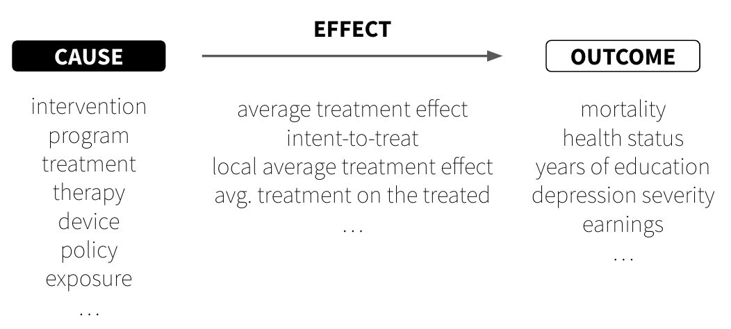
Figure 7.1: Causes, effects, and outcomes
As someone who has likely perfected the art of causal inference in your daily life, you might be surprised to learn that causal inference in science is still a rapidly evolving field. You already know that putting your hand on a hot stove causes pain, and that your headache went away because you took ibuprofen. We make these kinds of causal judgments constantly, often without much conscious thought. Yet formalizing this intuitive process for scientific research—where we need to be precise about what we mean and defend our conclusions to skeptics—turns out to be remarkably challenging. Even core terms like cause and effect are up for debate.
NoteEffects of causes or causes of effects?
The most common type of causal inference question we ask is about the effects of causes. What is the effect of \(X\) on \(Y\)? For instance, what is the effect of a new therapy on depression severity? Given a well-defined cause, \(X\), we can estimate what happens to \(Y\) if we intervene to change \(X\). Questions about the causes of effects—what causes \(Y\)?—are harder to answer. For example, what causes depression?
CAUSES
Watch Dr. Judea Pearl discuss what he calls the new science of cause and effect.
The Turing Award-winning computer scientist Dr. Judea Pearl and his co-author, mathematician-turned-science writer Dr. Dana Mackenzie, offered the following definition of causes in their 2018 instant classic, The Book of Why(Pearl et al., 2018):
A variable \(X\) is a cause of \(Y\) if \(Y\) “listens” to \(X\) and determines its value in response to what it hears
This definition has two key implications:
Causes must come before effects.\(X\) speaks and then \(Y\) listens.
Causes and effects are associated, meaning they go together or covary. When \(X\) happens, \(Y\) is more likely to happen. I say “more likely” because the effect does not always need to happen for there to be a causal relationship between \(X\) and \(Y\). For instance, smoking increases the probability of developing lung cancer, but not all smokers will develop lung cancer. Most of the relationships we study in global health are like this—probabilistic in nature, not deterministic.
But here’s a crucial distinction that trips up many students: a causal relationship can exist even when we can’t cleanly identify it. Imagine smoking truly does cause lung cancer, but there’s also some genetic factor that makes certain people both more likely to smoke and more susceptible to cancer. In this scenario, smoking still causes cancer—\(Y\) still “listens” to \(X\). The confounding factor doesn’t change the underlying causal relationship; it just makes it harder for us as researchers to measure how much of the cancer risk comes from smoking versus genetics.
This brings us to one of the central challenges in causal inference: ruling out plausible alternative explanations. During the smoking debate of the 1950s and 1960s, some proponents of smoking asked whether the apparent causal link between smoking and lung cancer could be explained by a smoking gene that predisposed people to both smoking and lung cancer.2 This wasn’t a question about whether smoking could cause cancer—it was a question about whether the evidence proved it did.
The need to rule out plausible alternative explanations keeps many researchers up at night. As Shadish, Cook, and Campbell (2002) put it, we can only infer a causal relationship when “(1) the cause preceded the effect, (2) the cause was related to the effect, and (3) we can find no plausible alternative explanation for the effect other than the cause.” Note that this third condition is about identifying causal effects—what we need to demonstrate causation convincingly—not about whether causation exists in the world. Studies that fail to rule out alternative explanations convincingly are characterized as having low internal validity. In other words, there is not a strong justification for inferring that the observed relationship between \(X\) and \(Y\) is causal, even if such a relationship truly exists.
Causes in global health research
We study a variety of potential causes in global health research and call them by different names. For instance, global mental health researchers often develop and test interventions delivered to individuals or groups to prevent or treat conditions such as depression. Development agencies administer programs to improve people’s well-being, including economic assistance programs intended to reduce poverty. Clinical researchers and biostatisticians test the efficacy of drugs and medical devices, generally referred to as treatments or therapies, on health outcomes, such as the COVID-19 vaccinations developed in 2020. Policy researchers and health economists study the health and financial impacts of policies, such as removing fees to deliver a baby at public health facilities. Epidemiologists estimate the effect of exposures, such as smoking, on the health status or prognosis of a target population.
NoteNo causation without manipulation?
Some scholars believe that it must be possible to manipulate, or change, a variable for that variable to be considered a cause. This would exclude immutable variables such as age and genetic sex as causes of effects because there is not currently a way to plausibly intervene to change them. The logic goes like this: if we can’t even imagine how we would change \(X\), how can we meaningfully ask what would happen to \(Y\) if \(X\) were different? This is sometimes framed as the need for a “well-defined intervention”—if you can’t specify exactly what the intervention would look like, you can’t clearly define the causal effect you’re trying to estimate. I don’t personally agree with the “no causation without manipulation” mantra, but I value the way it encourages us to focus on research questions that can improve public health.
EFFECTS
Causal inference is an exercise in counterfactual thinking, full of “what if” questions about the road not taken. We ask ourselves these questions all the time. What would have happened if I had taken that job? Said “yes” instead of “no”? How would life be different today?
Counterfactuals and potential outcomes
A counterfactual is the hypothetical state of a “what if” question. With counterfactual thinking, there is what actually happened, and then there is the hypothetical counterfactual of what would have happened, counter to fact, under the alternative scenario. The difference between what did happen and what would have happened is a known as the causal effect.
Robert Frost fans see the problem.
“The Road Not Taken”, by Robert Frost, The Atlantic Monthly, 1915.
Two roads diverged in a yellow wood, and sorry I could not travel both and be one traveler…
Robert has to choose one road; he can’t take both simultaneously. Robert can either take the road more traveled, a decision we’ll call \(X\) = 0, or he can take the road less traveled, a decision we’ll call \(X\) = 1.
NoteWhat’s with the Xs and Ys, 1s and 0s?
In some ways it might be easier to refer to Robert’s decision as the variable road, or \(R\), and set the values of road to “more traveled” or “less traveled”, representing his two choices. But instead I’m referring to his decision as \(X\) and to the values of \(X\) as 0 (more traveled) or 1 (less traveled). Why?
Often we refer to potential causes as \(X\) and to response variables as \(Y\). And typically, when the treatment (or exposure) \(X\) can take two levels, such as treated/not treated, we label treated 1, and not treated 0.
In this example, I imagine Robert looking left and then looking right. Observing that the second path was “grassy and wanted wear”, he decided to go right, taking the “one less traveled by”. Frost claims that his decision to take the uncommon path “made all the difference”, so I’m labeling this path (less traveled) as the treatment, \(X\) = 1.
Robert’s two choices correspond to two potential outcomes, or states of the world, that he could experience (Rubin, 1974). There is the potential outcome that results from taking the road more traveled, and the potential outcome that results from taking the road less traveled. We’ll call these scenarios \(Y_i^{X=0}\) (what happens if he takes the road more traveled) and \(Y_i^{X=1}\) (what happens if he takes the road less traveled).
So what does he do? He famously takes the road less traveled. Robert’s factual outcome is what happens after making this choice. His other potential outcome will never be observed. Taking the road more traveled is now the counterfactual. He can only wonder what would have happened, counter to fact, if he had taken the beaten path.
Could Robert experience the counterfactual by returning at a later date to take the other road? No, because he wouldn’t be the same person who stood there at the start. He could not un-experience the road less traveled. Also, we’d be measuring his happiness at two different points in time. Besides, he did not expect to return: “Yet knowing how way leads on to way / I doubted if I should ever come back.”
And yet, Robert boldly claims that taking the road less traveled “made all the difference”. How can he know for sure? We defined causal effects as the difference between what did happen and what would have happened, but we only observed what happened, not what would have. Therefore, we have a missing data problem.
This is what’s often called the fundamental problem of causal inference(Holland, 1986): we only get to observe one potential outcome for any given person (or unit, more generally). The causal effect of taking the road less traveled is the difference in potential outcomes: \(\delta_i = Y_i^{X=1} - Y_i^{X=0}\), but \(Y_i^{X=0}\) is missing. Therefore, we can’t measure this effect for Robert (\(i\)).
Average treatment effect
We can, however, compare groups of people like Robert who take one road or the other and estimate the average treatment effect, or ATE. I’m emphasizing “estimate” because truly calculating the ATE would require knowing both potential outcomes for each person (or unit, like classrooms or schools). We can only observe one potential outcome for any given person, but let’s ignore this for a moment to understand the true ATE.
The average treatment effect is also called the sample average treatment effect, or SATE.
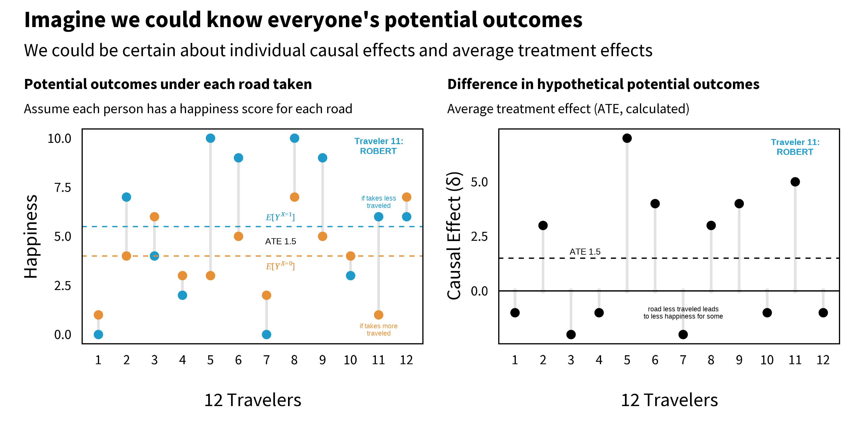
While we’re pretending, let’s imagine that the response variable Robert writes about in his poem is happiness later in life, and happiness, or \(Y\), is measured on a scale of 0 to 10 where 0 is not at all happy and 10 is very happy.
Figure 7.2 shows fictional happiness data for a sample of 12 people, including Robert, under both potential outcomes. Notice how each person in the left panel has two values: the happiness that would result if they took the road less traveled (\(X\)=1) and the happiness that would result if they took the road more traveled (\(X\)=0). Some people, like Traveler 1, would be happiest taking the road more traveled, whereas other people, such as Robert (11), would find greater happiness on the road less traveled. (Remember, we’re pretending here. We never observe both potential outcomes.)
Figure 7.2: Potential outcomes, part 1.
As shown in the right panel of Figure 7.2, the ATE is calculated as the difference between group averages (\(E[Y_i^{X=1}] - E[Y_i^{X=0}]\)), which is equivalent to the average of traveler’s individual causal effects. In this example where we are all knowing, the ATE is 1.5; taking the road less traveled increases happiness on average by 1.5 points on a scale of 0 to 10.
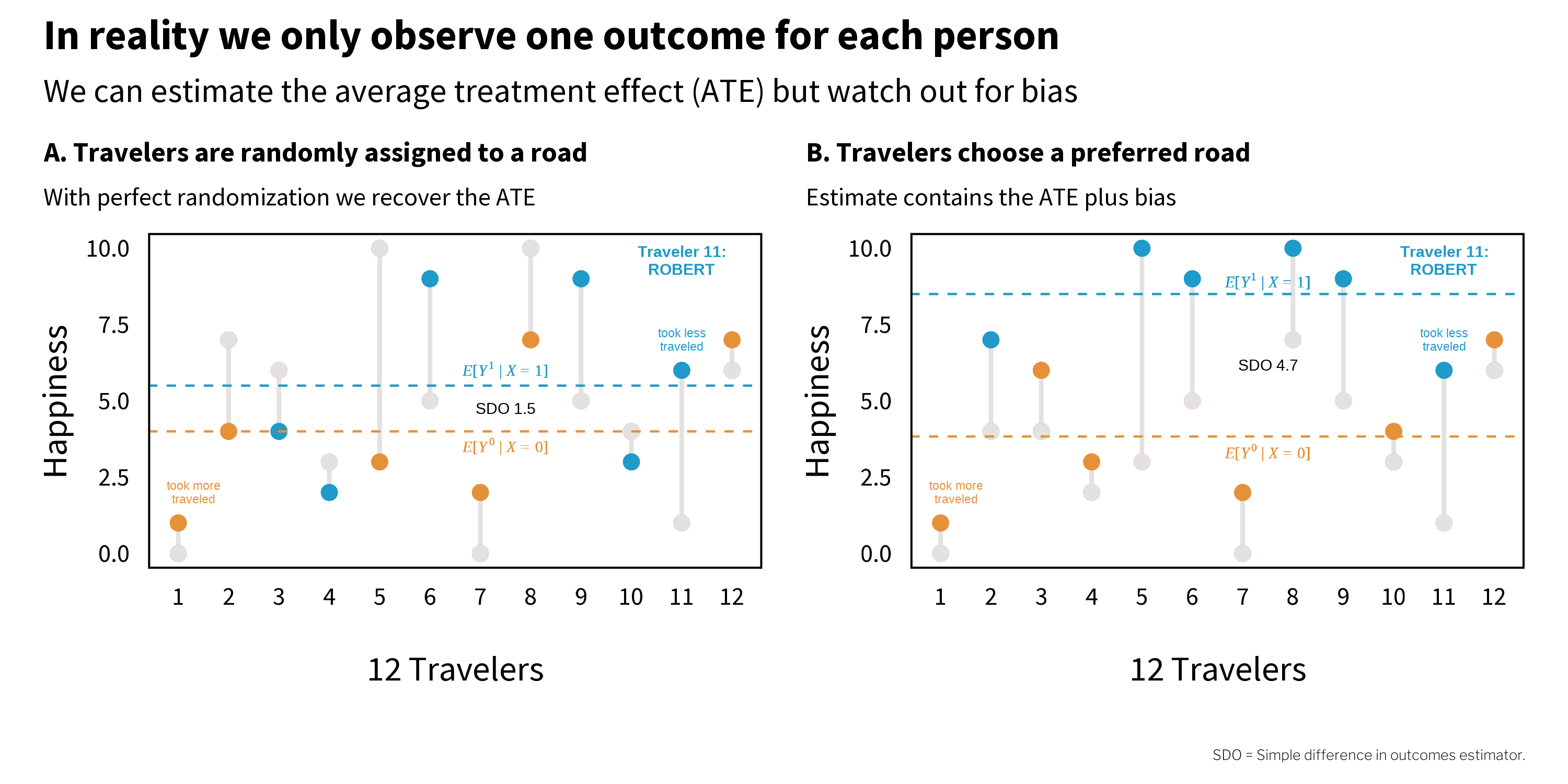
We’re not all knowing, of course, and we only get to observe one potential outcome for each person. This means we have to estimate the ATE by comparing people like Robert who take the road less traveled to people who take the road more traveled. But how do people come to take one road versus the other?
Figure 7.3 shows two scenarios (of an infinite number). On the left (A), travelers are randomly assigned to a road. Imagine that they come to the fork in the road and pull directions out of a hat. Half are assigned to the road less traveled, and half to the road more traveled. On the right (B), however, travelers choose a road themselves. Imagine that they go with their gut and all happen to pick the road that maximizes their individual happiness. In both panels, the grey dots represent the unobserved counterfactuals.
Figure 7.3: Potential outcomes, part 2.
Notice that under perfect randomization (left, A), the estimated ATE 1.5 is equal to the true (but unknowable) ATE. But on the right (B), when travelers selected their own road, the estimate is 4.7. This does not line up with the true ATE because the estimate includes bias. Remember that bias is anything that takes us away from the truth.
Why does the estimate go wrong in panel B? The answer is selection bias—systematic differences between groups that distort our comparison. When travelers chose their own road, the optimistic people (who would have been happier regardless of which road they took) selected into the road less traveled. So when we compare average happiness across roads, we’re not just seeing the effect of the road—we’re also seeing the effect of optimism.
A note on terminology: This chapter follows the econometric tradition where “selection bias” refers to confounding that arises when units select into treatment based on characteristics related to the outcome. Epidemiologists typically reserve “selection bias” for problems with who enters or remains in a study, and call this type of bias “confounding.” See the discussion in Chapter 5 for more on this terminological divide.
As we will see in later chapters, randomization can be a very effective way to neutralize selection bias, but randomization is not always possible or maintained. Most research is non-experimental, or what many would call observational. Selection bias will remain a threat in many cases, and unfortunately we can’t simply calculate it and subtract it away because the exact quantity is typically unknowable. That leaves us with research design and statistical adjustment as our only defense. As Cunningham (2020) states:
One could argue that the entire enterprise of causal inference is about developing a reasonable strategy for negating the role that selection bias is playing in estimated causal effects.
CAUSAL INFERENCE METHODS
Watch Dr. Esther Duflo’s speech at the Nobel Banquet, 10 December 2019.
There are different causal inference methods for addressing selection bias, and which one a researcher chooses tends to be heavily influenced by their context and discipline. For instance, clinical researchers, biostatisticians, and behavioral interventionists often prefer to use experimental designs that randomly allocate people (or units) to different treatment arms.3 There is also a rich tradition of experimentation in the social sector among economists and public policy scholars. Economists Abhijit Banerjee, Esther Duflo, and Michael Kremer won the 2019 Nobel Prize in Economics4 for their experimental approach to alleviating global poverty.
But as I stated previously, many research questions in global health are not amenable to experimentation, and the approach to causal inference must be rooted in non-experimental (or observational) data. Matthay, Hagan, et al. (2020) divide these non-experimental approaches into two main buckets: confounder-control and instrument-based. Confounder-control is characterized by the use of statistical adjustment to make groups more comparable. You’ll find many examples of confounder-control in epidemiology and public health journals. Instrument-based studies, sometimes called quasi-experimental designs, estimate treatment effects by finding and leveraging arbitrary reasons why some people are more likely to be treated or exposed. Instrument-based studies are quite common in economics and psychology. I’ll introduce each approach in turn.
NoteAdditional causal inference frameworks
Bradford Hill’s Considerations. In 1965, Epidemiologist and statistician Sir Austin Bradford Hill proposed a set of nine domains to consider when evaluating the evidence for a causal relationship: (1) strength, (2) consistency, (3) specificity, (4) temporality, (5) biological gradient, (6) plausibility, (7) coherence, (8) experiment, and (9) analogy. It does not feature prominently in current debates about causal inference, and it’s commonly misapplied. Modern Epidemiology has a good summary and critique: ghr.link/mod.
Sufficient Cause Framework and Causal Pies. The sufficient-component cause model is an approach for conceptualizing cause and effect used largely for pedagogical purposes. Dr. Kenneth Rothman defined sufficient causes as the minimal set of conditions that produce a given outcome. This set of causes is often represented by pie charts.
7.2 Causal Diagrams and Confounder-Control
Confounding is a type of bias where variables \(X\) and \(Y\) share a common cause \(Z\) that explains some or all of of the \(X\)\(Y\) relationship. You’re likely familiar with examples of confounding like ice cream sales and violent crime. If you look just in the data, it looks like increases in ice cream sales could be causing increases in violent crime (or maybe vice versa), but this is what we call a spurious correlation. Ice cream sales and violent crime are both more common when the weather is warm. Once you statistically control for weather, let’s say by looking just at sales on hot days, there is no relationship between ice cream sales and crime.
Causal relationships observed in non-experimental contexts are at high risk of confounding, and the goal of confounder-control studies is to find and statistically adjust for a sufficient set of variables to eliminate confounding. But this is not just an exercise in statistics because data are profoundly dumb (Pearl et al., 2018). A dataset cannot tell you which variables to adjust for, or what is a cause and what is an effect. For that you need information that lives outside of statistical models. You need causal models that are informed by domain expertise (McElreath, 2020).
Watch Dr. Nick Huntington-Klein introduce causal diagrams.
For this reason, a graphical approach based on causal diagrams has emerged as a popular tool for causal inference in confounder-control studies (Pearl, 1995).5 The most common type of graphical model you’ll encounter is the causal directed acyclic graph, or DAG. Figure 7.4 shows an example DAG of the effect of taking the road less traveled on happiness.
Figure 7.4: Causal directed acyclic graph (DAG) of the effect of taking the road less traveled on happiness.
CAUSAL STORIES
Dr. Scott Cunningham’s book, Causal Inference: The Mixtape, is worth every penny. If you’re short on pennies, read it online for free.
Cunningham (2020) frames DAGs as storytelling devices. The story I am telling with this DAG is that the road traveled causes happiness directly and indirectly by creating new social relationships. This DAG also shows my assumption that happiness AND the decision to take the road less traveled are both caused in part by one’s cognitive style (e.g., sense of optimism); they share a common cause. Happiness is also caused by income which, like cognition, is a function of background characteristics like genetics and family.
NoteStart by drawing your assumptions
Before I even do anything with this DAG, or any DAG I create, I’ve accomplished a lot just by drawing my assumptions. The DAG represents my belief in the data generating process. It includes all nodes and connections that I believe are relevant to the effect of road traveled on happiness. I’ve made my assumptions clear and can proceed to identify how I will estimate the causal effect of interest.
Now you might call bullshit, and that’s OK. You can draw a different DAG that might have different implications for the best analysis strategy. You and I should be able to defend our assumptions and be open to modifications based on subject matter criticism. But whether you draw a DAG or not, there is no escaping the need to make assumptions. DAGs just help to make your assumptions clear and transparent.
COMPONENTS OF A DAG
As a graph, DAGs consist of nodes and edges (or arrows). Nodes are variables like our exposure of interest, the road traveled, and our outcome of interest, happiness later in life. Nodes can take any form, from discrete values of road traveled (more traveled, less traveled) to continuous values of income. A DAG can include observed (measured) variables and unobserved variables, including background factors such as genetics.
Nodes are connected by edges, directed arrows that make causal statements about how two variables are related. For instance, by drawing an arrow from road traveled to happiness, I’m asserting that the road one travels causes happiness. Arrows do not indicate whether this relationship is positive or negative, just that road traveled influences happiness. Equivalently, the absence of an arrow between nodes implies that there is no causal relationship.
:::{.column-margin} Spirals are allowed, however, and offer a way to represent that causal relationships between variables measured at different time points (e.g., social relationships_t1\(\rightarrow\)happiness_t2\(\rightarrow\)social relationships_t3\(\rightarrow\)happiness_t4). :::
The only hard rule in a DAG is that cycles are not permitted. Arrows can go into and out of a node, but there must not be any recursive pathways. For instance, social relationships\(\rightarrow\)happiness\(\rightarrow\)social relationships is not allowed. Causal effects must only flow forward in time.
There are three possible relationship structures in a DAG (McElreath, 2020):
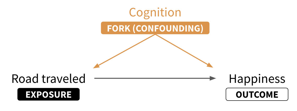
Forks: In forks like road traveled\(\leftarrow\)cognition\(\rightarrow\)happiness, cognition is a common cause of the focal variables of interest. As such, cognition confounds the causal effect of road traveled on happiness; some (or all) of the observed association is due to cognition. When you see a fork, you should think confounding.
Pipes: Pipes (or chains) involve mediator variables like social relationships that represent an indirect causal chain of effects. For instance, road traveled causes new social relationships which causes happiness. Whether or not you are interested in the indirect causal effect depends on your research question.6
Colliders: Colliders (or inverted forks) are closed pathways like road traveled\(\rightarrow\)active lifestyle \(\leftarrow\)happiness where a node on the pathway only has incoming arrows. These pathways are closed by default and only open when conditioning on the collider, thereby distorting the relationship between road traveled and happiness.
As you will see shortly, being able to recognize these relationships will help you to identify your causal effect of interest.
NoteDescendants and ancestors
Graphs like DAGs can also be described by the ancestry of the nodes. A descendant variable has at least one incoming arrow. Economists would call this an endogenous variable (vs an exogenous variable like background that has no incoming arrows). In the example DAG, happiness and social relationships are descendants of road traveled. Specifically, social relationships is a child of road traveled, and road traveled is its parent. Therefore, road traveled and social relationships are ancestors of happiness.
DECIDE WHICH NODES TO INCLUDE IN A DAG
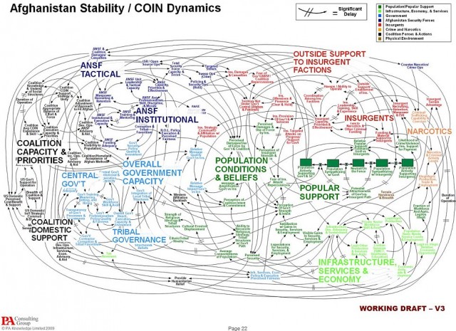
In order to use a DAG to identify a causal effect, you must include all of the relevant nodes and paths (Rohrer, 2018). As you can probably imagine, this can get out of hand quickly. Just look at the slide in Figure 7.5 that diagrams the American military’s perceived challenge in its war in Afghanistan.
This includes variables that you can measure and the ones you can’t (or didn’t) observe.
Figure 7.5: War is hard. Source: U.S. Joint Chiefs of Staff. (Not a DAG, per se, but you get the point.)
Dr. Huntington-Klein’s book, The Effect: An Introduction to Research Design and Causality, should be on your bookshelf. If you’re not in a position to purchase it today, read it online for free.
Huntington-Klein (2021) frames DAG creation as a balancing act:
On one hand, we want to omit from the diagram every variable and arrow we can possibly get away with. The simpler the diagram is, the easier it is to understand, and the more likely it is that we’ll be able to figure out how to identify the answer to our research question…On the other hand, omitting things makes the model simpler. But the real world is complex. So in our quest for simplicity, we might end up leaving out something that’s really important.
A piece of practical advice is to draw a basic DAG and then add additional variables (nodes) only if you believe they causally affect two or more existing nodes in the DAG (Rohrer, 2018). For instance, maybe you could argue that being left handed also contributes to one’s decision to take the road less traveled. If handedness does not have an arrow into any other nodes, you can safely leave it out of the DAG.
If this feels daunting, you’re doing it right. Science is hard, and I predict that you’ll find this process easier if you have the humility to know that, at best, your study will approximate the truth. There is a very good chance that your DAG will be wrong or incomplete. Your colleagues might tell you as much. This is part of the scientific process. Criticism should lead you to revise your DAG or strengthen how you defend your assumptions.
TRACING ALL PATHS
Once you’ve drawn your DAG, the next step is to list all of the paths from the proposed cause to the outcome of interest. In this example, it means tracing all of the paths that go from road traveled to happiness.
Start with road traveled and move your finger along each path until you get to another variable or to the outcome, happiness. When you encounter variables with arrows coming in or out, trace each path to the outcome. The direction of the arrows does not matter for tracing, just don’t trace back to variables you’ve already visited (in other words, no loops).
View the example DAG or create your own at DAGitty.net.
You can check your work—or skip the manual tracing process entirely—by creating and analyzing your DAG in R. While you can manually enter your graph into R, a shortcut is to create your DAG visually in your browser at DAGitty.net and copy/paste the model code into R. The function paths() returns the same five paths we traced by hand.
Next we need to determine which paths are good and which are bad (Huntington-Klein, 2021). “Good paths” identify our research question. “Bad paths” are the alternate explanations for the causal effect that we need to close. In our example DAG, as in many DAGS, good paths often start with an arrow exiting the proposed cause and bad paths have arrows entering the proposed cause.
An exception would be if we are only interested in the direct effect of road traveled on happiness, we would label the mediation pathway through social relationships as a bad path and work to close it.
Figure 7.6 visualizes the five paths in our example DAG and labels them good or bad. Notice that paths 1 and 2—the good paths—start with road traveled and flow forward to happiness. The rest are backdoor paths that we need to close.
Figure 7.6: Good and bad paths in our example DAG.
Dr. Andrew Heiss has a great tutorial on ways to close backdoors through regression, inverse probability weighting, and matching.
Open backdoor paths bias the causal effect we want to estimate, so we need to close them. We can do this by conditioning on variables that confound the causal effect of interest through techniques like regression. The neat thing is that we do not necessarily need to control for every possible confounder, just a minimum set sufficient to close all backdoor paths.7 For instance, in Figure 7.6, you can see that adjusting for cognition in paths 3 and 4 is sufficient to close the open backdoor paths.
Path 5 is also a backdoor path, but it’s closed by default because active is a collider (see the two incoming arrows). If we condition on active, let’s say by including it as a covariate in our regression, we will inadvertently open this path and introduce bias. There is such a thing as a bad covariate, and sometimes less is more when it comes to statistical models (McElreath, 2020; Westreich et al., 2013).8
If this DAG is correct and complete, adjusting for (controlling for) cognition on the backdoor path makes the relationship between road traveled and happinessd-separated (direction separated) from all other nodes. In other words, the causal effect is said to be identified.
EFFECT ESTIMATION
There are various statistical techniques to cut the bad paths so they don’t bias our causal effect of interest. I’ll show you regression. See Heiss (2020b) for other examples.
A simulated example
For this example, I simulated a dataset on 1000 people who decided to take the road less traveled or the road more traveled.9 This is an observational dataset. There was no random assignment to road_traveled. The core variables include:
Simulation is the only way to demonstrate that controlling for cognition recovers the correct effect. In real world datasets you don’t know the right answer. If you did, causal inference would be easy.
cognition (confounding variable): A binary (0/1) variable set to 1 if the person scored high on a measure of optimism, otherwise 0. Imagine that everyone completed a questionnaire before they decided on a road. This questionnaire included items that assessed aspects of their cognitive style, and we used their answers to construct an indicator of high/low optimism.
road_traveled (exposure/treatment): A binary (0/1) variable set to 1 if the person chose the road less traveled, otherwise 0. This variable was simulated to be a function of cognition. In this dataset, the odds of taking the road less traveled are 18 times higher for high optimism folks.
happiness (outcome): A variable that can range from 0 to 10, where 10 represents greatest happiness. Imagine that data on happiness was collected 10 years after people selected and traveled down one of the roads. This variable was simulated to be a function of cognition and happiness. On average, high optimism folks scored 1 point higher on the measure of happiness.
active (collider): A binary (0/1) variable set to 1 if the person has an active lifestyle. Imagine that this variable was collected at sometime after the person traveled the road. This variable was simulated to be a function of road_traveled and happiness. active does not cause anything in the model.
I simulated the data so that the road less traveled increases happiness by 1.5 points. That will be the correct answer going forward. Here are my receipts:
Figure 7.7: cognition confounds the \(X\)\(Y\) relationship.
Figure 7.7 should remind you that our core problem in this DAG is that the exposure (road_traveled) and the outcome (happiness) share a common cause: cognition. This is to say that cognition confounds the relationship between \(X\) and \(Y\).
You can see this visually in Figure 7.8. In the left panel, people who scored high on optimism are represented in red (vs low in black). Notice that red appears more frequently among the road less traveled group AND red looks to be associated with higher happiness scores. If we just compare happiness scores by road traveled, we get the wrong answer (difference of 2.07). This is because cognition biases the \(X\)\(Y\) relationship.
Remember, we know the correct answer is 1.5 because that’s how I simulated the data generating process.
To get to the right answer, we need to hold cognition constant. In the right panel I show this by looking just at people with a low optimism score. Now if we compare happiness scores by road traveled, we get close to the correct answer (difference of 1.47).10
Figure 7.8: Confounding
A Solution: Multiple Regression
In practice we might estimate the effect via a technique like multiple regression, which I’ll show you here.11 You’ll see that I modified the variable names to make Figure 7.9 easier to read. Most notably, the exposure road traveled is represented as x and the outcome happiness is represented as y. Cognition and active are simply c and a, respectively.
y ~ x: naive regression of happiness (y) on road_traveled (x)
y ~ x + c: same as (1) but also controlling for cognition (c)
y ~ x + c + a: same as (2) but also controlling for active (a)
Figure 7.9: Multiple regression models
The red model y ~ x repeats the same mistake as above. It just estimates the impact of road traveled x on happiness y without accounting for the confounding role of cognition c. It returns the wrong answer.
The green model y ~ x + c controls for cognition c, thereby removing the parts of x and y that are explained by c(Heiss, 2020a). This closes the biasing pathway and returns the correct answer.
This should not be surprising. I simulated the data generating process with c confounding the relationship between x and y. Our DAG was therefore correct, and controlling for c recovers the simulated effect.
The blue model y ~ x + c + a gets us into trouble. In the data I simulated, active a is a collider. It doesn’t cause anything in the DAG, and the bad path it sits on is closed by default. When I control for it by adding it to the regression, I open the pathway and distort the relationship between x and y.
It might come as a surprise that something can go wrong by adding covariates to your model. Many of us are taught that it’s probably good or at least neutral to add all seemingly relevant variables to a regression. This is just bad advice. Some covariates will make your estimates worse, not better.
Watch Dr. Richard McElreath’s excellent talk, Science Before Statistics: Causal Inference.
McElreath (2020) uses the term causal salad to describe this very common practice of tossing lots of “control” variables into a statistical model and telling a causal story. This approach can work when the goal is prediction, but it can go very very wrong when the goal is causal inference. One of his core points in Statistical Rethinking is that causal inference requires causal models that are separate from statistical models. Statistics alone can get us to the wrong answers. But if we follow the DAG—our causal model—we know to leave active alone.
THE BIG FINE PRINT
DAGs are useful tools for causal inference, but they are not magic. If your DAG does not completely and correctly identify your causal effect of interest, your estimates will be biased. To make matters worse, there is no test that will tell you if your DAG is correct—but there are tests that can tell you if it’s wrong.
DAGitty.net and the {dagitty} R package can help you identify testable implications of your DAG.
Here’s what I mean: every DAG implies that certain variables should be conditionally independent of each other. If your data violate these implied independencies, something is wrong with your DAG. You can also run placebo tests—checking whether your approach produces null effects in situations where you’d expect no effect. These tests can falsify your DAG, but passing them doesn’t prove it’s correct. Your DAG could still be missing important variables or relationships that happen not to show up in these particular tests.
But let’s be clear: there is no approach to causal inference that sidesteps the need for unverifiable assumptions (McElreath, 2020). DAGs require you to make and defend your assumptions, but so does every other approach (you just might not know it).
Note“I’ve read lots of papers that adjust for confounding. None of them used a DAG.”
You’re right—and this is worth pausing on. If you’ve been reading the global health literature, you’ve seen countless papers that “control for” age, sex, education, wealth, and other variables without ever drawing a diagram. Are we doing something different here?
Yes and no.
Yes, in the sense that we’re being explicit about our causal assumptions. The DAG forces us to think carefully about why we’re adjusting for certain variables and to communicate those reasons transparently. It’s a tool for clarity and honesty.
No, in the sense that the underlying statistical machinery is the same. When a paper “controls for” confounders in a regression model, it’s doing the same kind of adjustment we described above—it’s just not showing its work. The authors still had to make decisions about which variables to include (and exclude), which means they had a causal model in their heads, whether or not they drew it.
The difference is transparency. Without a DAG, assumptions often go unstated. But they’re still there. Every choice about what to adjust for reflects beliefs about causal structure. DAGs just make those beliefs visible—to you, to your readers, and to your critics.
7.3 Instrument-Based Approaches and Quasi-Experimental Designs
If confounder-control is about closing backdoors through statistical adjustment, instrument-based approaches are about isolating front doors (Huntington-Klein, 2021). These approaches are sometimes called quasi-experimental designs because they attempt to mimic the beauty and logic of a perfectly conducted randomized controlled trial (RCT).
EXPERIMENTS DESTROY CONFOUNDING
As shown in Figure 7.10, RCTs (experiments), are effective because they close all backdoors that run from the proposed cause to the outcome. For instance, if we were somehow able to randomly assign people to the road less traveled or the road more traveled—and if people complied with these assignments—then the only arrow into road_traveled would be randomization. Randomization would be the only cause of road_traveled.
Figure 7.10: Observational DAG vs experimental DAG.
Randomization destroys confounding. This includes confounding from variables you think to measure, like cognition in this example, as well as variables that you can’t or don’t measure for whatever reason. This idea is so powerful that many people refer to experiments as the gold-standard when it comes to causal inference.12
EXOGENOUS VARIATION WITHOUT RANDOMIZATION
When randomization is not possible, confounding is likely. You can try to account for this confounding statistically (confounder control), or you can search for partial causes of the exposure/treatment that are unrelated to the outcome. Sometimes you can get lucky and find an exogenous source of variation in the exposure/treatment and use it to identify the causal effect.
For instance, imagine that we couldn’t randomize who travels which road, but we could restrict access to the road less traveled to people born on or after January 1, 1980. By this arbitrary rule, someone born on January 1, 1980 would be allowed to pass, but someone born on December 31, 1979 would have to take the road more traveled. This is the basic setup for a regression discontinuity design that fits in the instrument-based or quasi-experimental bucket (Figure 7.11).
Figure 7.11: Regression discontinuity DAG.
In this design, birthdate \(\geq\) January 1, 1980 is an instrument that causes exogenous variation in who is exposed to the road less traveled (see the left panel of Figure 7.12). This variation is almost as good as randomization because the cutoff is arbitrary. Furthermore, when we limit our investigation to people born right around this arbitrary cutoff, any potential link between birthdate and the outcome is broken. We’d argue that people born just before and just after the cutoff are similar in many observable and unobservable ways. The only difference is that people born before the cutoff weren’t allowed to take the road less traveled. This isolates the front door from road_traveled to happiness.
Figure 7.12: A regression discontinuity example.
The key to this design, and others in this category, is that the instrument changes the probability of exposure (treatment) WITHOUT having any other mechanism of impacting the outcome (Matthay, Hagan, et al., 2020). In Chapter 11 we’ll see examples of regression discontinuity in practice, along with other quasi-experimental designs like instrumental variables, difference-in-differences, and interrupted time series.
7.4 Key Assumptions and Threats to Internal Validity
We’ve now seen two broad strategies for causal inference from observational data: confounder-control, which closes backdoor paths through statistical adjustment, and instrument-based approaches (quasi-experimental designs), which isolate front-door variation that mimics randomization. Different as they are, both strategies share the same goal: getting us closer to the counterfactual comparison we’d have if we could run an experiment.
This brings us back to internal validity—the confidence we have that our study design actually supports the causal claims we want to make. Remember, internal validity asks: Is the relationship we observed actually causal, or could something else explain it? Every approach to causal inference, whether it uses DAGs, instrumental variables, or randomized trials, is ultimately an attempt to strengthen internal validity by ruling out alternative explanations.
But here’s the catch: every approach relies on assumptions. And most of those assumptions can’t be directly tested. Let’s be explicit about what we’re assuming when we make causal claims.
ASSUMPTIONS
I listed three requirements for identifying causal relationships when I defined causes:
causes must come before effects;
causes and effects are associated, meaning they go together or covary; and
there are no other plausible alternative explanations for the effect other than the proposed cause.
The third requirement—no other plausible alternative explanations—is the hardest of them all to meet. Every approach to causal inference relies on assumptions related to this requirement, and most of these assumptions can’t be directly tested. You’ll encounter these assumptions repeatedly in methods courses and in the literature, so let me introduce them here. Don’t worry if they feel abstract at first—they’ll become more concrete as you see them applied in specific studies.
Assumption 1: We’ve accounted for all the confounders that matter. This is the big one. When we use confounder-control, we’re betting that we’ve identified and adjusted for every variable that affects both treatment and outcome. If we missed something important, our estimate is biased. Researchers call this assumption different things depending on their discipline: ignorability (statistics), exogeneity (economics), or exchangeability (epidemiology) (Gelman et al., 2020). The names differ, but they all mean roughly the same thing: after we adjust for our covariates, the only remaining difference between groups is the treatment itself.
What does it look like when this assumption fails? Imagine that people who are naturally more likely to succeed—regardless of treatment—are also more likely to seek out treatment (Matthay, Hagan, et al., 2020). If we can’t measure and adjust for this “success-prone” trait, it looks like treatment works even if it doesn’t. We’ve stacked the deck. Randomization solves this problem entirely because it breaks the link between who someone is and what treatment they receive. But for observational studies, we always have to worry: What if there’s an important confounder we didn’t measure?
Assumption 2: Everyone has some chance of being treated. This one is called positivity, and it’s more intuitive than it sounds. If you’re adjusting for certain variables, every combination of those variables needs to include some treated and some untreated people. Otherwise, you’re asking the data to tell you something it can’t.
Here’s an example from Westreich (2019): suppose you’re studying the effects of hysterectomy and you adjust for biological sex. But only people with a uterus can have a hysterectomy—so there are no treated males in your data. You’re asking: “What would happen if a male had a hysterectomy?” but your data can’t answer that. The fix is simple: don’t adjust for sex in this case. Positivity violations often reveal that we’re trying to compare groups that aren’t actually comparable.
Assumption 3: The treatment is the treatment. This assumption, called consistency, asks whether “the treatment” is really one thing or many things lumped together (Westreich, 2019). Suppose you’re studying text message reminders for medication adherence. Does it matter whether the texts arrive in the morning or at night? If timing matters for the outcome, then “text reminders” isn’t a single treatment—it’s a family of treatments, and we need to be specific about which one we’re estimating.
Unlike the other assumptions, consistency is more of a “be precise about your question” issue. When it fails, the study can still work—we just need to be clearer about exactly what we’re estimating (e.g., “the effect of morning texts” rather than “the effect of texts”).
Assumption 4: We’re measuring what we think we’re measuring. All causal inference assumes that our measures of treatment, outcome, and confounders actually capture what we intend. If your “depression” measure doesn’t really measure depression, or if your “treatment received” variable misclassifies who actually got treated, your causal estimate will be biased—even if everything else is perfect. This assumption is so important that we devote an entire chapter to it. See Chapter 9 for a detailed discussion of construct validity and the challenges of measurement.
THREATS TO INTERNAL VALIDITY
These causal inference assumptions will be likely familiar to anyone who uses the potential outcomes framework or Pearl’s graphical causal models approach, but folks with a psychology or education background might be more accustomed to identifying and avoiding threats to internal validity in the Campbell tradition (Shadish et al., 2002). You’ll recall from earlier in this chapter that internal validity pertains to the robustness of a causal claim that the observed variation in \(Y\) is caused by \(X\). A study with a weak causal claim would be said to have low internal validity. Matthay & Glymour (2020) offer a helpful crosswalk between potential outcomes, DAGs, and the Campbell tradition, and West et al. (2010) compare Campbell’s approach with the potential outcomes approach (sometimes called the Rubin Causal Model).
In the Campbell tradition, researchers are taught to identify the possible threats to internal validity, practice “control by design”, and strive for “coherent pattern matching”. In short, this means to think about the alternative plausible explanations for causal effects (threats), add design elements such as additional comparison groups to remove or reduce these threats (control by design), and make more complex hypotheses to raise the inferential bar and strengthen one’s causal claim (coherent pattern matching).
Plausible alternative explanations for the causal effect are threats to internal validity. Shadish et al. (2002) enumerate eight specific threats and warn that threats can accumulate (see Table 7.1). The core threat is confounding, which Shadish et al. (2002) frame as a selection threat.
Table 7.1: Threats to internal validity from Shadish et al. (2002).
Threats to internal validity from @scc
Threat
Description
Ambiguous temporal precedence
Lack of clarity about which variable occurred first may yield confusion about which variable is the cause and which is the effect.
Selection
Systematic differences over conditions in respondent characteristics that could also cause the observed effect.
History
Events occurring concurrently with treatment could cause the observed effect.
Maturation
Naturally occurring changes over time could be confused with a treatment effect.
Regression artifact
When units are selected for their extreme scores, they will often have less extreme scores on other variables, an occurrence that can be confused with a treatment effect.
Attrition
Loss of respondents to treatment or to measurement can produce artifactual effects if that loss is systematically correlated with conditions.
Testing
Exposure to a test can affect test scores on subsequent exposures to that test, an occurrence that can be confused with a treatment effect.
Instrumentation
The nature of a measure may change over time or conditions in a way that could be confused with a treatment effect.
Remember, internal validity is not a property of your research design per se; it’s a characteristic of your claim. While it’s true that some designs, like randomized controlled trials, face fewer threats to internal validity in theory, it’s also true that study implementation matters. The RCT label does not insulate a poorly conducted RCT from criticism. It’s best to think consider the internal validity of claims on a study-by-study basis. Also, there is not a statistical test that will tell you if your claim has high internal validity. You can use the results of various statistical tests to probe the support for your causal claim, but no test will tell you that a claim has high or low internal validity. P-values, for instance, are silent on the issue.
7.5 Putting It All Together: A Real Global Health Question
Up to this point, we’ve used simple examples—roads, travelers, happiness—to illustrate what causal questions are, how counterfactuals work, and how DAGs help us reason about causation. To close this chapter, let’s apply those ideas to a real question from public health research.
Does HPV vaccination lead to riskier sexual behavior?
When the human papillomavirus (HPV) vaccine was introduced, critics worried it might cause “sexual disinhibition”—that vaccinated girls might feel protected against sexually transmitted infections and therefore engage in riskier behavior. This concern affected vaccine uptake and shaped public health debates worldwide. Researchers wanted to know: does getting vaccinated actually change behavior?
WHY THE NAIVE COMPARISON FAILS
A natural first instinct might be to compare outcomes—like pregnancy rates or STI diagnoses—between vaccinated and unvaccinated girls. But this comparison is misleading.
Girls who get vaccinated differ systematically from those who don’t. The same health beliefs and parental attitudes that lead a family to vaccinate their daughter may also lead to different conversations about sexual health, different monitoring of behavior, and different baseline risk profiles. These factors affect both exposure and outcome, creating backdoor paths that bias a naive comparison—even if the vaccine itself has no effect.
This is the core problem of confounding: the groups we want to compare differ in ways that matter.
Note
It is worth noting that HPV vaccines have been evaluated in randomized trials for their biological efficacy and safety. Those trials were not designed to study downstream sexual behavior, nor were they typically powered or structured to do so. As a result, questions about behavioral responses to vaccination have largely been addressed using observational and quasi-experimental designs.
DRAWING A DAG TO GUIDE CONFOUNDER CONTROL
To see what confounder control would require, we can draw a DAG. Figure 7.13 shows a simplified causal diagram for this problem.
Figure 7.13: Causal DAG for the effect of HPV vaccination on sexual behavior outcomes.
The arrow from HPV vaccination to sexual behavior represents the causal effect we want to estimate. To estimate this effect, we need to close several backdoor paths. Can you identify them?
NotePause and Reflect
Pause here before reading on. Can you identify these backdoor paths? Which nodes make up a minimal adjustment set?
To estimate the causal effect of vaccination using confounder control, we would need to adjust for the confounders—health beliefs, parental attitudes, and socio-economic status (or good proxies for them). We would not need to adjust for vaccination campaigns or relationship context, because they don’t create backdoor paths.
But here’s the catch: health beliefs and parental attitudes are notoriously difficult to measure well—or at all—in administrative data. They’re complex, multidimensional, and rarely captured in the kinds of records researchers have access to. It’s not clear to me that we could do this study, but that’s one reason you draw a DAG—to determine if you can get the data you need to identify the causal relationship.
A DIFFERENT APPROACH: QUASI-EXPERIMENT USING A REGRESSION DISCONTINUITY DESIGN
Researchers studying this question in Ontario found a clever way around the confounding problem (Smith et al., 2015). In 2007, Ontario introduced a publicly funded HPV vaccination program for girls in Grade 8. Eligibility was determined by birth date: girls born on or after January 1, 1994 were eligible; girls born December 31, 1993 or earlier were not.
This arbitrary cutoff created something close to random assignment. Girls born one day apart—December 31 versus January 1—are essentially identical in their health beliefs, parental attitudes, and socioeconomic circumstances. The only systematic difference is program eligibility, which dramatically affected vaccination rates.
By comparing outcomes just above and just below this cutoff, researchers could estimate the effect of vaccination without needing to measure all those hard-to-observe confounders. The design itself handled the confounding problem.
The result? No evidence that HPV vaccination increased risky sexual behavior. The study found no significant effect on pregnancy rates or sexually transmitted infections among vaccinated girls. As with all regression discontinuity designs, this estimate applies locally—near the eligibility cutoff—and relies on assumptions about smoothness around the threshold. We’ll unpack these details in Chapter 11.
WHY THIS MATTERS
This example illustrates how DAGs function in real research—and why we need both confounder-control and design-based approaches in our toolkit.
The DAG makes the confounding problem explicit: health beliefs and parental attitudes create backdoor paths that would be difficult to close through statistical adjustment alone. That clarity helps us see the value of a clever design-based solution.
The design-based approach—exploiting the birthday cutoff—didn’t require measuring every confounder. It relied on a different logic: the structure of the data itself generated plausibly random variation in who got vaccinated.
Both approaches aim to answer the same causal question—but they trade off different assumptions. We’ll explore quasi-experimental methods like this in Chapter 11. For now, the lesson is simpler: before choosing a method, you need to decide what causal story you’re telling—and a DAG is a powerful tool for making that story explicit.
7.6 Closing Reflection
Randomized controlled trials are the gold standard for causal inference. When you can randomize, you destroy confounding by design—no unmeasured variables can bias your estimate, no DAG required. Causal claims from well-conducted RCTs have the strongest internal validity. If you can run a trial, run a trial.
But you can’t always run a trial. We can’t randomize adolescents to receive the HPV vaccine to study behavioral effects. We can’t randomize people to drink coffee for decades. We can’t randomize children to malnutrition. Ethical, logistical, and financial constraints put many of our most important questions out of experimental reach.
This chapter is about what to do when randomization isn’t possible.
We opened with a coffee study that fell into the Causal Deniability trap: warn that “correlation is not causation,” then make health recommendations anyway. That’s not good enough. If we’re going to make causal claims—and we are, every time we recommend a policy or counsel a patient—we need to do the work.
We closed with an HPV study that shows what that work looks like. Drawing a DAG revealed the confounding problem: health beliefs and parental attitudes create backdoor paths that would be nearly impossible to close with statistical adjustment. That clarity pointed toward a design-based solution—exploiting an arbitrary birthday cutoff to approximate random assignment.
The DAG didn’t tell the researchers which method to use. It told them what they were up against—and that’s exactly what you need to know before choosing your approach.
The tools in this chapter make that kind of reasoning possible:
Define causes and effects precisely. What exactly are we claiming changes what?
Think in potential outcomes. What would happen under different scenarios?
Draw your assumptions. Use DAGs to make your causal model explicit.
Identify what to adjust for. Close backdoor paths, but don’t condition on colliders.
Know when to look for a design. If the DAG reveals unmeasurable confounders, a clever design may be your best path forward.
Causal inference from observational data is hard. The assumptions are strong, and while you can probe them, you can never definitively prove they hold. But that’s not a reason to retreat into causal deniability. It’s a reason to be rigorous—to state what we’re assuming, to probe those assumptions, and to interpret our findings honestly.
Ding, M. et al. (2015). Association of coffee consumption with total and cause-specific mortality in 3 large prospective cohorts. Circulation, 132(24), 2305–2315.
Gelman, A. et al. (2020). Regression and other stories. Cambridge University Press.
Haber, N. et al. (2018). Causal language and strength of inference in academic and media articles shared in social media (CLAIMS): A systematic review. PloS One, 13(5), e0196346.
Heiss, A. (2020a). Causal inference. In R for political data science (pp. 235–273). Chapman; Hall/CRC.
Hernán, M. A. (2018). The c-word: Scientific euphemisms do not improve causal inference from observational data. American Journal of Public Health, 108(5), 616–619.
Holland, P. W. (1986). Statistics and causal inference. Journal of the American Statistical Association, 81(396), 945–960.
Matthay, E. C., & Glymour, M. M. (2020). A graphical catalog of threats to validity: Linking social science with epidemiology. Epidemiology, 31(3), 376.
Matthay, E. C., Hagan, E., et al. (2020). Alternative causal inference methods in population health research: Evaluating tradeoffs and triangulating evidence. SSM Population Health, 10, 100526.
Pearl, J. (1995). Causal diagrams for empirical research. Biometrika, 82(4), 669–688.
Pearl, J. et al. (2018). The book of why: The new science of cause and effect (1st ed.). Basic Books, Inc.
Rohrer, J. M. (2018). Thinking clearly about correlations and causation: Graphical causal models for observational data. Advances in Methods and Practices in Psychological Science, 1(1), 27–42.
Rubin, D. B. (1974). Estimating causal effects of treatments in randomized and nonrandomized studies. Journal of Educational Psychology, 66(5), 688.
West, S. G. et al. (2010). Campbell’s and rubin’s perspectives on causal inference. Psychological Methods, 15(1), 18.
Westreich, D. et al. (2013). The table 2 fallacy: Presenting and interpreting confounder and modifier coefficients. American Journal of Epidemiology, 177(4), 292–298.
You might be interested in associations if you are developing a prediction model.↩︎
It turns out that such a gene was later discovered, but it does not explain the clear relationship between smoking and cancer (see The Book of Why for a fascinating history).↩︎
Folks in this camp might refer to themselves as clinical trialists.↩︎
Formally the Sveriges Riksbank Prize in Economic Sciences in Memory of Alfred Nobel.↩︎
Causal diagrams are not just for confounder-control studies, but this is where you see them used most often.↩︎
Often we care about the total causal effect that includes the direct effect (e.g., road traveled\(\rightarrow\)happiness) AND all indirect, mediated effects (e.g., road traveled\(\rightarrow\)social relationships\(\rightarrow\)happiness). Sometimes, however, an aim of a study will to understand possible mechanisms of action that involve mediated pathways.↩︎
Both DAGitty.net and the dagitty::adjustmentSets() function in R will tell us which variables make up minimally sufficient adjustment sets.↩︎
“What if I need to adjust for a variable that’s not in my dataset,” you ask. The short answer is that you might be out of luck. Whomp whomp. The longer answer is more optimistic, but probably involves creativity, some assumptions, and math.↩︎
I didn’t simulate social_relationships because we don’t need it to estimate the total effect of road_traveled on happiness.↩︎
Actually you’d probably use something like matching or inverse probability weighting, but those methods make the example too complex. See Heiss (2020) for examples.↩︎
A lot can go wrong with experiments that can dull their shine (we’ll get to examples later), but it’s hard to deny their claim in theory to strong causal inference.↩︎