6 Statistical Inference
Consider the following figure. It comes from a randomized clinical trial of 2,303 healthy postmenopausal women that set out to answer the question, “Does dietary supplementation with vitamin D3 and calcium reduce the risk of cancer among older women?” (Lappe, Watson, et al., 2017). Before we go any further, look at the image and decide what you think.

If you said “No, just look at the p-value”, please be patient — I’ll deal with you in a moment. If you said, “Maybe, but there’s no estimate of uncertainty” or “Maybe, but what’s more important is the size of the risk decrease”, then you are my favorite. Please go get a cookie.
If you said “Yes”, you’re probably in good company. I think most readers will come to the same conclusion. Without knowing anything else about the specific analysis or statistics in general, you can look at this figure and see that both groups started at 0% of participants with cancer (which makes sense given the design), over time members of both groups developed some type of cancer, and by the end of the study period cancer was more common among the non-supplement (placebo) group.
But “Yes” is not what the authors concluded. Here’s what they said:
In this RCT…supplementation with vitamin D3 and calcium compared with placebo did not result in a significantly lower risk of all-type cancer at 4 years. [emphasis added]
Media headlines lacked the same nuance. The New York Times wrote, “The supplements did not protect the women against cancer”. A headline in Time read, “There were no differences in cancer rates between the two groups”.
Technically they are correct. While the supplement group had a 30% lower risk for cancer compared to the placebo group (a hazard ratio of 0.70), the 95% confidence interval around this estimate spanned from 0.47 (a 53% reduction) to 1.02 (a 2% increase), thus crossing the line of “no effect” for ratios at 1.0. The p-value was 0.06 and their a priori significance cutoff was 0.05, so the result was deemed “not significant” and the conclusion was that supplements do not lower cancer risk.
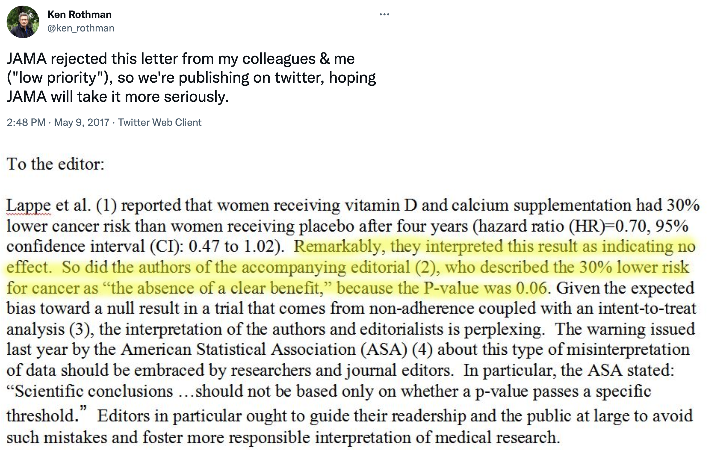
But is that the best take? Not everyone thought so. Here’s what Ken Rothman and his colleagues wrote to the journal editors:
JAMA ultimately published a different letter to the editor that raised similar issues (Jaroudi et al., 2017), and the authors of the original paper responded (Lappe, Garland, et al., 2017):
…the possibility that the results were clinically significant should be considered. The 30% reduction in the hazard ratio suggests that this difference may be clinically important.
The best answer, at least in my view, is that the trial was inconclusive. The point estimate is that supplements reduced cancer risk by 30%, but the data are also consistent with a relative reduction of 53% and an increase of 2%. In absolute terms, the group difference in cancer prevalence at Year 4 was 1.69 percentage points. It seems like there might be a small effect. Whether a small effect is clinically meaningful is for the clinical experts on your research team to decide.
This example highlights some of the challenges with statistical inference. Recall from Chapter 1 that science is all about inference: using limited data to make conclusions about the world. We’re interested in this sample of 2,300 because we think the results can tell us something about cancer risk in older women more generally. But to make this leap, we have to make several inferences.
First, we have to decide whether we think the observed group differences in cancer risk in our limited study sample reflect a true difference or not. This is a question about statistical inference. Second, we have to ask whether this difference in observed cancer risk was caused by the supplements. This is a question of causal inference (and internal validity), and we’ll take this on in Chapter 7. Finally, if we think the effect is real, meaningful, and caused by the intervention, do we think the results apply to other groups of older women? This is a question of generalizability and external validity, a topic we’ll cover in Chapter 8.
Shadish, Cook, and Campbell call this first question—whether we can trust the statistical relationship we’ve found—a question of statistical conclusion validity. Before we can ask what a relationship means (causal inference) or where it applies (external validity), we have to ask whether there’s a relationship at all, and whether we’ve correctly identified it. Statistical conclusion validity is threatened when we make errors in inference: concluding there’s an effect when there isn’t (false positive), missing a real effect (false negative), or misestimating the size of an effect. As you’ll see, the history of science is littered with such errors—and the methods we use to avoid them are more contested than you might expect.
But for now, let’s explore statistical inference. In Chapter 5, you learned to interpret effect sizes and confidence intervals when critically reading papers—practical skills for evaluating research. Now we’ll go deeper: why does statistical inference work the way it does? What are we actually claiming when we calculate a p-value or confidence interval? And why is all of this so controversial?
There’s a lot to unpack from this example. I’ll start by telling you about the most common approach that involves p-values and null hypotheses, highlight some of the challenges and controversies of this approach, and then present some alternatives. I’ll end with some suggestions about how you can continue to build your statistical inference skills.
6.1 Two Major Approaches to Statistical Inference
There are two main approaches to statistical inference: the Frequentist approach and the Bayesian approach. A key distinction between the two is the assumed meaning of probability.
I’m focusing on two approaches, but there’s actually a third: the Likelihood approach. Where Frequentists ask about the probability of data given a hypothesis, and Bayesians ask about the probability of a hypothesis given data, Likelihoodists ask a different question entirely: How well do competing hypotheses predict the data we observed? The likelihood ratio quantifies relative evidence—how many times more likely is the data under one hypothesis versus another—without requiring you to set arbitrary alpha levels (Frequentist) or specify prior beliefs (Bayesian). See Dienes (2008) for an accessible introduction, or Royall (2017) for the full treatment.
Believe it or not, smart people continue to argue about the definition of probability. If you are a Frequentist, then you believe that probability is an objective, long-run relative frequency. Your goal when it comes to inference is to limit how often you will be wrong in the long run.
You can be both and use whichever approach makes the most sense for the task, but I’ll be a bit more black-and-white for now.
If you are a Bayesian, however, you favor a subjective view of probability that says you should start with your degree of belief in a hypothesis and update that belief based on the data you collect.
I’ll explain what this all means, but before we get too far along, please think about what YOU want to know most:
- the probability of observing the data you collected if your preferred hypothesis was not true; or
- the probability of your hypothesis being true based on the data you observed?
6.2 Frequentist Approach
The Frequentist approach (and terms like “significant”) originated with Sir Ronald Fisher, but Jerzy Neyman and Egon Pearson worked out the logic of hypothesis testing and inference (Dienes, 2008). If you are a standard user of Frequentist methods, you are probably a follower of Neyman-Pearson.
Open just about any medical or public health journal and you’ll find loads of tables with p-values and asterisks, and results described as “significant” or “non-significant”. These are artifacts of the Frequentist approach, specifically the Neyman-Pearson approach.
GROUNDING IN A REAL TRIAL
Read the HAP trial article in The Lancet.
To explore how Frequentist inference works, we’ll use a real trial that we’ll return to throughout this book: the Healthy Activity Program (HAP) trial (Patel et al., 2017).
The problem: Depression is treatable with psychological therapies, but these treatments require trained professionals—psychiatrists, psychologists, clinical social workers—who are scarce in most of the world. In India, there are fewer than 1 psychiatrist per 100,000 people. The result is a massive treatment gap: most people with depression receive no effective care.
The proposed solution: What if we could train lay counselors—people without formal mental health credentials—to deliver a simplified but effective psychological treatment? The Healthy Activity Program does exactly this. HAP is based on behavioral activation, a therapeutic approach that helps people re-engage with meaningful activities and break the cycle of withdrawal and low mood. Lay counselors deliver 6–8 sessions of 30–40 minutes each.
The trial: Patel et al. (2017) enrolled 495 adults with moderately severe to severe depression from 10 primary health centers in Goa, India. Participants were randomly assigned to receive either enhanced usual care alone (the control group) or enhanced usual care plus HAP (the treatment group). Enhanced usual care meant that physicians received the patient’s screening results and clinical guidelines for treating depression—more than typical care, but no structured psychological treatment.
The question: Does adding HAP to enhanced usual care reduce depression severity compared to enhanced usual care alone?
This is the question we’ll use to learn how statistical inference works.
HOW IT WORKS
In the Neyman-Pearson approach, you set some ground rules for inference, collect and analyze your data, and compare your result to the benchmarks you set. Inference is essentially automatic once you set the ground rules.
Step 1: Specify two hypotheses
In hypothesis testing, we set up two precise statistical hypotheses: a null hypothesis (H0) and an alternative hypothesis (H1). Most often the null hypothesis is stated as the hypothesis of no difference:
The “null” hypothesis doesn’t have to be a hypothesis of no difference (Dienes, 2008). The null could be a specific difference that is a value other than 0, e.g., μ1 - μ2 = 3, or a band of differences.
H0: μ1
=μ2 (or μ1-μ2=0), meaning there is no difference in average depression severity between the group that was invited to receive HAP plus enhanced usual care compared to the group that only received enhanced usual care
A “two-tailed” alternative hypothesis states that there is a difference, but does not specify which arm is superior:
H1: μ1
$\neq$μ2 (or μ1-μ2$\neq$0), meaning that the average difference between the groups is not zero.
It might seem confusing because H1 is the hypothesis we talk about and write about, but it’s actually the null hypothesis (H0) that we test and decide to reject or accept (technically, ‘fail to reject’).
In her great book Learning Statistics with R (ghr.link/lsr), Danielle Navarro frames this as “the trial of the null hypothesis”.
The null is where statistical inference happens. The Frequentist rejects or retains the null hypothesis, but does not directly prove the alternative. They simply decide whether there is sufficient evidence to convict (i.e., reject) the null.
Step 2: Imagine a world in which H0 is true (i.e., innocent)
This is where things get a bit weird. Frequentists subscribe to the long run view of probability. In this framework, you have to establish a collective, a group of events that you can use to calculate the probability of observing any single event (Dienes, 2008). Your study is just one event. You can’t determine the probability of obtaining your specific results without first defining the collective of all possible studies.
I know what you’re thinking. This seems nuts. In my defense, I said it gets a bit weird. Hang with me though. The good news is that you do not have to repeat your study an infinite number of times to get the collective. You can do it with your imagination and the magic of statistics.
So put on your wonder cap and imagine that you conducted thousands of experiments where H0 was true. Yeah, that’s right, I’m asking you to picture running your study over and over again with a new group of people, but the truth is always that the intervention does not work. The aim of this thought exercise is to establish what type of data we’re likely to find when the null hypothesis of no difference is TRUE.
I used a bit of back-of-the-envelope math to come up with the total accessible population. First, Patel et al. (2017) conducted the study in 10 primary health centers in Goa, India, and these PHCs have a catchment of about 30,000 people each. Second, based on the 2016 census (ghr.link/inc), about 55.9% of the population falls in the eligible age range for the trial. Third, Patel et al. (2017) estimate the prevalence of depression to be 4%. Taken together, this is about 6,700 depressed people.
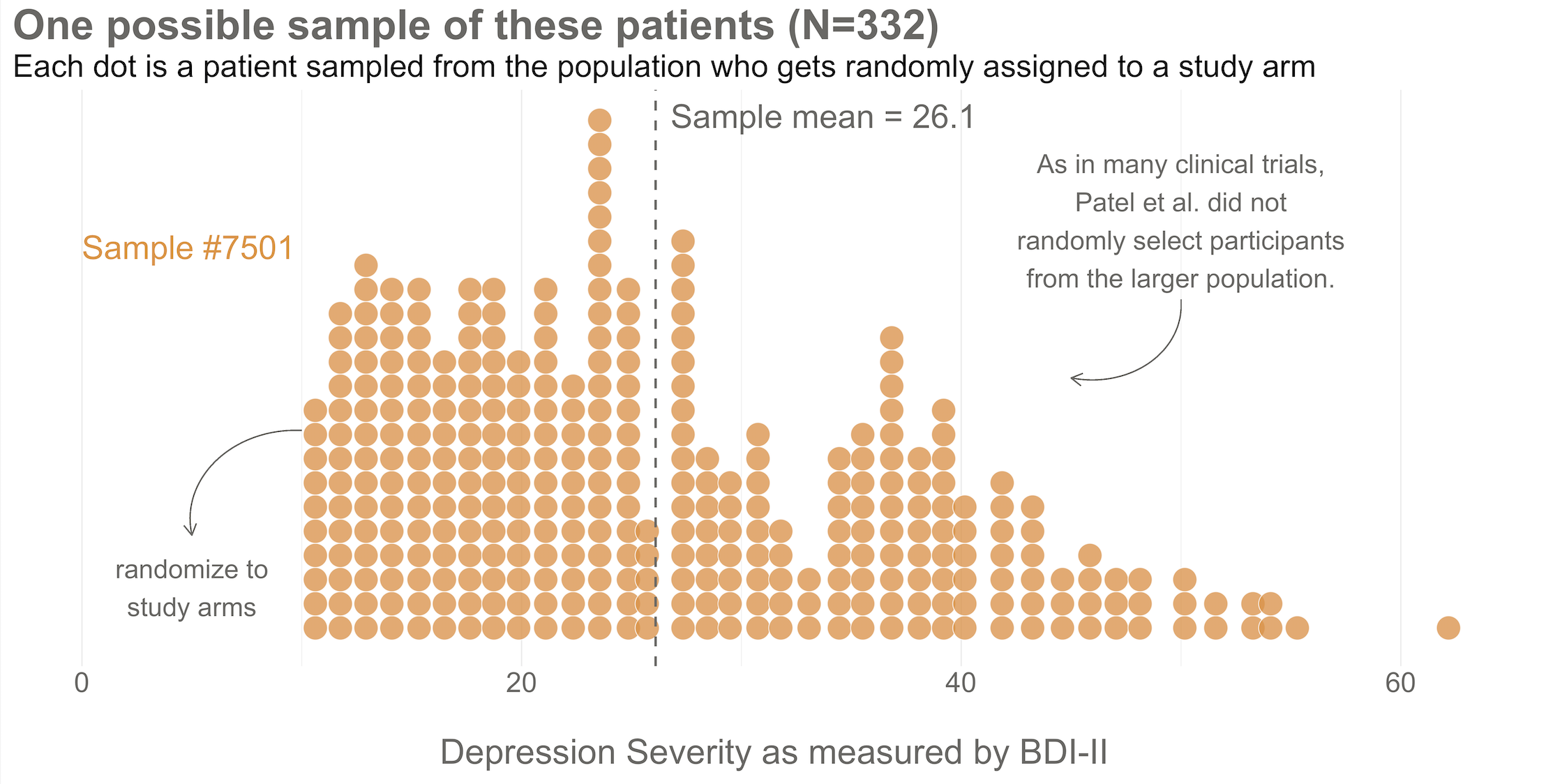
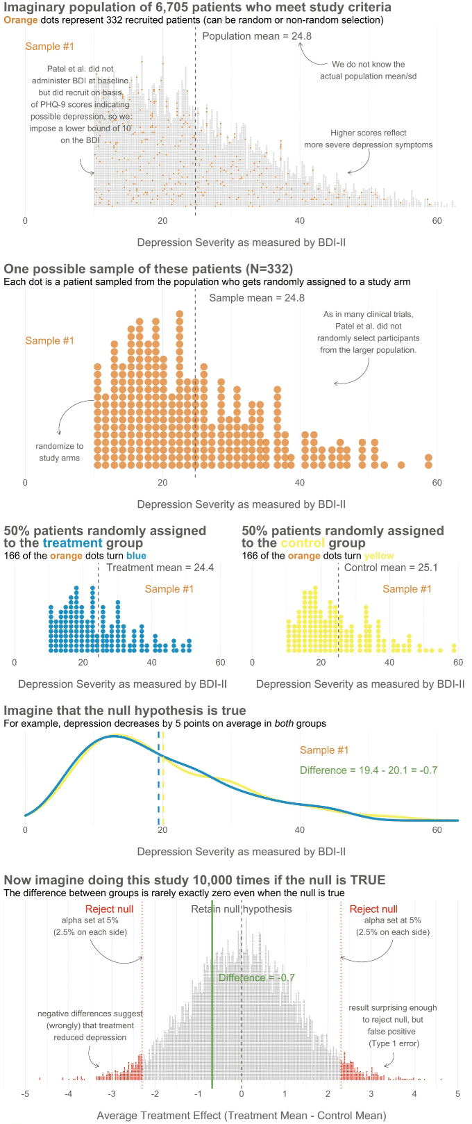
To kick things off, consider this hypothetical accessible population of 6,705 depressed people who are eligible for the HAP trial (see Figure 6.3). In each of your imagined studies, you’ll recruit a new sample of 332 patients from this population. Let’s assume that the baseline level of depression severity among this population ranges from a score of 10 to 63 on the depression instrument you’re using, the Beck Depression Inventory-II (BDI-II). I say “assume” because you’ll never get to know more than 332 of these 6,705 patients. We know they exist, but we don’t know the true population size or the true average level of depression among this group.
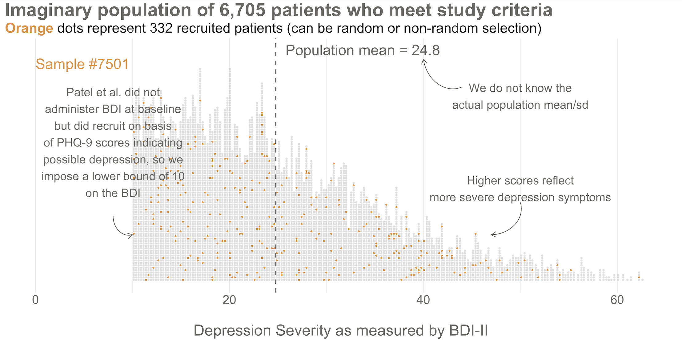
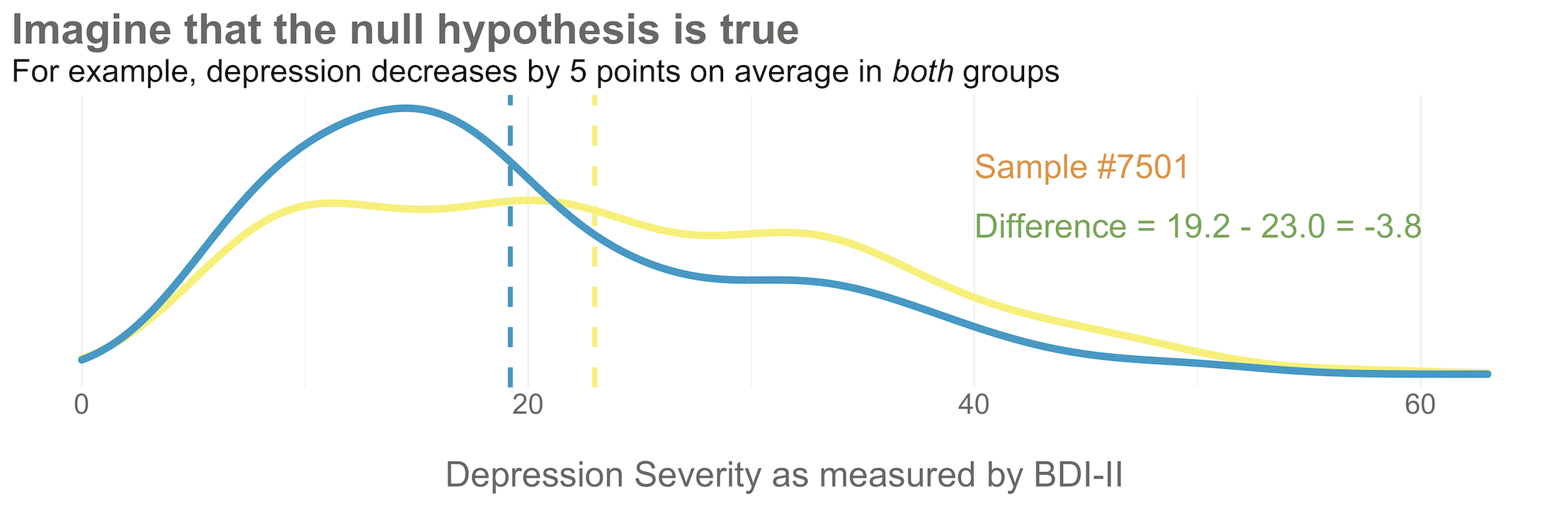
Next, imagine that each orange dot in Figures 6.3 and 6.4 represents 1 of the 332 patients you recruited into the actual study you conducted. You do know each one of these people, you do measure their depression level at baseline, and you do calculate the sample mean. This is the only sample you’ll see as the researcher in real life, but let’s pretend that this sample was #7,501 out of an imaginary set of 10,000 simulated studies.
Your trial design is a randomized controlled trial, so you randomize these 332 people to the treatment group (HAP plus enhanced usual care) or the control group (enhanced usual care only). As shown in Figure 6.5, you allocate 1:1, meaning that 50% (166) patients end up in the treatment arm, and 50% in the control arm.
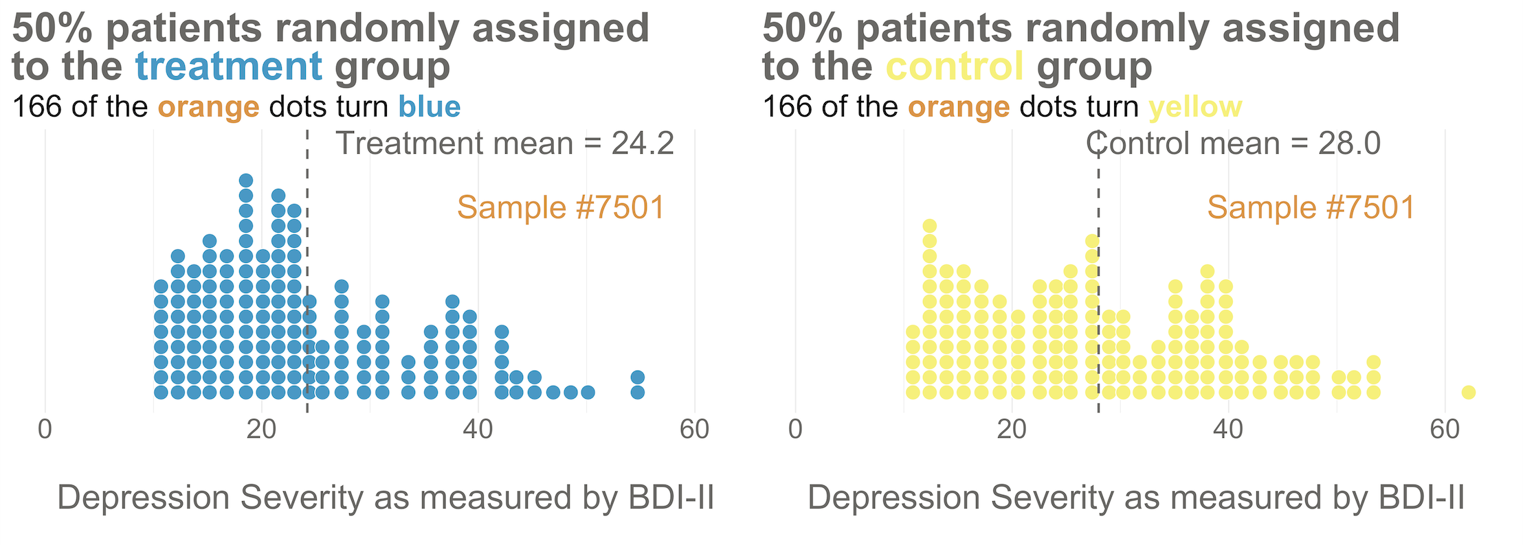
Now I’d like you to imagine that your intervention is NOT superior to enhanced usual care alone (and vice versa). A few months after the treatment arm completes the program, you reassess everyone in the study and find that the average depression score in both groups decreases by 5 points (see Figure 6.6). Since the baseline mean for the HAP group was 24.2, and the enhanced usual care arm mean was 28.0, the endline means shift down by 5 points to 19.2 and 23.0, respectively. The effect size—in this example the average post-intervention difference between groups—is 19.2 - 23.0 = -3.8. The instrument you’re using to measure this outcome, the BDI-II, ranges from a possible score of 0 to 63. So an absolute difference of 3.8 points is small, but it’s not 0.
Student in the first row raises hand: If the null hypothesis of no difference is actually true, why isn’t every study result exactly zero?
It’s a good question. The reason is this: there’s error in data collection and sampling error that comes from the fact that we only include a small fraction of the population in our study samples. Therefore, we might get a result that is near 0—but not exactly 0—even if the null hypothesis is really true.
Hopefully Figure 6.7 will make this point clear. To help you imagine a world in which H0 is true, I drew 10,000 samples of 332 people from the simulated accessible population of ~6700, randomly assigned each person to a study arm, and calculated the treatment effect for the study if everyone’s depression score reduced by exactly 5 points. This figure plots all 10,000 study results.
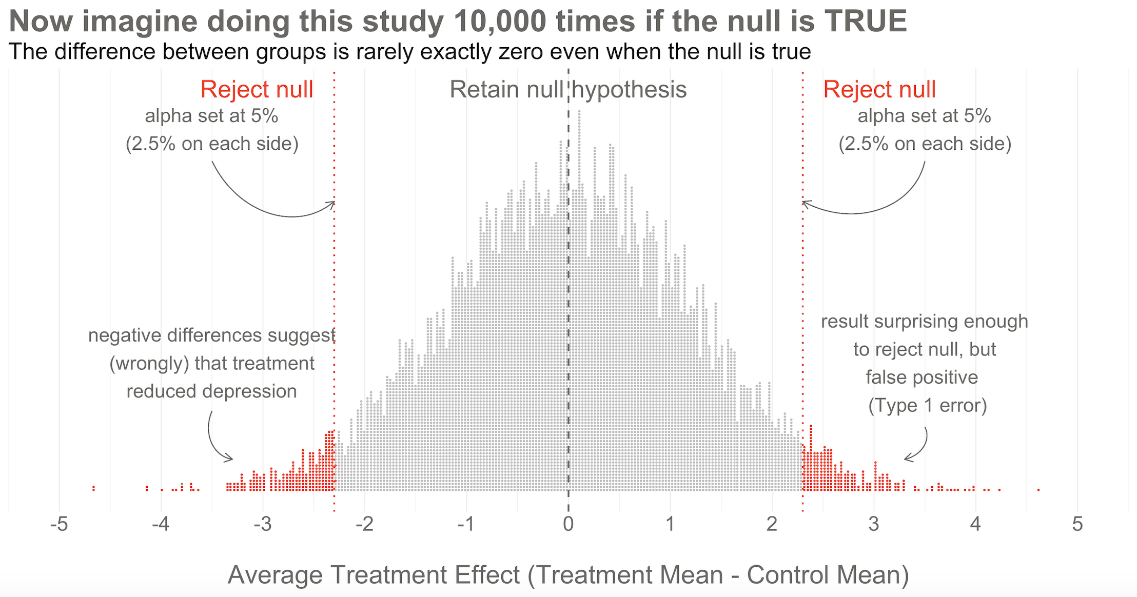
Here’s the key thing to observe: I simulated 10,000 studies where everyone always improved by an equal amount—no treatment effect—but there is NOT just one stack of results piled 10,000 high at exactly zero. Instead, the results form a nice bell shaped curve around 0.
This is the Central Limit Theorem at work. When plotted together, the results of our imaginary study replications form a distribution that approximates a normal distribution as the number of imaginary replications increases. This is fortunate because we know useful things about normal curves. For instance, we can find any study result on the curve and know where it falls in the distribution. Is it in the fat part around 50%? Or is it a rather extreme result far in the tails at 1% or 2%?
To conclude Step 2, let’s think back to the Frequentist definition of probability that relies on having some collective of events. The plot in Figure 6.7 represents this collective. Frequentists can only talk about a particular result being in the 1st or 50th percentile of results if there is a group of results that make up the collective. Without the collective—the denominator—there can be no probability.
Of course in reality, no Frequentist repeats a study over and over 10,000+ times to get the collective. They rely on the central limit theorem to imagine the most plausible set of results that might occur when the null hypothesis is really true. This statistically derived, but imaginary, collective is fundamental to the Frequentist approach.
If you’ve taken a statistics course before, you might be wondering: where’s the smooth bell curve? In most textbooks and software, you don’t see a pile of simulated dots. You see a smooth bell-shaped curve—the null distribution—already drawn for you. Where does that come from if we only ran one study?
The answer: probability theory. Once we assume the null hypothesis is true, the only randomness comes from sampling and random assignment. The Central Limit Theorem tells us that if you repeatedly draw samples and calculate means (or differences in means), those statistics follow predictable shapes—often normal curves. The formulas you learned (standard errors, t-statistics) encode the width and shape of that curve mathematically.
So software like R or Stata doesn’t need to rerun your study thousands of times. It applies these probability results directly, using your sample size and variability, to generate the null distribution analytically. The smooth curve isn’t “made up”—it’s the mathematical object that represents the infinite set of possible study results under the null hypothesis.
The simulation I showed you and the theory-based curve you see in textbooks are two routes to the same destination. Simulation helps build intuition; theory provides computational shortcuts. If you’re like me, watching the bell-shaped pile of dots emerge from simulation makes the abstract formulas feel more real.
Step 3: Set some goal posts
Skeptical student: OK, I get that a study result does not have to be exactly zero for the null to be true. But how different from zero must a result be for Frequentists to reject the null hypothesis that the treatment had no effect?
In the Frequentist approach, you decide if the data are extreme relative to what is plausible under the null by setting some goal posts before you conduct the study. If the result crosses the threshold, it’s automatically deemed “statistically significant” and the null hypothesis is rejected. If it falls short, the null hypothesis of no difference is retained. This threshold is known as the alpha level. For Frequentists, alpha represents how willing they are to be wrong in the long run when it comes to rejecting the null hypothesis. Traditionally, scientists set alpha to be no greater than 5%.
Lakens et al. (2018) argue that “the optimal alpha level will sometimes be lower and sometimes be higher than the current convention of .05”, which they describe as arbitrary. They want you to think before you experiment—and to justify your alpha.
Returning to our simulated results in Figure 6.7, you can see that I drew the goal posts as dotted red lines. They are positioned so that 5% of the distribution of study results falls outside of the lines, 2.5% in each tail. This is a two-tailed test, meaning that we’d look for a result in either direction—treatment group gets better (left, negative difference) OR worse (right, positive difference).
Patel et al. (2017) used a two-tailed test, which was appropriate because it was possible the treatment could have made people more depressed. I’m showing a one-tailed test below because it simplifies the learning.
You can also draw a single goal post that contains the full alpha level (e.g., 5%). I show this in Figure 6.8. This is appropriate when you have a directional alternative hypothesis, such as the treatment mean minus the control mean will be negative. In the HAP example, this would indicate that the treatment group ended the trial with a lower level of depression severity.
Step 4: Make a decision about the null
With the goal posts set, the decision is automatic. Your actual study result either falls inside or outside the goal posts, and you must either retain or reject the null hypothesis. I’ll say it again: statistical inference happens on the null.
I simulated 10,000 studies where there was no effect so we could visualize plausible results when the null is true, but in practice we just conduct one study and rely on the central limit theorem to tell us the probability of observing different results if the null hypothesis is true.
Going back to our example, imagine that you actually conducted study #7,501 of 10,000. When you collected endline data, you found a mean difference between the two arms of -3.8 as shown in Figure 6.8. What’s your decision with respect to the null? Do you retain or reject?
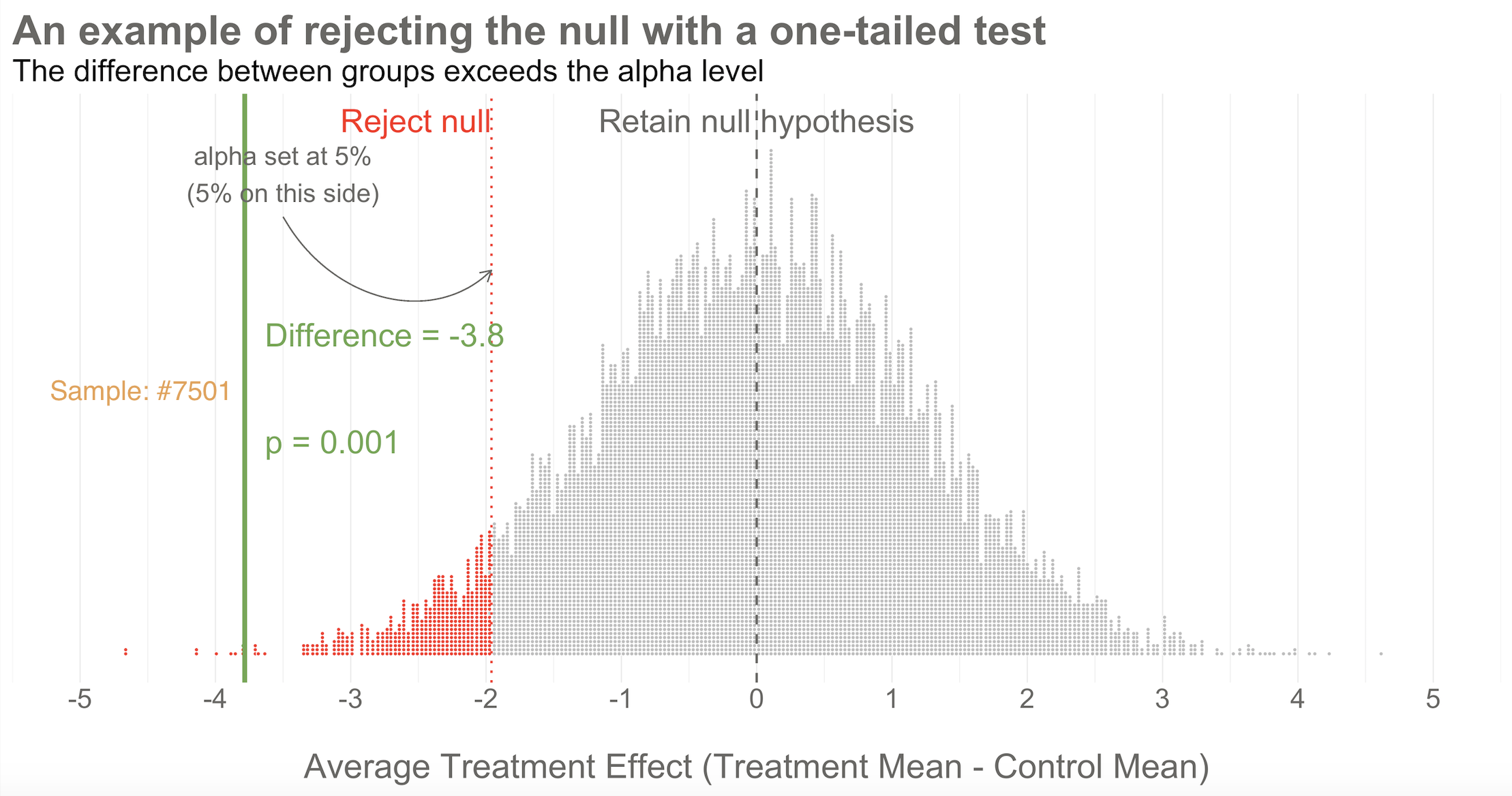
Reject! A difference of -3.8 falls outside of the alpha level you set at 5%. Therefore, you automatically reject the null hypothesis and label the result “statistically significant”.
But there’s something else we know about this result, the raw effect size of -3.8: it falls at the 1st percentile of our simulated collective. It’s an extreme result relative to what we expected if the null is true. We’d say it has a p-value of 1%. The p-value is a conditional probability. It’s the probability of observing a result as big or bigger than our study result (-3.8)—and here’s the conditional part—IF THE NULL HYPOTHESIS IS TRUE.
Smart student mutters to self while taking notes: Why does he keep saying “if the null hypothesis is true” like some lawyer who loves fine print?
I heard that! And good thing, because it’s important to say this again: when it comes to inference, we never know the “truth”. We do not know if the null hypothesis is actually true or false. That’s why the p-value is a conditional probability. A p-value is the probability of observing the data if the null hypothesis is true P(D|H), NOT the probability that the null hypothesis is true given the data P(H|D).
Let that sink in. The p-value might not mean what you want it to mean.
Furthermore, since we can’t know the truth about the null hypothesis, it’s possible that we make the wrong decision when we reject or retain it.
Type I and Type II errors are the primary threats to statistical conclusion validity. Every design choice—your alpha level, sample size, measurement precision—affects the probability of making these errors. The methods we’ll discuss in this chapter are all attempts to control these threats.
If the null hypothesis is really true—and that’s what I simulated—we made a mistake by rejecting the null. We called the result statistically significant, but this is a false positive. Statisticians refer to this mistake as a Type I error, though I think the term false positive is more intuitive since we’re falsely claiming that our treatment had an effect when it did not.
The good news is that in the long run we will only make this mistake 5% of the time if we stick to the Frequentist approach. The bad news is that we have no way of knowing if THIS EXPERIMENT is one of the times we got it wrong.
The other type of mistake we can make is called a Type II error—a false negative. We make this mistake when the treatment really does have an effect, but we fail to reject the null. We’ll talk more about false negatives—and power—in ?sec-power-sample-size.
Why simulate?
Why did I bother simulating 10,000 studies instead of just showing you the formulas? Because simulation makes the abstract concrete. When you watch studies pile up into a bell curve, the Central Limit Theorem stops being a theorem and starts being something you can see. When you watch 20 studies flash by and only 1 rejects the null, the “5% false positive rate” stops being a number and starts being a gut feeling.
Figure 6.9 flips through 20 of the 10,000 studies I simulated—all with no true treatment effect. Watch for study #7,501. It’s the only one in this set that crosses the goal post and rejects the null. In a world where the treatment doesn’t work, this study would lead us to falsely conclude that it does. That’s a Type I error happening in real time.
WHAT DID THE HAP TRIAL FIND?
Again for reference, the BDI-II sum score can range from 0 to 63.
After adjusting for the study site (PHC) and participants’ depression scores at baseline (measured via a different instrument, PHQ-9), Patel et al. (2017) found that HAP reduced depression severity by an average of 7.57 points (95% confidence interval -10.27 to -4.86). Look back to Figure 6.8 and you’ll see that a difference of this size is off the chart. You would not expect to find an effect size this big if the null hypothesis of no difference was true.
The 95% confidence interval excludes the null effect of 0, so we know the p-value will be less than 5%. And it was! Patel et al. (2017) reported a p-value of < 0.0001. If the null hypothesis is true—meaning that there really was no treatment effect—you would expect to get a difference of 7.5 (or more) less than 0.01% of the time.
CAVEATS AND CONSIDERATIONS
Keep these in mind when you review manuscripts or write up your own Frequentist analysis.
Statistical significance does not imply practical or clinical significance
Lakens (2017) frames p-values as a reflection of “how surprising the data is, assuming that there is no effect”.
To say that a result is “statistically significant” tells the world only that the result was sufficiently surprising to reject the null hypothesis (based on your definition of surprising—alpha—and what data you could expect to see if the null hypothesis is true). Statistical significance does not imply any type of practical or clinical significance. It does not mean that your finding is “significant” in the colloquial sense of “meaningful” or “important”.
And no, you don’t get to peek at your data, see 0.052, and collect more data without paying the statistical price. When you take interim peeks at the data you have to move the goal posts outward. Rather than an alpha of 0.05, you might have to raise the bar to 0.01, for instance. There is no free lunch.
In fact, you could get a statistically significant, but practically meaningless result just by collecting more data. For reasons that will become clear in ?sec-power-sample-size, simply increasing the sample size will shrink the p-value. With enough resources, you could conduct a study that finds a new medication “significantly” reduces average systolic blood pressure (the top number) from 120 to 119, p < 0.05. Will a doctor start prescribing this new medication because there was enough data to statistically distingiush an effect size of 1 from 0? No, probably not. Whether reducing systolic blood pressure by 1 point on average is clinically or practically significant is completely separate from whether you have enough data to say that the effect is not zero. This is why you should always report effect sizes, not just p-values.
No, your p-value is not “trending toward significance”
If you review a manuscript where an author decribes a p=0.052 as “trending toward significance”, you are required by law to inform them that, by their logic, it is also trending away from significance.
In the Neyman-Pearson approach, results are either above the alpha level you set or below it, statistically significant or non-significant. You may not modify the word “significant” with language like “trending” or “marginally” or “approaching”. If you set alpha to 0.05 so your long term error rate is 5%, a p=0.052 for a particular study is non-significant. p-values are not a measure of the strength of your evidence (Dienes, 2008).
A non-significant finding does not equal “no effect”
If you want to establish that there is no effect—to be on #teamPreciseNull—then check out equivalence testing. Lakens (2017) has a nice primer.
A common mistake is to infer from a p-value of 0.052 that there is “no effect” or “no difference”. All you can take away from a p-value greater than your alpha threshold is that the result is not sufficiently surprising if the null hypothesis is true. It’s possible that the effect is small—too small for you to detect with a small sample size. Scroll to the beginning of this chapter to see an example of this mistake in print.
A p-value is not the probability that the null hypothesis is true
A p-value of 0.03 does not mean there’s a 3% chance of no effect. It means there’s a 3% chance of seeing data this extreme if the null were true—a very different statement. People often want to know P(H|D), the probability of the hypothesis given the data, but the p-value gives you P(D|H), the probability of the data given the hypothesis. This distinction trips up even experienced researchers.
A p-value does not tell you the result is “due to chance”
You’ll sometimes hear people say a non-significant result means the finding is “due to chance.” This phrasing is meaningless. The result either reflects a real effect or it doesn’t; probability doesn’t apply to events that already happened. What you can say is that the result is not sufficiently surprising under the null hypothesis to reject it.
A p-value does not tell you whether the result will replicate
A p = 0.04 result has a disturbingly high probability of failing to replicate, especially if the original study was underpowered. The p-value from a single study tells you little about what you’d find if you ran the study again. Replication requires considering effect sizes, sample sizes, and the broader literature.
A p-value does not tell you whether to believe the finding
Whether you should believe or publish a finding requires considering effect size, prior plausibility, study quality, and replication—none of which the p-value captures. A p < 0.05 result from a poorly designed study testing an implausible hypothesis deserves skepticism, while a p = 0.08 result from a well-designed study testing a plausible hypothesis might warrant serious attention.
A “5% false positive rate” doesn’t mean what you think
Here’s a subtlety that trips up even experienced researchers: controlling the Type I error rate at 5% does not mean that 5% of significant findings are false positives. The actual proportion of false positives among published “significant” results—called the positive predictive value (or rather, its complement, the false discovery rate)—depends on three things: your alpha level, your statistical power, and the proportion of hypotheses you test that are actually true.
Let’s make this concrete. Imagine 200 research teams each test a different hypothesis, all using α = 0.05 and studies powered at 80%. If half the hypotheses are actually true (100 true, 100 false):
- Of the 100 true hypotheses: 80 will correctly yield p < 0.05 (true positives)
- Of the 100 false hypotheses: 5 will incorrectly yield p < 0.05 (false positives)
- Total “significant” findings: 85
- False discovery rate: 5/85 = 6%—not bad!
But now imagine a field where researchers chase long-shot ideas and only 10% of hypotheses are true (20 true, 180 false):
- Of the 20 true hypotheses: 16 will correctly yield p < 0.05
- Of the 180 false hypotheses: 9 will incorrectly yield p < 0.05
- Total “significant” findings: 25
- False discovery rate: 9/25 = 36%—more than a third are wrong!
The lesson: Type I error control at the individual study level doesn’t guarantee a trustworthy literature. When underpowered studies test unlikely hypotheses and only significant results get published, the literature fills with false positives. This is why some have called for more stringent alpha levels, larger samples, and mandatory replication—not because α = 0.05 is “wrong,” but because it’s not enough on its own.
CRITICISMS
The Frequentist approach dominates the literature, but it’s not without its critics. Lots of critics, in fact. More than 800 scientists signed on to a proposal to abandon statistical significance (Amrhein et al., 2019), and some journals have banned reporting p-values. Other researchers have proposed keeping significance testing, but redefining statistical significance to a higher bar, from an alpha of 0.05 to 0.005 (Benjamin et al., 2018). The misuse and misunderstanding of p-values and statistical significance is so widespread that the American Statistical Association issued a statement reminding scientists of what a p-value does and does not tell us (Wasserstein et al., 2016).
Frustration with null-hypothesis significance testing, or NHST, is not new. People like Paul Meehl have been warning us for decades (Meehl, 1967, 1990). But in recent years, this frustration reached a boiling point when researchers began systematically trying to replicate published findings—and discovered that many of them couldn’t be reproduced. This replication crisis shook the foundations of several scientific fields and forced a reckoning with how p-values and significance testing were being used in practice.
We’ll explore the replication crisis in depth in ?sec-openscience, including how a 2011 paper claiming to prove ESP—yes, extrasensory perception—using standard statistical methods became a wake-up call for science.
The problem wasn’t p-values per se. It was a constellation of questionable research practices (QRPs) that had become normalized—practices that inflate false positive rates even when researchers have no conscious intent to deceive (John et al., 2012). Some have estimated that these practices could make most research findings false (Ioannidis, 2005).
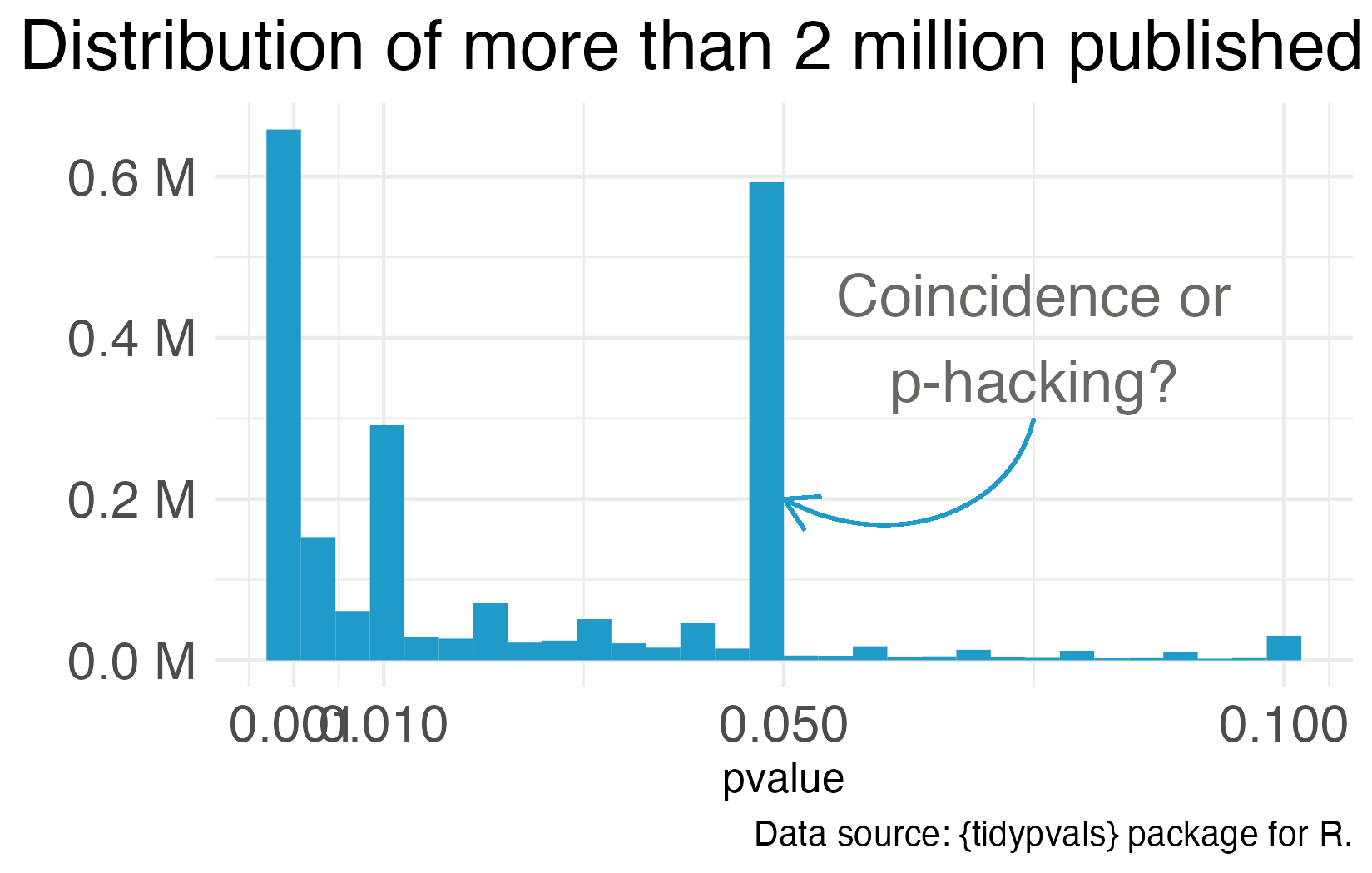
One notorious QRP goes hand in hand with NHST: p-hacking. You see Reader, data analysis is a garden of forking paths. Even simple analyses require the analyst to make lots of decisions. There are many pathways one can take to get from question to answer. p-hacking is going down one path, finding a p-value of 0.052, and turning around to go down another path that leads to 0.049. It’s true that an analyst of any stripe can engage in a multitude of QRPs, but p-hacking is uniquely Frequentist.
Of course, it’s not the p-value’s fault that it’s often misunderstood and abused. Even the “abandon statistical significance” camp recognizes its value for some tasks. Their main criticism is that the conventional use of p-values encourages us to think dichotomously—there either is an effect or there is not—and this is bad for science. Non-significant doesn’t mean “no effect”, but that’s often the conclusion when p = 0.052 (just scroll to the top of the chapter for an example).
Furthermore, when publication decisions are made on the basis of p < 0.05, we distort the literature and encourage QRPs. And when we encourage QRPs—particularly when our sample sizes are small and we look for small effect sizes—we end up with a crisis. We publish a lot of noise that fails to replicate. In ?sec-openscience, we’ll examine what went wrong and the open science reforms designed to fix it. For now, let’s consider some alternatives to p-values and NHST.
EFFECT SIZES AND CONFIDENCE INTERVALS
One way to avoid dichotomous thinking is to focus on estimating effects rather than testing null hypotheses (Calin-Jageman et al., 2019). Instead of asking “Is there an effect?” ask “How big is the effect, and how uncertain are we about it?”
Figure 6.11 illustrates this shift using the HAP trial results. Panel A shows the NHST framing: Is the difference statistically significant? (Yes.) Panel B adds context by showing individual data points—reminding us that many people in the treatment group remained at high levels of depression severity even though the group improved on average. Panel C focuses on estimation: the point estimate (-7.6) and the 95% confidence interval.
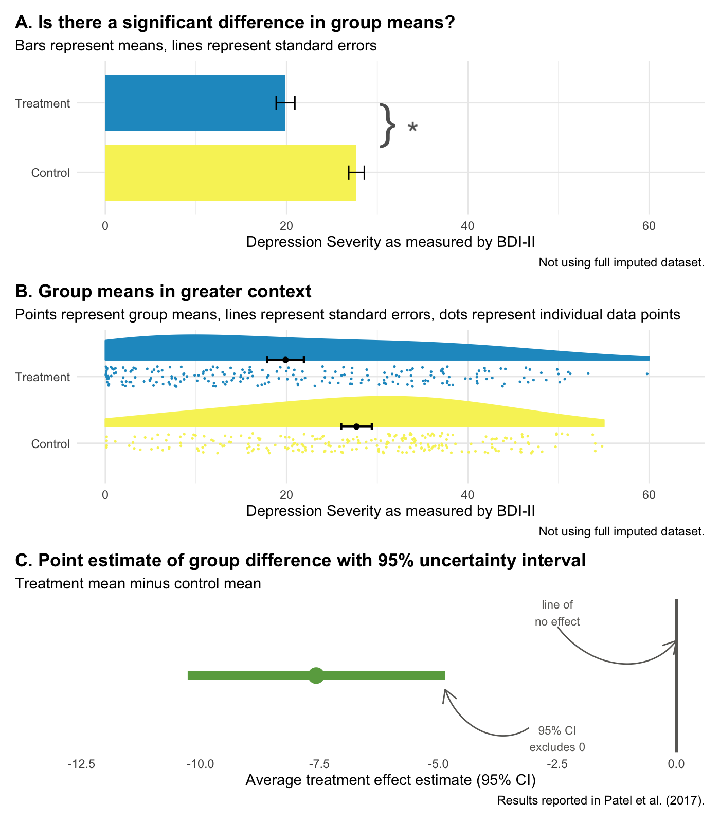
Confidence intervals give us the same information as a p-value, plus more:
- The interval excludes 0, so we know p < 0.05.
- Our best estimate of the treatment effect is -7.6, but the data are consistent with effects ranging from -10.3 to -4.9.
- We can rule out effects larger than -10.3 and smaller than -4.9.
And let’s face it, your eye looks to see if the interval excludes zero. How quickly we fall back into dichotomous thinking.
But confidence intervals are still Frequentist. A 95% confidence interval means that if you repeated your study many times and calculated an interval each time, 95% of those intervals would contain the true value. It does not mean there’s a 95% probability that the true value is in this specific interval. That’s a subtle but important distinction.
Bottom line: Reporting effect sizes and confidence intervals is better practice than reporting p-values alone. But Frequentist confidence intervals still don’t tell you the probability that your hypothesis is correct. For that, we need the Bayesian approach.
6.3 Bayesian Approach
Imagine it’s early in the pandemic. COVID is still rare in your community—maybe 1 in 100 people are infected. You take a rapid test and it comes back positive. The test is accurate about 95% of the time. What’s the chance you actually have COVID?
Most people say 95%. But that’s not quite right.
This counterintuitive result is sometimes called the “base rate paradox” or the “false positive paradox.”
When the disease is rare, most positive tests are actually false positives. Think about it: if you test 1,000 people and only 10 are truly infected, even a highly accurate test will flag some of the 990 healthy people by mistake. In this scenario, your actual chance of being infected might be closer to 15–20%, not 95%.
Now imagine a month later. The virus is surging—1 in 10 people are infected. Same test, same positive result. Now your chance of actually being infected jumps to around 70%.
What changed? Not the test. Not your result. Just what was true before you took the test—the prior probability. When COVID was rare, a positive result was likely to be wrong. When COVID was common, the same positive result was likely to be right.
This is Bayesian reasoning in a nutshell: your conclusion depends on what you believed before you saw the evidence.
FROM DIAGNOSIS TO DATA ANALYSIS
The COVID example involves a yes/no question: Am I infected? But the same logic applies when we analyze data from a clinical trial. Instead of asking “Do I have COVID?”, we’re asking “What is the treatment effect?” Instead of a test result, we have trial data. And instead of disease prevalence, our prior belief is about what effect sizes are plausible before we see the data.
Where do prior beliefs come from? Previous studies, clinical expertise, biological plausibility. If a new drug claims to cure cancer with 99% effectiveness, you’d be skeptical—that prior belief would require extraordinary evidence to overturn.
In the Frequentist approach we covered earlier, there’s no formal role for prior beliefs. You collect data, calculate a p-value, and ask: “How surprising would these data be if the null hypothesis were true?” Your prior knowledge might inform your study design, but it doesn’t enter the statistical analysis itself.
The Bayesian approach is different. It explicitly combines three things:
Prior: What you believed about the treatment effect before collecting data. This might be a broad, open-minded prior (“effects between -20 and +20 are all plausible”) or a more skeptical one (“large effects are unlikely based on previous research”).
Likelihood: How well different effect sizes explain the data you actually observed. This is similar to what Frequentist methods calculate—it’s the information in your data.
Posterior: Your updated belief after seeing the data. The posterior combines your prior belief with the evidence, weighted by how informative each is.
The key insight is that the same data can lead to different conclusions depending on your prior. If you start skeptical and see modest evidence, you might remain unconvinced. If you start open-minded, the same evidence might shift your beliefs substantially. This isn’t a bug—it’s a feature. It formalizes something we do naturally: extraordinary claims require extraordinary evidence.
BAYESIAN RE-ANALYSIS OF THE HAP TRIAL
Let’s return to the HAP trial to see what this looks like in practice. To run a Bayesian analysis, we first need to specify a prior—what we believe about the treatment effect before seeing the trial data.
For HAP, I used a weakly informative prior: a normal distribution centered at zero with a standard deviation of 10. What does this mean in plain terms? It says: “Before seeing the data, I think the most likely effect is zero (no difference between groups), but I’m open to effects anywhere from about -20 to +20 on the BDI-II scale. Effects larger than that are almost impossible.”
Why center the prior at zero? It reflects a skeptical starting point—the intervention might not work. The wide spread ($$20 points) means we’re not strongly skeptical; we’re letting the data do most of the talking.
This is a common choice when you want to be open-minded but not absurd. A prior centered at zero with wide spread lets the data dominate the analysis while ruling out implausible extremes (like a 50-point improvement on a 63-point scale). If we had strong prior evidence from previous trials, we might center the prior elsewhere.
Figure 6.12 compares the Frequentist 95% confidence interval reported by Patel et al. (2017) to the Bayesian 95% credible interval using this prior and the same trial data.
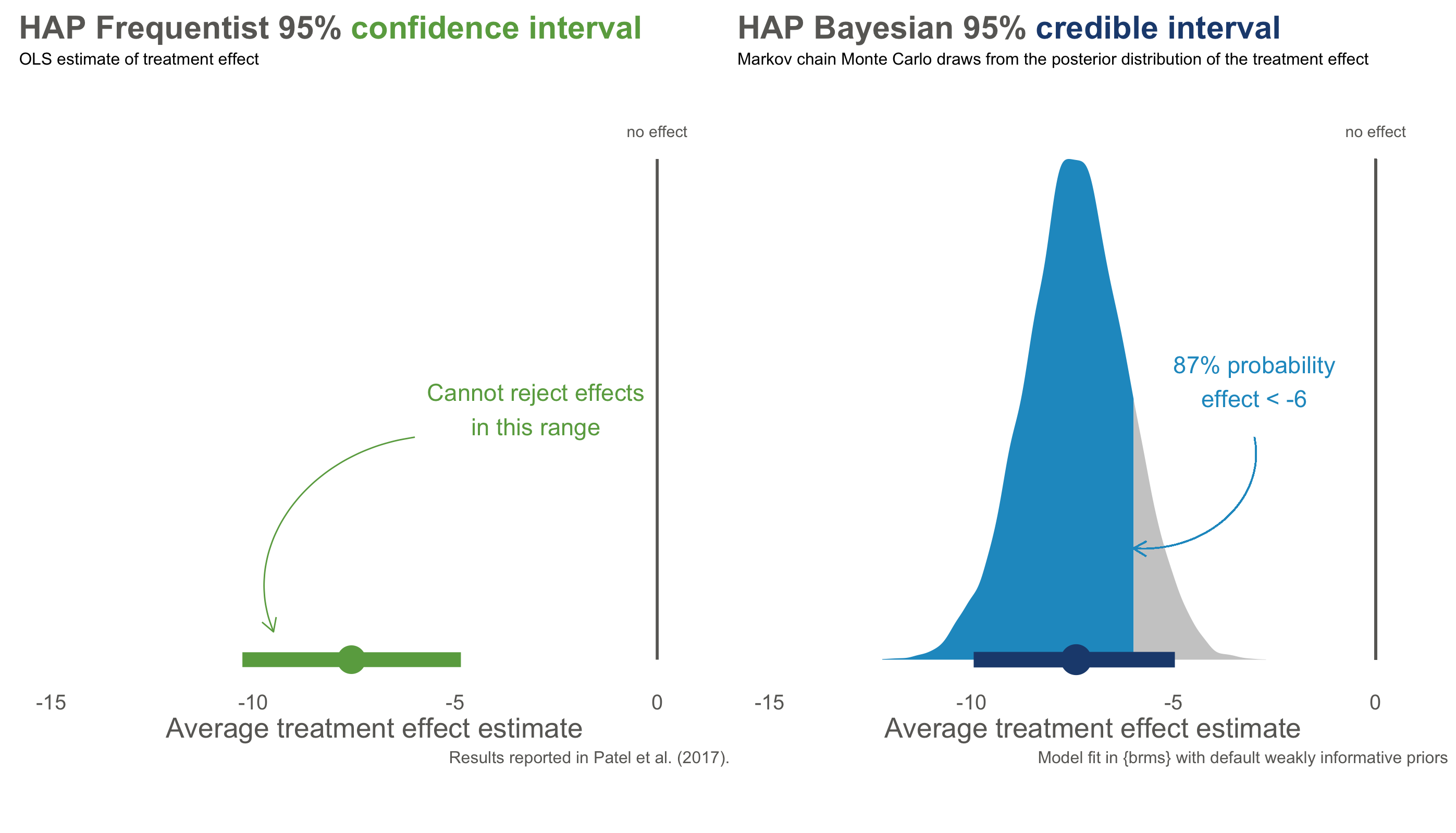
The numbers are nearly identical—both approaches estimate an effect around -7.6 points, with similar ranges of uncertainty. But the interpretation is fundamentally different.
The confidence interval on the left is a Frequentist statement about long-run procedures: “If we repeated this trial many times and calculated intervals each time, 95% of them would contain the true effect.” It says nothing about this specific interval. Maybe the true effect is in there, maybe it isn’t—we can’t assign a probability.
The credible interval on the right is a direct probability statement: “Given the data and our prior beliefs, there is a 95% probability that the true treatment effect falls in this interval.” We can make claims about this specific interval because we’re describing our state of knowledge, not a hypothetical series of experiments.
Bayesians do not typically frame inference in terms of significance testing. Some use Bayes factors to quantify evidence, but I think they risk recreating NHST-style dichotomous thinking.
Even more useful: with a posterior distribution, we can answer questions that Frequentist methods cannot. What’s the probability that the effect is larger than -5 points? About 87%. What’s the probability of any effect at all (less than zero)? Over 99%. These are direct answers to the questions we actually care about.
WHY NOT ALWAYS USE BAYESIAN METHODS?
If Bayesian methods give us what we want—the probability of hypotheses given data—why doesn’t everyone use them?
Partly, it’s historical. Frequentist methods dominated 20th-century statistics and became embedded in training, software, and journal expectations. The computational demands of Bayesian methods were also prohibitive until recently.
But there are also genuine tensions. Critics worry that priors introduce subjectivity—two researchers with different priors could reach different conclusions from the same data. Bayesians counter that Frequentist methods have hidden subjective choices too (Why α = 0.05? Why this particular test?), and that making prior assumptions explicit is more honest than pretending they don’t exist.
In practice, when sample sizes are large and priors are weak, Frequentist and Bayesian answers often converge—as they did in the HAP trial. The differences matter most when data are sparse, priors are strong, or you need to make direct probability statements about hypotheses.
6.4 Closing Reflection
Statistical inference is hard. Don’t be discouraged if these concepts require multiple readings and practice to internalize. Even experienced researchers misinterpret p-values and confidence intervals.
Here’s what I hope you take away:
Report effect sizes, not just p-values. A p-value tells you whether a result is surprising under the null hypothesis—nothing more. It doesn’t tell you the size of an effect, the probability that your hypothesis is true, or whether the finding matters. Always report point estimates and intervals.
Understand what your intervals mean. A 95% confidence interval is a statement about a procedure, not about the specific interval in front of you. A 95% credible interval is a statement about that specific interval—but it depends on your prior. Neither is “right”; they answer different questions.
Be honest about uncertainty. No statistical test proves a hypothesis true or false. The best researchers acknowledge what they don’t know and communicate uncertainty clearly.
Think back to where we started: a vitamin D trial where a 30% reduction in cancer risk was dismissed because p = 0.06. The authors concluded “no effect” when the data were genuinely ambiguous. That’s a threat to statistical conclusion validity—drawing the wrong conclusion from the evidence. But even if we get inference right—even if we correctly conclude the supplement probably reduces cancer risk—we still haven’t answered whether it causes that reduction, or whether the effect would hold in other populations.
Those are questions of internal and external validity, and they’re where we turn next.