
9 Measurement and Construct Validation
Measurement is one of the hardest parts of science and, when done poorly, has implications for the validity of our inferences (Flake et al., 2020; Gelman, 2015). The more you learn about a discipline or an applied problem, the deeper you’ll travel down the measurement rabbit hole. Debates about definitions and data are unavoidable. Even something as seemingly black and white as death is hard to measure completely, consistently, and correctly. Let’s take the COVID-19 pandemic as an example.
Watch this CDC explainer about how to certify deaths due to COVID-19.
In part this is due to limited testing capacity in many settings. It might also stem from deliberate misreporting for political or economic reasons.
There are several challenges to counting the number of deaths from a disease like COVID-19. First, some countries don’t have robust civil registration and vital statistics systems that register all births, deaths, and causes of deaths (Whittaker et al., 2021; World Health Organization, 2021). Many people die without any record of having lived. Second, an unknown number of deaths that should be attributed to COVID-19 are not, which means we can only count “confirmed deaths” (Our World in Data, 2023).
There is also the challenge of defining what counts as a COVID-19 death. Did someone die “with” COVID-19 or “from” COVID-19. All cause of death determinations are judgment calls, and COVID-19 deaths are no different (CDC, 2020). When someone dies in the U.S., for instance, a physician, medical examiner, or coroner completes a death certificate and reports the death to a national registry.1 States are encouraged to use the Standardized Certificate of Death form which asks the certifier to list an immediate cause of death and any underlying causes that contributed to a person’s death.2 COVID-19 is often an underlying cause of death (e.g., COVID-19 \(\rightarrow\) pneumonia), and it’s up to the certifier to make this determination. This is not easy in many cases because COVID-19 can lead to a cascade of health problems in the short and long term (Boyle, 2021).
Given the challenges in counting all COVID-19 deaths, some scholars and policymakers prefer the metric of excess mortality, which represents the number of deaths from any cause that are above and beyond historical mortality trends for the period. Excess mortality counts confirmed COVID-19 deaths, ‘missing’ COVID-19 deaths, and deaths from any other causes that might be higher because of the pandemic. But the quantification of excess mortality has its own challenges. Among them is that excess mortality is estimated with statistical models, so differences in input data and modeling approaches can lead to different estimates (Hay et al., 2023).
My goal here is not to depress you or make you question if we can ever truly measure anything. There is a time and place for a good existential crisis about science, but this chapter is not it (see ?sec-openscience instead). Rather, my goal is to convince you of the importance of thinking hard about measurement and to give you frameworks for doing so. This matters because measurement problems can compromise the validity of your conclusions—no matter how rigorous your study design.
9.1 Construct Validity
At its core, measurement is about assigning numbers to things we observe (Stevens, 1946). But we rarely care about the numbers themselves. We care about what the numbers represent—depression, poverty, health, quality of life. Construct validity is the extent to which your measures actually capture the concepts you intend to study. For some constructs, like height or hemoglobin levels, the connection between concept and measure is relatively direct. For others—abstract concepts like depression or empowerment that we can only infer from observable indicators—establishing construct validity requires more work.
Think about the Healthy Activity Program (HAP) trial introduced in Chapter 6. Patel et al. (2017) conducted a randomized controlled trial in India to test the efficacy of a lay counsellor-delivered psychological treatment for severe depression. To measure depression, they asked participants to respond to statements from a questionnaire called the Beck Depression Inventory (BDI-II), assigned numbers to each response, and calculated a total score. But here’s the thing: the researchers didn’t really care about BDI-II scores. They cared about depression—an unobservable state they could only infer from those questionnaire responses. The BDI-II was their best attempt to quantify a complex condition they couldn’t directly observe. If it doesn’t actually capture depression—if it measures something else, or misses important dimensions of the experience—then even a perfectly executed trial tells us nothing about whether the treatment helps.
The rest of this chapter is about getting measurement right. We start with planning: using conceptual models to identify what to measure, the terminology of measurement, criteria for selecting good indicators, and how composite measures are constructed. Then we turn to validation: how to evaluate whether your measures actually capture the constructs you intend to study.
9.2 Using Conceptual Models to Plan Study Measurement
The first step in planning study measurement is to decide what to measure. I always start this process by creating a conceptual model, such as a DAG or a theory of change. Conceptual models can help you identify what data you must collect or obtain to answer your research question.
DAG EXAMPLE
In Chapter 7, I introduced directed acyclic graphs (DAGs) as tools for mapping causal assumptions. Here I want to show how a DAG doubles as a measurement planning tool: every node tells you something about what data you need to collect.
Consider the HPV vaccination example from Chapter 7. Researchers wanted to estimate the causal effect of HPV vaccination on sexual behavior. Figure 9.1 shows the DAG with the minimum adjustment set highlighted—the smallest group of variables that blocks all confounding paths between the exposure and outcome.
The shaded nodes—health beliefs, parental attitudes, and socio-economic status—are the variables we must measure or obtain data on to close the backdoor paths. We don’t need data on vaccination campaigns or relationship context for our primary analysis, because they don’t create backdoor paths.
The DAG has turned a causal inference problem into a data collection checklist. And that checklist forces hard questions: How will we measure “health beliefs”? Is there a validated instrument for “parental attitudes” in our study population? Can we get reliable SES data? If the answer to any of these is no, we know before we start that our analysis will have gaps—and we can plan accordingly.
Sometimes the DAG sends you back to the drawing board entirely. Barnard-Mayers et al. (2022) drew a DAG to plan a causal analysis of the HPV vaccine’s effect on cervical cytology among girls with perinatal HIV. It helped them identify the confounders they needed—but they realized they lacked good data on sexual history, structural racism, and maternal history. The study was susceptible to confounding they couldn’t fix with the available data.
LOGIC MODEL EXAMPLE
DAGs are powerful for observational studies where confounding is the central concern. But for intervention studies—where you’re testing whether a program or treatment works—a different kind of conceptual model is often more useful for measurement planning: the logic model (sometimes called a theory of change).
A logic model maps the hypothesized causal chain from what you put into a program to what you expect to get out of it. It reads left to right, like a story: resources go in, activities happen, products come out, and if everything works as intended, change follows. The basic structure looks like this:
Inputs \(\rightarrow\) Activities \(\rightarrow\) Outputs \(\rightarrow\) Outcomes \(\rightarrow\) Impacts
The measurement planning payoff is similar to the DAG: each box in the chain represents something you might need to measure. But whereas a DAG tells you what to control for, a logic model tells you what to monitor and evaluate. It answers a different set of questions: Did we spend what we planned to spend? Did we deliver the intervention as designed? Did participants actually receive it? And did the outcomes change?
Logic models and theories of change are close cousins. In practice, a logic model tends to be a more linear, box-and-arrow diagram focused on a specific program. A theory of change is often broader, mapping the assumptions and causal pathways that connect a program to its intended long-term impact. For measurement planning purposes, either works.
Let’s walk through a concrete example. Figure 9.2 displays a plausible logic model for the HAP trial.

Inputs
Inputs are the resources needed to implement a program—the money, staff, materials, and infrastructure you need before you can do anything. Documenting inputs is essential for cost-effectiveness analysis and for anyone who wants to replicate or scale your work. In the HAP trial, inputs included funding and the intervention curriculum (Anand, Arpita and Chowdhary, Neerja and Dimidjian, Sona and Patel, Vikram, 2013). On average, HAP cost $66 per person to deliver.
Activities
Watch Dr. Vikram Patel talk about task sharing to scale up the delivery of mental health services in low-income settings.
Activities are what you actually do with your inputs—the services delivered, trainings conducted, or interventions implemented. In a logic model, activities represent the “action” that’s supposed to produce change. The main HAP activities were psychotherapy for patients and supervision of lay counselors. HAP was designed to be delivered in an individual, face-to-face format (telephone when necessary) over 6 to 8 weekly sessions each lasting 30 to 40 minutes (Chowdhary et al., 2016). Supervision consisted of weekly peer-led group supervision and twice monthly individual supervision.
In intervention studies like this, it’s important to determine if the intervention was delivered as intended. This is called treatment fidelity, and it’s a measure of how closely the actual implementation of a treatment or program reflects the intended design. The study authors measured fidelity in several ways, including external ratings of a randomly selected 10% of all intervention sessions. An expert not involved in the program listened to recorded sessions and compared session content against the HAP manual. They also had counselors document the duration of each session.
Outputs
Outputs are the direct, countable products of your activities—how many sessions delivered, how many people trained, how many materials distributed. Outputs tell you whether you did what you said you would do, but they don’t tell you whether it worked. In the HAP trial, Patel et al. counted the number of sessions delivered to patients in the treatment arm, as well as the number of patients who completed the program (69% had a planned discharge). Presumably they also tracked the number of counselors trained and supervision sessions conducted.3
Outcomes and Impacts
Outcomes are the changes you hope to see as a result of your activities—the “so what” of your work. Unlike outputs, which count what you did, outcomes measure whether it made a difference. The hypothesized outcome in the HAP study was a reduction in depression:
The two primary outcomes were depression severity assessed by the modified Beck Depression Inventory version II (BDI-II) and remission from depression as defined by a PHQ-9 score of less than 10, both assessed 3 months after enrollment.
Impacts are the longer-term changes you believe will result from achieving your outcomes—but they’re often not directly tested in a single study. They unfold over years or decades, making them difficult to measure within a typical research timeframe. The HAP authors assumed that the long-term impact of reducing depression at scale would be improvements in quality of life for patients and their families, increased workforce productivity, and a reduction in costs to society.
FROM CONCEPTUAL MODEL TO STUDY MEASUREMENT
Logic models and DAGs provide a solid foundation for measurement planning. If you or I were designing the HAP study, for instance, the example logic model would tell us that we need to collect or obtain data about the following:
- Expenditures
- Measures of treatment fidelity
- Counts of therapy sessions completed, supervision sessions held
- Measures of depression and several secondary outcomes
Generating this list is the first step. The next step is figuring out the specifics of measurement.
9.3 Measurement Terminology
Before diving into the specifics of measurement, we need a shared vocabulary. Four terms form a conceptual hierarchy, each building on the one before it:
- Construct: The abstract concept you want to study (e.g., depression)
- Outcome: The change in a construct you hope to observe (e.g., reduced depression)
- Indicator: A specific, measurable metric representing that change (e.g., depression severity score)
- Instrument: The tool used to collect the indicator data (e.g., Beck Depression Inventory)
Think of it as moving from the abstract to the concrete. You start with a concept in your head, define what change you’re looking for, identify a measurable proxy for that change, and select or develop a tool to capture it. Table 9.1 summarizes these terms.
| Term | Definition | Example |
|---|---|---|
| Construct | A characteristic, behavior, or phenomenon to be assessed and studied. Often cannot be measured directly (latent). | Depression |
| Outcome (or Endpoint) | The hypothesized result of an intervention, policy, program, or exposure. | Decreased depression severity |
| Indicator | Observable measures of outcomes or other study constructs. | Depression severity score |
| Instrument | The tools used to measure indicators. | A depression scale (questionnaire) made up of questions (items) about symptoms of depression that is used to calculate a severity score |
CONSTRUCTS
Constructs are the high-level characteristics, behaviors, or phenomena you investigate in a study—the answer to the question, “What is your study about?” In the HAP study, the key construct was depression.
Some constructs can be directly observed or measured. These manifest constructs include things like height, weight, age, blood pressure, and distance traveled. But many constructs in the social and behavioral sciences are latent—they exist as abstract concepts with no direct measure. There is not (yet) a blood test that tells you whether someone is depressed. The same is true for empowerment, corruption, democracy, and quality of life. In global health research, we often work with both types, measuring manifest constructs like hemoglobin levels alongside latent constructs like food insecurity.
OUTCOMES AND ENDPOINTS
An outcome is the change in a construct that you hypothesize will result from an intervention, policy, program, or exposure. In the HAP study, the construct was depression; the outcome was a reduction in severe depression. Outcomes take on the language of change: increases and decreases, improvements and declines.
You’ll also see outcomes and endpoints referred to as dependent variables, response variables, \(Y\), or left-hand side variables (referring to an equation).
In the clinical trial literature, outcomes are often called endpoints: death, survival, time to disease onset, blood pressure, tumor shrinkage. Whatever the terminology, most studies focus on one or two primary outcomes linked directly to the main study objective. The HAP trial had two: a reduction in depression severity and a reduction in depression prevalence.
Secondary outcomes may be registered, investigated, and reported as well, but these analyses will often be framed as exploratory in nature if the study design is not ideal for measuring these additional outcomes. Patel et al. (2017) specified several secondary outcomes, including increases in behavioral activation and reductions in disability, total days unable to work, suicidal thoughts or attempts, intimate partner violence, and resource use and costs of illness (Patel et al., 2014).
INDICATORS
The language of qualitative studies is a bit different. These studies emphasize study constructs, but not indicators or measures. Quantification is not typically the goal.
Constructs and outcomes are abstractions. To study them, we need something concrete and observable—an indicator. An indicator is a specific, measurable representation of a construct or outcome. It answers the question: “How will I know it when I see it?”
In the HAP study, the outcome was a reduction in severe depression. But “reduction in depression” is not something you can directly observe. You need an indicator—a specific metric that stands in for the abstract concept. The HAP researchers used two: a depression severity score (a continuous score reflecting symptom intensity) and depression prevalence (a binary indicator of whether someone meets diagnostic criteria). Both are observable, quantifiable proxies for the underlying construct.
In intervention and evaluation research, indicators are often categorized by what they measure:
- Input indicators: Measures of resources needed to implement the program.
- Process indicators: Measures of program implementation (e.g., fidelity).
- Outcome indicators: Measures of the program or study endpoints.
INSTRUMENTS
Once you’ve identified your indicators, you need a way to measure them. Instruments are the tools used to collect indicator data. Instruments can take many forms: surveys, questionnaires, clinical assessments, environmental sensors, anthropometric measures, blood tests, imaging, satellite imagery, and the list goes on.
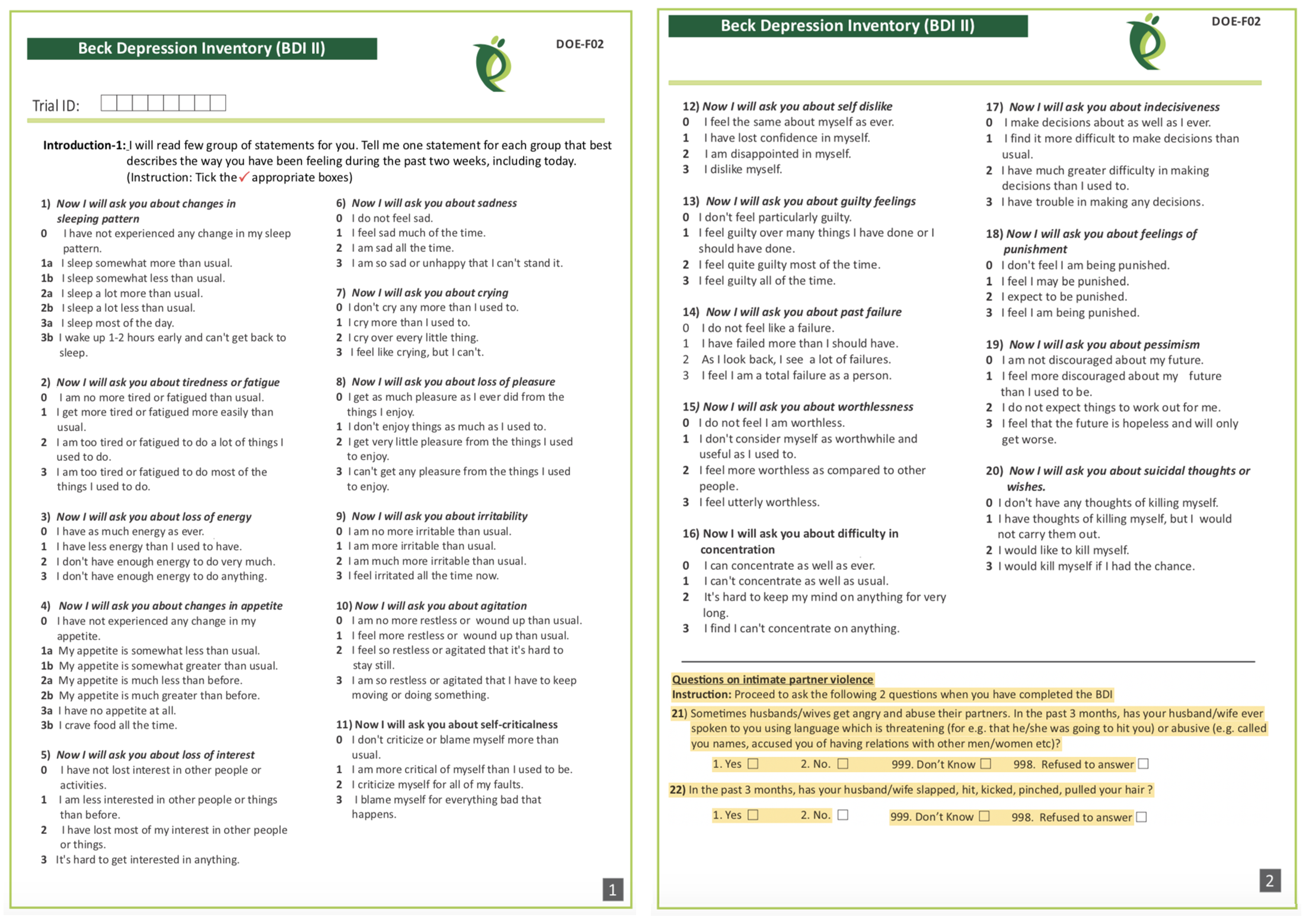
The HAP authors measured depression with two instruments: (i) the 21-item Beck Depression Inventory version II (Beck et al., 1996); and (ii) the 9-item Patient Health Questionnaire-9 (Kroenke et al., 2002). Responses to each BDI-II item (see Figure 9.3) are scored on a scale of 0 to 3 and summed to create an overall depression severity score that can range from 0 to 63, where higher scores indicate more severe depression.
9.4 What Makes a Good Indicator?
When you select and define indicators of outcomes and other key variables, this is called operationalizing your constructs. Operationalization a critical part of measurement planning. When you finish the study and present your findings, one of the first things colleagues will ask is, “How did you define and measure your outcome?” Hopefully you can say that your indicators are DREAMY™.
SMART is another acronym worth knowing. SMART indicators are Specific, Measurable, Achievable, Relevant, and Time-Bound.
| Defined | clearly specified |
| Relevant | related to the construct |
| Expedient | feasible to obtain |
| Accurate | valid measure of construct |
| Measurable | able to be quantified |
| customarY | recognized standard |
DEFINED
A good indicator is clearly specified: what exactly is being measured, how it will be measured, and when. This includes specifying the time frame—are you measuring depression at baseline, 3 months post-intervention, or 12 months? A well-defined indicator enables readers to critically appraise your work and serves as a building block for future replication attempts.
Patel et al. (2017) defined two indicators of depression:
- Depression severity: BDI-II total score measured at 3 months after the treatment arm completed the intervention
- Depression prevalence: the proportion of participants scoring 10 or higher on the PHQ-9 total score measured at 3 months post intervention
Notice that each definition specifies what (BDI-II score, PHQ-9 threshold), how (total score, proportion above cutoff), and when (3 months post-intervention).
RELEVANT
An indicator should measure what you actually care about—not something adjacent to it. This seems obvious, but relevance can be subtle. An indicator might be easy to measure, widely used, or available in existing datasets, yet still miss the construct you’re trying to capture. The question to ask is: if this indicator changed, would it mean the thing I care about actually changed?
In the HAP study, scores on the BDI-II and PHQ-9 are clearly relevant to depression—they were designed to capture depressive symptoms. An example of an irrelevant indicator would be the Beck Anxiety Inventory. While anxiety and depression are often comorbid, anxiety is a distinct construct. Showing that an intervention reduces anxiety wouldn’t tell you whether it reduces depression.
EXPEDIENT
An indicator must be feasible to collect given your resources, setting, and timeline. The best indicator in the world is useless if you can’t actually obtain the data. This means considering cost, participant burden, staff training requirements, and logistical constraints.
In the HAP study, asking participants to complete a 21-item questionnaire (BDI-II) and a 9-item questionnaire (PHQ-9) was feasible—it didn’t require specialized equipment or place undue burden on participants. In contrast, collecting biological samples (hair, saliva, blood) for cortisol analysis might provide useful information about stress but could be impractical in some settings due to cold chain requirements, laboratory access, or participant reluctance.
ACCURATE
Accurate is another word for valid: does the indicator actually measure what it claims to measure? This is such an important topic that I devote the next major section of this chapter to it. For now, the key point is that accuracy isn’t assumed—it must be established, ideally in the same population you’re studying.
When selecting indicators and instruments, the HAP authors had to ask themselves whether scores on the BDI-II and PHQ-9 actually distinguish between depressed and non-depressed people in their target population of primary care patients in rural India. They cited their own previous validation work to support this decision (Patel et al., 2008).
MEASUREABLE
An indicator must be quantifiable—you need to be able to assign a number to it. For some constructs this is straightforward: height, weight, blood pressure, test scores. For others, measurement requires creativity.
Psychological constructs like depression are typically measured using questionnaires that translate subjective experiences into numerical scores. But what about constructs that people won’t self-report honestly? Olken (2005) faced this challenge when trying to measure government corruption in Indonesia. Asking officials to report their own corrupt behavior wasn’t going to work. Instead, the researchers dug core samples of newly built roads to estimate true construction costs, then compared these estimates to the government’s reported expenditures. The difference became their indicator of corruption.
CUSTOMARY
Sometimes the status quo stinks and you’ll want to conduct a study to overcome the limitations of the standard methods. More often, you’ll want to follow the crowd.
In general, it’s good advice to use standard indicators, follow existing approaches, and adopt instruments that have already been established in a research field. There are several ways to do this.
One way is to read the literature and find articles that measure your target constructs. For example, if you’re planning an impact evaluation of a microfinance program on poverty reduction and wish to publish the results in an economics journal, start by reading highly cited work by other economists to understand current best practices. How do these scholars define and measure outcomes like income, consumption, and wealth?
Systematic reviews and methods papers are also good resources for learning about measurement. For instance, Karyotaki et al. (2022) critically appraised several task sharing mental health interventions, including HAP. Their review is a resource for for understanding how depression is operationalized and measured across studies.
A third approach is to search for nationally or internationally recognized standards. If studying population health, for instance, a good source of customary indicators is the World Health Organization’s Global Reference List of the 100 core health indicators (WHO, 2018). Another good source of customary indicators for population health is the United Nations Sustainable Development Goals (SDG) metadata repository, which includes 231 unique indicators to measure 169 targets for 17 goals (United Nations, 2023).
9.5 Constructing Indicators
Some indicators are straightforward: a hemoglobin level below 7.0 g/dl indicates severe anemia. The number from the lab is the indicator—you just need a clear definition and a reliable instrument. Other indicators require construction—combining multiple pieces of data—and the complexity of that construction varies.
NUMERATORS AND DENOMINATORS
Population-level global health indicators often involve numerators and denominators. For instance, the WHO defines the maternal mortality ratio as (World Health Organization):
the number of maternal deaths during a given time period per 100,000 live births during the same time period
Constructing this indicator requires data on the counts of maternal deaths and live births. Each has a precise definition:
Maternal deaths: The annual number of female deaths from any cause related to or aggravated by pregnancy or its management (excluding accidental or incidental causes) during pregnancy and childbirth or within 42 days of termination of pregnancy, irrespective of the duration and site of the pregnancy.
Live births: The complete expulsion or extraction from its mother of a product of conception, irrespective of the duration of the pregnancy, which, after such separation, breathes or shows any other evidence of life such as beating of the heart, pulsation of the umbilical cord, or definite movement of voluntary muscles, whether or not the umbilical cord has been cut or the placenta is attached.
COMPOSITE INDICATORS
Many indicators combine multiple pieces of information into a single measure. These composite indicators fall into two broad categories: (i) rule-based composites and (ii) summative or model-based composites.
Rule-based composites use logical rules to combine responses. A series of questions feeds into a decision tree—if this AND that, then yes. The rules are defined in advance based on substantive knowledge, and the result is typically a categorical indicator.
Summative or model-based composites—indexes and scales—combine items by aggregating responses into a score. The simplest approach is to add up the responses (equal weighting). More sophisticated approaches weight items differently based on their relationship to the construct. Either way, you’re turning multiple pieces of information into a single number. Indexes and scales differ in the relationship between items and constructs, which I’ll explain below.
Rule-Based Composites
Consider a common indicator in malaria research: Does the household have any factory-treated mosquito nets or nets that have been dipped in a liquid to kill or repel mosquitos in the past 12 months? You can’t just ask this question directly—it’s too long, too compound, and respondents may not know whether their net was factory-treated. Instead, you break it into simpler questions and combine the answers:
- Does your household have any mosquito nets?
- If yes: How many months ago did your household get the net?
- If 12 months or fewer: Was the net factory-treated with insecticide? (Often determined by observation or brand)
- If no: Was it ever soaked or dipped in insecticide?
- If yes: How many months ago?
These questions combine through logical rules: A household has a valid ITN if they have a net AND it was either factory-treated OR dipped within the past 12 months. The final indicator—a single yes/no variable—is constructed from multiple survey items using predetermined logic.
Rule-based composites are common in global health. Other examples include vaccination status (combining records of multiple doses) and eligibility criteria for program enrollment.
Summative or Model-Based Composites
Indexes and scales combine multiple items into a single score. The key difference between them lies in the relationship between items and constructs. In an index, the items collectively define the construct—add or remove an item and the construct itself changes. In a scale, the items reflect an underlying construct that exists independently of any single item. Figure 9.4 illustrates this distinction.

Index
The Dow Jones Industrial Average is a stock-market index that represents a scaled average of stock prices of 30 major U.S. companies. Companies with larger share prices have more influence on the index. Another example is the Human Development Index, or HDI (UNDP, n.d.). It combines country-level data on three dimensions: (i) life expectancy at birth; (ii) expected years of schooling for kids entering school and mean years of schooling completed by adults; and (iii) Gross National Income per capita.
An index combines items that collectively define the construct. The items don’t reflect some underlying thing that exists independently—they constitute it.
Wealth is a good example: a household’s wealth is the sum of its assets—livestock, housing quality, appliances. Add more assets, and wealth increases by definition.
The DHS wealth index uses household survey data on assets as a measure of household economic status (Rutstein et al., 2004). Asset variables include individual and household assets (e.g., phone, television, car), land ownership, and dwelling characteristics such as water and sanitation facilities, housing materials, persons sleeping per room, and cooking facilities. A household’s wealth score is the weighted sum of the assets it owns. In the case of the DHS wealth index, these weights are derived from the data using principal component analysis—though simpler approaches, like equal weighting, are also common.
Scales work differently.
Scale
Scales are also constructed using data reduction techniques, but unlike indexes, they combine items that reflect an underlying construct rather than define it. Depression manifests in symptoms—sadness, fatigue, loss of appetite—but the symptoms don’t define depression; they’re observable expressions of it. Two people with the same underlying depression severity might show different symptom patterns.
Because scale items stem from a common, latent cause, they should be intercorrelated. The modified BDI-II used in the HAP trial was designed to measure depression with 20 related items asking people to report on their experience of common symptoms. Figure 9.5 shows how these items were correlated in the Patel et al. (2017) data.4
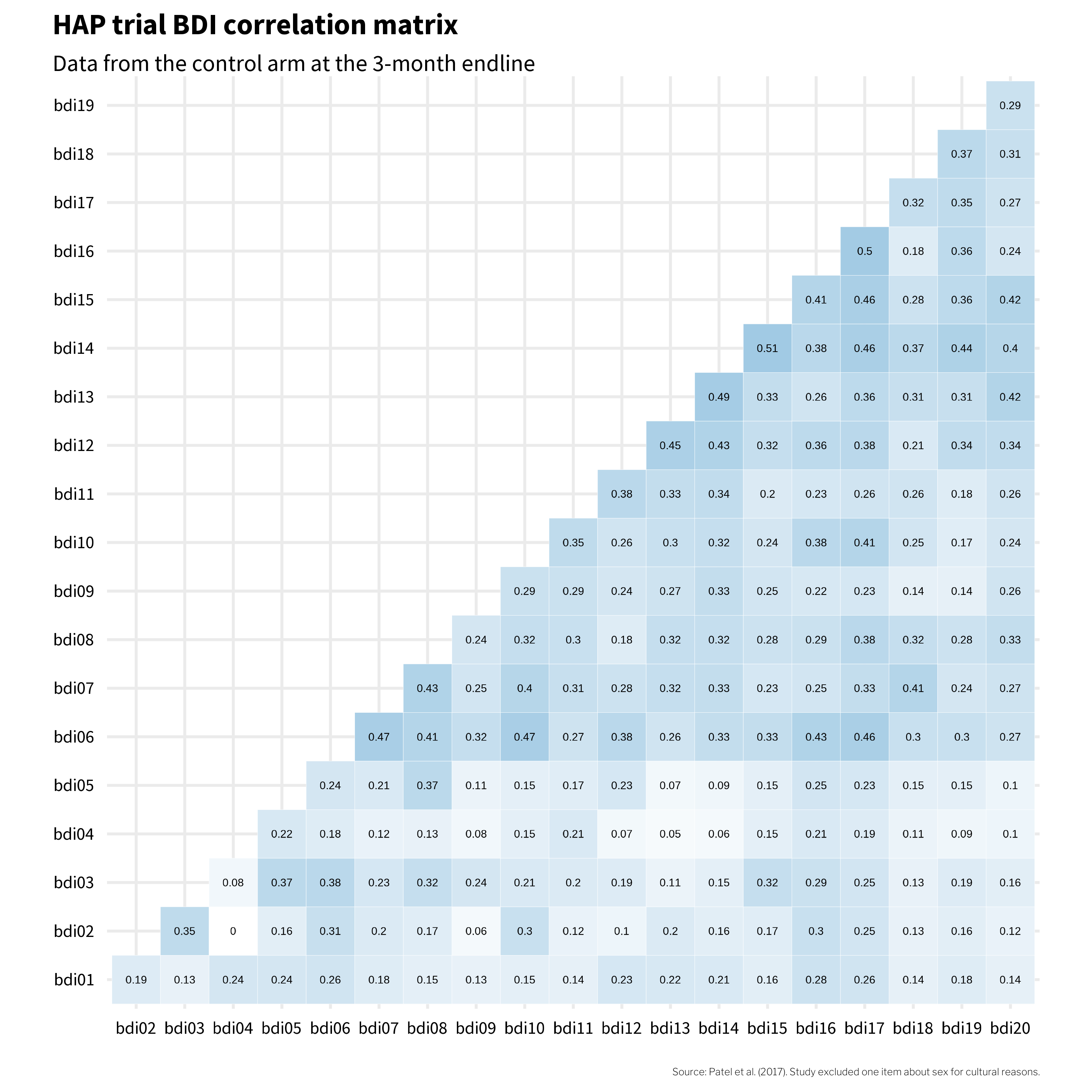
If these 20 items all reflect the same underlying construct—depression—then we’d expect them to be positively correlated with each other. And mostly, they are. The darker squares in Figure 9.5 show that most item pairs correlate in the 0.2 to 0.3 range. That’s a good sign: when someone endorses one symptom, they tend to endorse others too, which is what we’d expect if a common cause (depression) is driving the responses.
But look at bdi04 (changes in appetite). It’s essentially uncorrelated with bdi02 (tiredness) and only weakly correlated with everything else. That’s a clue worth paying attention to. It suggests that in this population, changes in appetite may not travel with the other symptoms of depression the way the instrument’s designers assumed. Keep bdi04 in mind—it’s going to keep showing up as we dig deeper into this instrument’s structure.
Scale Construction
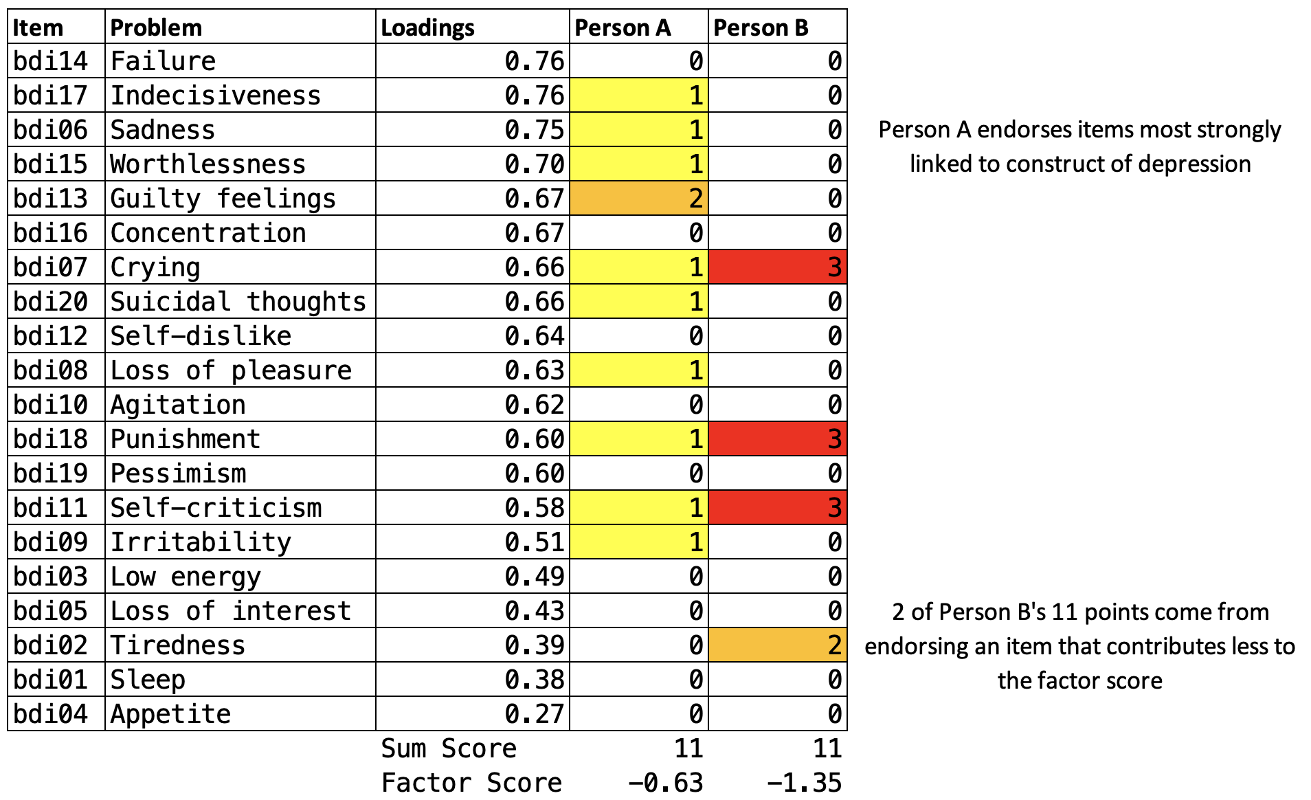
Once you’ve identified the items that will make up your scale, a key decision is how to combine them into a single score. Should feeling sad count the same as feeling suicidal? The most common approach is equal weighting: responses to each BDI-II item are scored 0 to 3 and simply summed to create a depression severity score ranging from 0 to 63.5 Figure 9.6 shows data from four people in the HAP study. Each item contributes equally to the sum score (bdi_total)—no fancy math required.
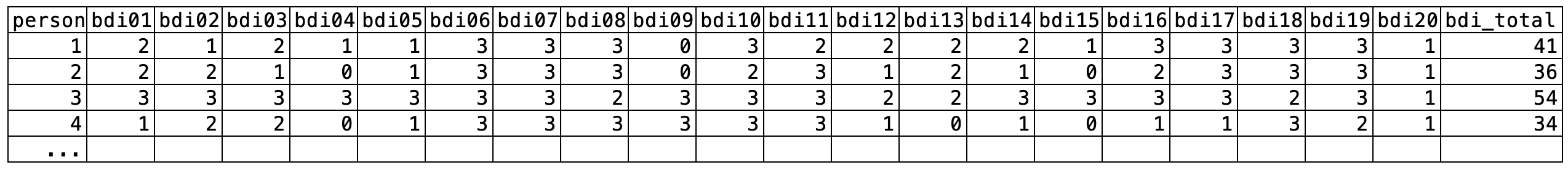
bdi_total) is simply the sum of all item scores.
But scales like the BDI-II could use optimal weighting instead. McNeish et al. (2020) describe an alternative approach using a factor model, where items more closely related to the construct are weighted more heavily.
In a factor model, all items are assumed to reflect a single underlying construct (like “depression severity”). The model estimates how strongly each item relates to that construct—its factor loading. Items with higher loadings contribute more to the factor score.
Figure 9.7 shows a path diagram of a congeneric factor model for the BDI-II—“congeneric” just means that each item is free to relate to the underlying construct with its own unique strength, rather than being forced to contribute equally. The loadings from the latent depression severity score are uniquely estimated for each item. The items bdi14 (feeling like a failure) and bdi17 (indecisiveness) have the highest loading of 0.76, meaning these items are most closely related to the construct of depression severity. Thus, these items contribute the most to the overall factor score. bdi04 (changes in appetite) has the weakest relationship to the construct and contributes the least to the factor score.

Does it matter which construction method you choose? McNeish et al. (2020) argue that it can. Figure 9.8 plots every participant’s sum score (equal weighting—just add up the responses) on the x-axis against their factor score (optimal weighting) on the y-axis. If the two methods told the same story, every point would fall on a straight line. They don’t. Look at the two orange points: Person A and Person B both have a sum score of 11, but their factor scores diverge—Person A scores −0.63 while Person B scores −1.35. Same raw total, two different pictures of depression severity. Which one is right?
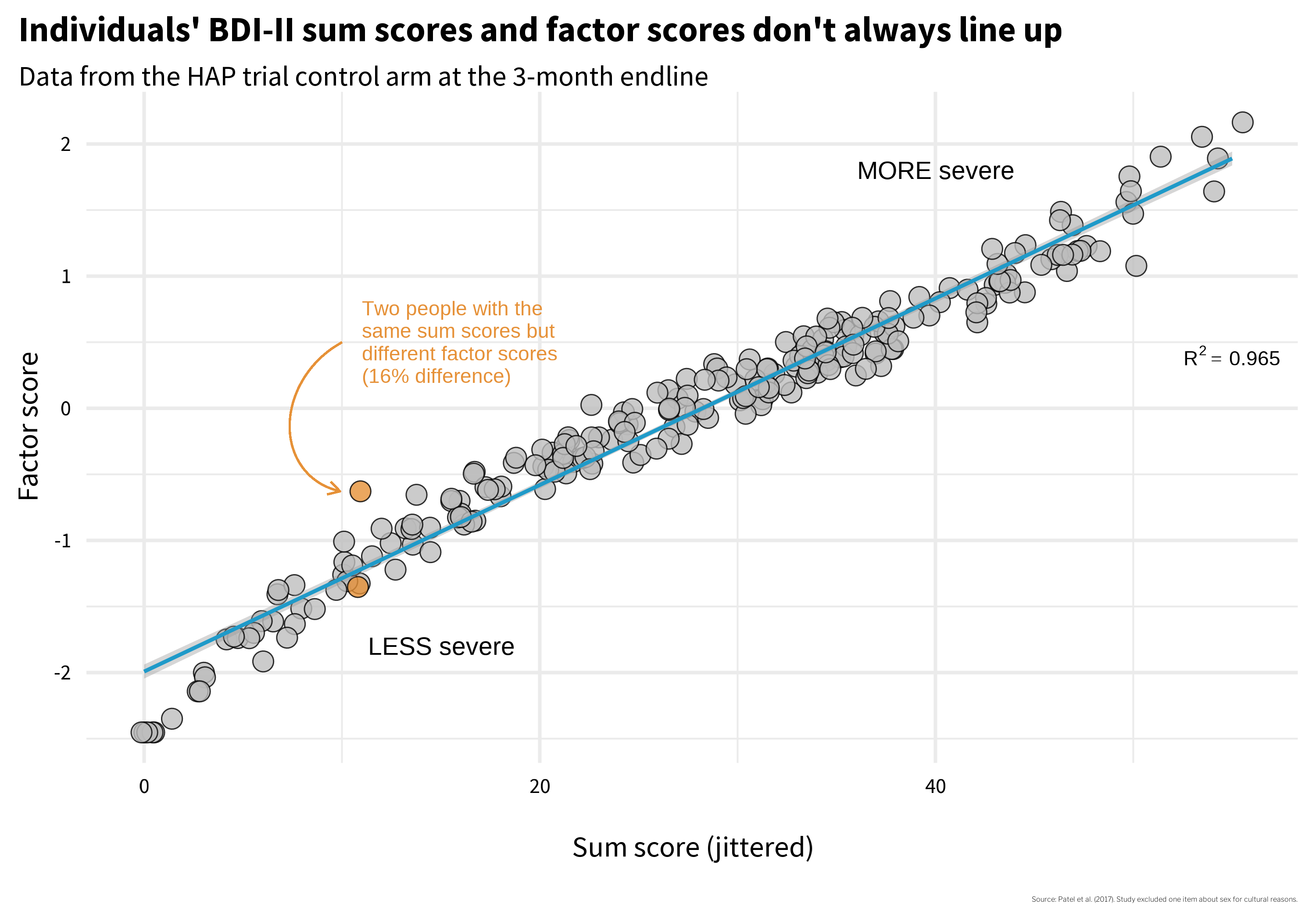
Why do they differ? Figure 9.9 shows each person’s item-level responses, and the answer jumps out: Person A endorsed several items with high factor loadings—the items that carry the most weight in the factor model. Same sum score, but the pattern of endorsement matters when items contribute unequally. This is a validity issue. How you calculate the score changes what the number means.
So do Person A and Person B have the same level of depression severity, as their identical sum scores suggest? Or are they experiencing different levels, as the factor scores imply?
There’s no universally correct answer. For a long time, simplicity was a necessity. Practitioners administered questionnaires on paper and hand-scored them—no fancy math possible. Sum scores were not just convenient; they were the only practical option. And there’s still value in that simplicity: sum scores are transparent, easy to calculate, and comparable across studies. Factor scores, by contrast, are often derived from sample-specific weights, making cross-study comparisons more complicated.
McNeish et al. (2020) offer helpful guidance for choosing between construction methods, and I encourage you to examine their paper when facing this decision. But the Person A/B example illustrates a broader point: two identical numbers can represent meaningfully different experiences. How you construct an indicator shapes what it captures—and what it obscures.
This brings us back to the core questions you’ll face when measuring any construct: What items are essential to capture the construct? How should you combine multiple items into a single score? And how do you know that the resulting number actually represents the construct you intended to measure? That last question—how do you know?—is the focus of the next section.
9.6 Evaluating Your Measures
The previous sections focused on planning—identifying what to measure and how indicators are constructed. Now we turn to validation: how do you know if an instrument actually measures what it claims to measure? Whether you’re developing a new instrument, adapting an existing one, or simply selecting from available options, understanding the validation process helps you critically appraise measurement quality.
Construct validation is the process of establishing that the numbers we generate with a method of measurement actually represent the idea—the construct—that we wish to measure (Cronbach et al., 1955). Using the BDI-II example, where sum scale scores can range from 0 to 63, validating this construct means establishing that higher numbers correspond with greater depression severity, or that scores above a certain threshold, such as 29 (out of 63), correctly classify someone as having “severe depression”. If our numbers don’t mean what we think they mean, our analyses don’t either.
You might be thinking that construct validation is not a top concern in your work because you, a principled scientist, are using “validated” scales. If so, you’d be wrong. Validity is not a property of an instrument. Flake et al. (2022) make this point clearly:
Thus, validity is not a binary property of an instrument, but instead a judgment made about the score interpretation based on a body of accumulating evidence that should continue to amass whenever the instrument is in use. Accordingly, ongoing validation is necessary because the same instrument can be used in different contexts or for different purposes and evidence that the interpretation of scores generalizes to those new contexts is needed.
I won’t argue that you must always start from scratch to validate the instruments you select, but it’s important to think critically about why you believe an instrument will produce valid results in your context. For instance, if you are using an instrument originally validated with a sample of 200 white women in one small city in America, what gives you confidence that the numbers produced carry the same meaning in rural India?
Whether you’re developing a new instrument or evaluating an existing one for your context, it helps to think about validation as a journey through three phases (Loevinger, 1957). Each phase answers a different question:
Phase 1: Substantive — Does it ask the right questions? This phase asks whether your instrument captures the right content. What topics should be included? How should items be worded so your target population understands them? You answer these questions through literature reviews, expert consultation, focus groups, and cognitive interviewing.
Phase 2: Structural — Do the numbers behave? Once you have pilot data, you examine whether items discriminate between cases and non-cases, whether they cluster together in the expected pattern (factor structure), and whether scores are consistent (reliability).
Phase 3: External — Does it match reality? Here you compare scores to other measures (convergent and discriminant validity), to known groups who should differ (known groups validity), and to outcomes the construct should predict (criterion validity).
Table 9.2 summarizes the types of validity evidence associated with each phase. I’ll walk through each phase using examples, primarily from the HAP trial.
| Phase | Validity Evidence | Question | Examples |
|---|---|---|---|
| Substantive | Content validity | What topics should be included in the instrument based on theory and prior work? | Complete a literature review, talk with experts, conduct focus groups to explore local idioms |
| Item development | How should the construct be assessed? | Conduct cognitive interviewing to ensure local understanding of item wording and response options | |
| Structural | Item analysis | Are the instrument items working as intended? | Analyze patterns of responding, select items that discriminate between cases and non-cases |
| Factor analysis | How can the observed variables be summarized or represented by a smaller number of unobserved variables (factors)? | Conduct exploratory and/or confirmatory factor analysis | |
| Reliability | Are responses to a set of supposedly related items consistent within people and over time? | Examine internal consistency and test-retest correlations for evidence of stability | |
| Measurement invariance | Does the instrument function equivalently across different groups or conditions? | Conduct multiple group factor analysis, item response theory analysis | |
| External | Convergent/discriminant/known groups validity | How well does the instrument relate to other measures of the same or different constructs? | Establish convergent, discriminant, and known groups validity |
| Criterion validity | How well does the instrument predict or correlate with an external criterion or outcome of interest? | Establish predictive validity, diagnostic accuracy |
PHASE 1: DOES IT ASK THE RIGHT QUESTIONS?
The first phase of construct validation asks whether your instrument captures the right content. Whether you’re building something new or adapting an existing tool for a new context, there are two questions to answer: Does the instrument cover the important aspects of the construct? And are the questions understood by the target population?
Does It Cover the Right Domains?
An instrument has evidence of content validity when it assesses all of the conceptually relevant domains of a construct and excludes unrelated content. The process of establishing content validity typically starts with a review of the literature, conversations with experts, and—critically—talking to members of your target population to learn how they understand and describe the experience you’re trying to measure.
This last step matters more than you might think. Constructs don’t always travel well across cultures. My colleagues and I saw this firsthand in a study in rural Kenya where we examined how women understood depression in the context of pregnancy and childbirth (Green et al., 2018). We convened focus groups and asked women to describe what observable features characterize depression (sadness, or huzuni, in Swahili) during the perinatal period. Then we co-examined the overlap—and lack thereof—between their descriptions and existing depression screening tools (see Figure 9.10).
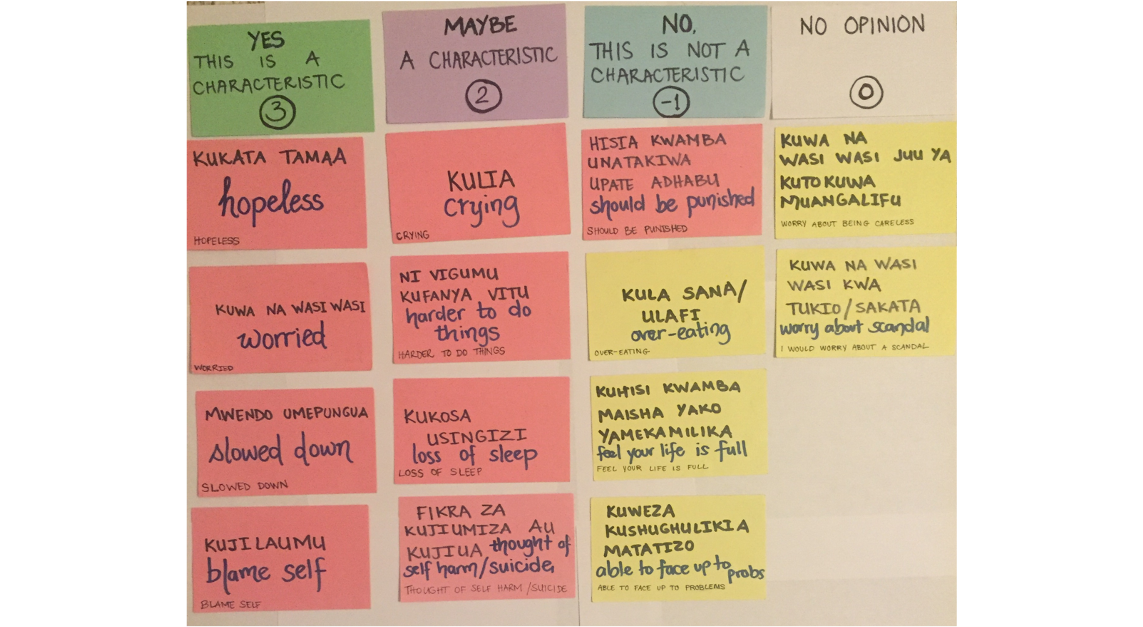
Some symptoms on standard screening tools aligned with what women described—but others didn’t resonate at all, and the women identified experiences that no existing tool captured. A group of Kenyan mental health professionals then reviewed the results and offered feedback based on their local clinical expertise. Without this kind of ground-up process, we would have used an instrument that missed important aspects of the construct and included items that didn’t belong.
Are the Questions Understood?
Even when an instrument covers the right domains, the items themselves might not work for your population. An item like “I feel I am being punished” (BDI-II item 6) might be interpreted very differently depending on religious and cultural context. An item about changes in sleep patterns might not discriminate well in a population where sleep disruption is near-universal due to living conditions rather than depression.
Cognitive interviewing is a structured way to catch these problems. You sit down with members of your target population, ask them to read each item aloud, and have them describe in their own words what they think the item is asking. You’d be surprised how often an item that seems perfectly clear to the research team means something entirely different to a respondent—or means nothing at all.
Check out this helpful “how to” guide for cognitive interviewing.
The HAP team’s decision to drop one BDI-II item about sex for cultural reasons is a small example of what this phase produces. The item wasn’t misunderstood—it was culturally inappropriate for the context. Phase 1 is about examining, questioning, and adapting an instrument so that its content fits the population and setting in which it will be used.
PHASE 2: DO THE NUMBERS BEHAVE?
You’ve collected pilot data. Two hundred people in your target population responded to every item on your questionnaire. Now what? Before you can claim these items measure depression—or whatever construct you’re after—you need to answer three questions: Are the items working? Do they hang together? And are they consistent?
Item Analysis
A common initial exploratory data analysis practice is to plot the response distributions of each item. If you ask people to rate their agreement with a statement like, “I feel sad”, and if 100% of people in your sample respond “strongly agree”, the item has zero variance. When all or nearly all of your sample responds the same way to an item, that item tells you nothing useful. The appropriate next step is to drop the item or conduct additional cognitive interviewing to modify the item in a way that will elicit variation in responses.
You might decide to keep an item with low variability if it’s a critical item for clinical detection like suicidal ideation.
If you have data that enable you to plot response distributions by group, you can also examine the extent to which items distinguish between groups. Figure 9.11 shows a hypothetical example where 100 people responded to three items, each measured on a 4-point scale from “Never” to “Often”.
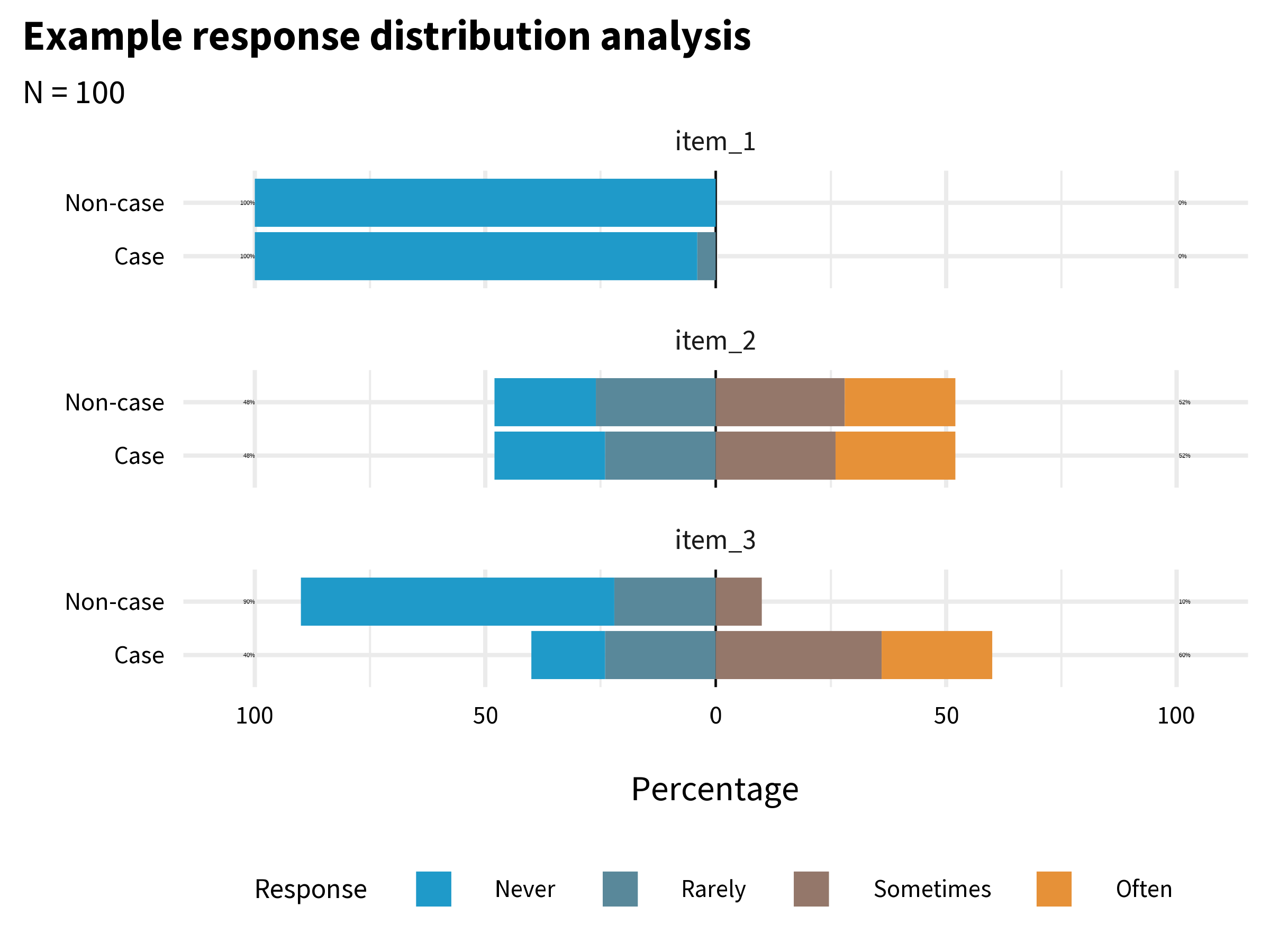
item_1 has very little variability. Almost everyone responded “Never”. This item does not tell us much, and you might decide to drop or improve it. item_2 has more variability, but it does not distinguish between cases and non-cases. In combination with other variables it might be useful, so you might decide to keep it unless you need to trim the overall length of the questionnaire. item_3 looks the most promising. It elicits variability in responses, and a larger proportion of the Cases group endorsed the item.
Factor Analysis
Item analysis tells you whether individual items are working. But knowing that each item works on its own doesn’t tell you whether they work together. Suppose you have 20 items that all show good variability and discriminate between groups. Are those 20 items measuring one thing—depression—or are some of them clustering around sadness while others cluster around physical symptoms? Are you measuring one construct or two?
This is what factor analysis helps you figure out. It looks at patterns of correlation among your items and asks: can these be explained by a smaller number of underlying constructs? There are two main types. Exploratory factor analysis (EFA) is used when you don’t yet know the underlying structure—you’re asking the data to reveal it. Confirmatory factor analysis (CFA) is used when you already have a hypothesis about the structure and want to test whether the data support it. As Flora et al. (2017) put it: “Researchers developing an entirely new scale should use EFA…CFA should be used when researchers have strong a priori hypotheses about the factor pattern.”
EFA Example
To get a glimpse of what this means, let’s imagine that, as members of the HAP study team, we created the BDI-II items from scratch and wanted to examine the dimensionality of the items.
Table 9.3 displays the factor loadings for the 2-factor model. A factor loading tells you how closely each item is tied to a particular factor—think of it as a correlation between the item and the underlying construct. Higher loadings mean the item is a better indicator of that factor. Lower loadings mean the item is doing its own thing, measuring something the factor doesn’t capture well.
| Factor loadings | |||
| item | label | f1 | f2 |
|---|---|---|---|
| bdi03 | Low energy | 0.71 | |
| bdi06 | Sadness | 0.67 | |
| bdi05 | Loss of interest | 0.66 | |
| bdi02 | Tiredness | 0.54 | |
| bdi10 | Agitation | 0.48 | |
| bdi16 | Concentration | 0.46 | |
| bdi08 | Loss of pleasure | 0.45 | |
| bdi07 | Crying | 0.43 | |
| bdi14 | Failure | 0.89 | |
| bdi13 | Guilty feelings | 0.78 | |
| bdi20 | Suicidal thoughts | 0.73 | |
| bdi15 | Worthlessness | 0.62 | |
| bdi12 | Self-dislike | 0.6 | |
| bdi19 | Pessimism | 0.57 | |
| bdi18 | Punishment | 0.55 | |
| bdi17 | Indecisiveness | 0.49 | |
| bdi11 | Self-criticism | 0.45 | |
| bdi01 | Sleep | ||
| bdi04 | Appetite | ||
| bdi09 | Irritability | ||
| Loadings less than 0.40 (absolute value) are not presented. | |||
What we see is a cluster of items that load strongly on factor 1, a cluster of items that load strongly on factor 2, and a few items such as bdi04 (appetite) that are not strongly associated with either factor. Remember that cold square in the correlation heatmap (Figure 9.5)? Here it is again—bdi04 doesn’t correlate well with other items, and now the EFA confirms it doesn’t load cleanly on either factor. The data are telling us something: changes in appetite may not be a strong marker of depression in this population. The software labels these factors f1 and f2—it’s up to us to interpret what they mean. My sense is that f1 captures the affective dimension of depression (e.g., sadness, crying), whereas f2 is about negative cognition (e.g., guilty feelings, self-dislike).
Determining the “right” number of factors is an advanced topic with no single best approach. In practice, researchers often compare models with different numbers of factors and use a combination of statistical criteria and theoretical interpretation.
CFA Example
EFA is useful when you’re exploring. But when prior research or theory gives you a reason to expect a particular structure, confirmatory factor analysis (CFA) lets you test that expectation against your data. You specify the model in advance—how many factors, which items load on which factor—and then ask: does this structure fit?
The BDI-II has decades of research behind it. While many research groups have proposed multi-factor solutions (Beck et al., 1988), the instrument is typically scored as a single factor (consistent with our EFA results). The path diagram in Figure 9.7 is the output of a CFA—a one-factor congeneric model where each item’s loading is freely estimated. The fact that this model fits the data well is evidence that a single “depression severity” factor adequately explains the pattern of correlations among the 20 items. If it didn’t fit, we’d need to reconsider the structure—perhaps depression in this population is better captured by two or more factors.
Reliability
Factor analysis asks about structure—do the items cluster together in the pattern you expect? Reliability asks a different question: how consistently do they measure?
Every observed score consists of two parts: the true score—a person’s actual level of the construct—and measurement error. Error can be random or systematic. Random error is noise—unpredictable variations that make measurements inconsistent. Reliability refers to this consistency. Systematic error is bias that pushes scores in a particular direction; its main victim is validity.
A bathroom scale is valid if it correctly measures your weight, and reliable if it gives the same reading when you step off and back on. A scale that consistently tells you 80kg when you actually weigh 65kg is reliable but not valid. Consistency is reliability, regardless of being right or wrong.
For an in-depth look at reliability, see this chapter by William Revelle.
There is no one test of an instrument’s reliability because variation in measurement can come from many different sources: items, time, raters, form, etc. Therefore, we can assess different aspects of reliability of measurement, including test-retest reliability, internal consistency reliability, and inter-rater reliability, to name a few.
Reliability: Test-Retest
An instrument exhibits good test-retest reliability if it maintains roughly the same ordering between people when administered repeatedly under the same conditions, often benchmarked as a correlation of at least 0.70.
But perfect reliability doesn’t require identical scores at time 1 and time 2. Reliability is about preserving the rank order between people, not about exact agreement. Scores can be perfectly reliable (r = 1.0) even if every person’s score shifts by the same amount. Figure 9.12 illustrates this.
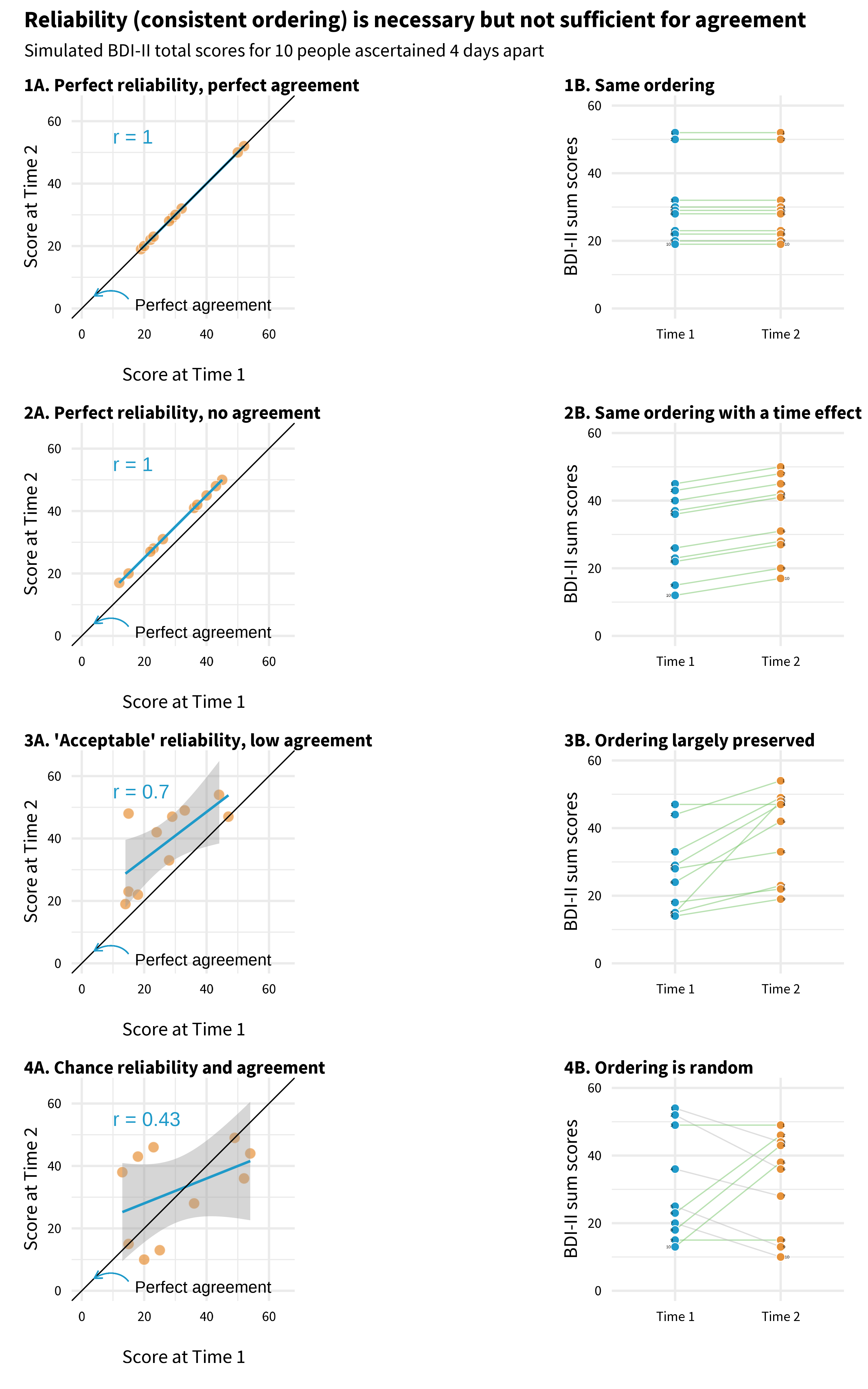
Each panel plots mock BDI-II scores for 10 people measured four days apart. Points that fall on the diagonal line have identical scores at both times.
Start with Panel 1. Every point sits on the diagonal. The person who scored highest on day 1 scored highest on day 4. The person who scored lowest stayed lowest. The scores are perfectly reliable (the ordering is preserved, r = 1.0) and perfectly agreed (the actual numbers are the same).
Now look at Panel 2. No point sits on the diagonal—everyone’s score went up. Maybe something happened between day 1 and day 4 that affected the whole group. But look at the pattern: the person who scored highest on day 1 still scored highest on day 4. The rank order is perfectly preserved, so reliability is still r = 1.0. The scores don’t agree at all, but they’re perfectly reliable. This is the key distinction: reliability is about who scores higher than whom, not about the exact numbers.
Panel 3 is what real data typically look like. The points don’t fall on the diagonal, and the ordering isn’t perfect—but the general pattern holds. People who scored higher on day 1 tend to score higher on day 4. This is acceptable reliability.
Panel 4 is the one that should worry you. There’s no pattern. Knowing someone’s score on day 1 tells you almost nothing about their score on day 4 (r = 0.43). If your instrument looks like this over a short, stable period, it’s not measuring a consistent trait—it’s mostly measuring noise.
Reliability: Internal Consistency
Repeated administrations aren’t always feasible, so internal consistency reliability evaluates how closely scale items relate to each other in a single administration. If items aren’t highly correlated, they probably aren’t measuring the same latent construct.
Cronbach’s alpha quantifies how much score variability is due to relationships between items versus random error. It’s also called tau-equivalent reliability because it assumes each item contributes equally to the total score.
The most common index is Cronbach’s alpha, which ranges from 0 to 1 (higher = better). Values above 0.70 are generally considered acceptable, though this threshold is somewhat arbitrary.
In the HAP trial, the modified BDI-II showed strong internal consistency (α = 0.87), well above the 0.70 threshold. You might be thinking: didn’t factor analysis already tell us the items hang together? It did, but the two tools play different roles. Factor analysis is diagnostic—it tells you which items belong together and how strongly each one relates to the construct, item by item. Alpha is a report card—a single number summarizing how consistently the set of items works as a unit. How much of the variability in total scores reflects the construct versus noise?
Reliability: Inter-Rater
Test-retest and internal consistency apply when the instrument is a questionnaire—a person answers questions, and you evaluate the consistency of their responses. But not all measurement in global health research involves questionnaires. Sometimes the “instrument” is a human observer: a clinician diagnosing a condition, a researcher coding interview transcripts, or a supervisor rating the quality of a counseling session. When measurement depends on human judgment, you need to ask: do different observers see the same thing?
Inter-rater reliability measures the extent to which they agree.
In the HAP trial, researchers needed to assess whether lay counselors delivered therapy sessions with fidelity to the program design. They trained observers to rate audio recordings using a standardized instrument called the Q-HAP scale (see Figure 9.13). The key question: when different observers listen to the same session, do they rate it the same way?
Inter-rater reliability is typically quantified with the intra-class correlation coefficient (ICC), which ranges from 0 to 1. The HAP observers showed moderate agreement (ICC ≈ .62), acceptable for research purposes but suggesting room for improvement in training or instrument clarity.
Responsiveness to Change
For intervention studies, reliability isn’t enough—you also need responsiveness (or sensitivity to change): the ability of an instrument to detect meaningful change over time when change has actually occurred. An instrument can be perfectly reliable yet insensitive to change if it suffers from floor effects (scores cluster at the minimum, leaving no room to detect decline) or ceiling effects (scores cluster at the maximum, leaving no room to detect improvement).
Consider a depression intervention targeting people with mild symptoms: if your instrument was validated on severely depressed populations, participants may score near the floor at baseline, making it impossible to detect improvement. When selecting instruments, check whether they’ve demonstrated responsiveness in populations similar to yours. Effect sizes from prior intervention studies using the instrument can provide evidence of responsiveness.
Let’s take stock. At this point in the validation journey, we know the modified BDI-II asks the right questions for this population (Phase 1), that its items hang together in a coherent factor structure, and that it produces consistent scores (Phase 2). But we still haven’t answered the harder question: do those scores actually mean what Patel and colleagues think they mean? A score of 35—does that really correspond to severe depression, or could it reflect something else entirely? That’s what Phase 3 is about.
PHASE 3: DOES IT MATCH REALITY?
Phases 1 and 2 look inward—at the content of the instrument and the behavior of the items. Phase 3 looks outward. You compare your scores to other measures, to groups that should differ, and to real-world outcomes. The question is no longer “do the items work?” but “do the scores mean what we think they mean?”
There are two broad ways to test this. The first asks whether your scores relate to other measures the way theory predicts. The second asks whether your scores predict something concrete in the real world.
Does It Relate to Other Measures the Way You’d Expect?
If the BDI-II measures depression, then BDI-II scores should correlate with scores on other depression instruments. They should also correlate—though less strongly—with measures of related constructs like anxiety, which often co-occurs with depression. And they should not correlate with measures of unrelated constructs like narcissism. This pattern of expected relationships is what validation researchers call the nomological network—a theoretical map of how your construct connects to others.
“Nomological” from the Greek nomos meaning “law.” The nomological network is the web of lawful relationships between constructs.
Convergent validity is evidence that your instrument does correlate with things it should correlate with. Discriminant validity is evidence that it doesn’t correlate with things it shouldn’t. In practice, a validation study should include measures of both related and unrelated constructs so you can test whether the pattern of correlations matches your predictions.
You can also test whether your instrument distinguishes between groups that are already known to differ on the construct. For example, Puffer et al. (2021) expected their family conflict measure to show higher scores among families referred for services compared to non-referred families. If it didn’t, something would be wrong. This is known groups validity—a straightforward test of whether the scores behave sensibly when you already know the answer.
Does It Predict Something in the Real World?
The other type of external evidence is criterion validity: how well your scores relate to an external standard or outcome.
Predictive validity asks whether scores today predict something meaningful in the future. A hiring test has good predictive validity if high scorers go on to perform well on the job. A depression screener has good predictive validity if elevated scores predict future clinical diagnosis or service use.
You’ll sometimes see concurrent validity listed as a separate type. It examines whether your instrument correlates with an existing gold standard measured at the same time. The distinction from convergent validity is real but thin—in both cases, your scores should correlate with things they ought to correlate with.
Diagnostic accuracy asks a more specific question: can the instrument correctly classify individuals? You compare your instrument (the index test) against a gold standard (the criterion) and ask how well it sorts people into the right categories.
For example, Green et al. (2018) developed a perinatal depression screening questionnaire in Kenya and evaluated its diagnostic accuracy by comparing questionnaire scores to blinded clinical interviews. Of 193 women screened, clinical interviewers identified 10 who met diagnostic criteria for Major Depressive Episode.
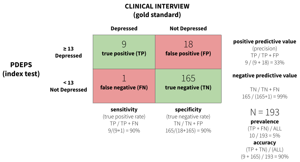
Figure 9.14 displays a confusion matrix for the study. A score of 13 or greater on the PDEPS correctly identified 90% of true cases—it only missed 1 out of 10. This is known as sensitivity, or the true positive rate. The same cutoff also correctly identified 90% of non-cases, known as specificity, or the true negative rate. A score of 13 is the optimal cutoff that maximizes both.
For some applications you might prioritize sensitivity over specificity, or vice versa. If false negatives are very costly—missing a case of depression that could lead to self-harm—you might choose a lower cutoff that catches more true cases, even at the cost of more false positives.
CROSS-CULTURAL VALIDITY
The three phases above apply to any validation effort. But much of global health research involves using instruments across cultural and linguistic boundaries—and that raises a distinct set of challenges. It’s not just about whether the items work statistically. It’s about whether the construct itself means the same thing in a different context, whether the language carries the same weight, and whether the response format makes sense to someone whose daily life looks nothing like the population the instrument was originally designed for.
Kohrt et al. (2011) propose six questions to ask when validating or selecting an instrument for cross-cultural use. They illustrate each one through their work adapting the Depression Self-Rating Scale (DSRS) and Child PTSD Symptom Scale (CPSS) for conflict-affected youth in Nepal—and the examples are worth learning from.
What Is the Purpose of the Instrument?
Validity can vary by setting, population, and purpose. An instrument validated for estimating prevalence may not be ideal for evaluating treatment response, even in the same population. A prevalence instrument is designed to sort people into categories—above or below a cutoff. A treatment instrument needs to detect change over time and differentiate severity levels within the clinical range. A screener that reliably classifies “depressed” versus “not depressed” may not be sensitive enough to tell you whether someone is getting better (Kohrt et al., 2011). Start by defining what you need the instrument to do.
What Is the Construct to Be Measured?
Not all constructs are the same kind of thing. Kohrt et al. (2011) distinguish three types: (i) local constructs—unique ways a population conceptualizes distress (e.g., in the Kenya perinatal study (Green et al., 2018), depressed women often expressed wanting to return to their maternal home6); (ii) Western psychiatric constructs—categories like PTSD or Major Depressive Disorder that may or may not map onto local experience; and (iii) cross-cultural constructs—phenomena assumed to have shared meaning across groups, though the specific symptoms and expressions may differ.
Local constructs are also known as idioms of distress or culture-bound syndromes.
The choice matters because it determines your validation strategy. A prevalence study will typically start with a Western psychiatric construct and validate against a clinical diagnosis. A screening or treatment study might use a local or cross-cultural construct and validate against functional impairment or clinical judgment. Kohrt and colleagues chose depression and PTSD as cross-cultural constructs—phenomena observable in Nepali populations with salient local terminology—but they didn’t assume the Western versions of these constructs would work without modification.
What Are the Contents of the Construct?
This is about content equivalence: are the specific items on the instrument relevant in this context? Even when the broad construct travels well, individual items may not. “Stands quietly when in line”—common on ADHD instruments in high-income countries—is not a universal expectation of children in Nepal and wouldn’t function as an indicator of pathology there (Kohrt et al., 2011).
The Kohrt team found that every DSRS item was endorsed by at least two children per focus group as connected to dukkha (sadness)—with the exception of two items. No child endorsed “stomachaches” or “enjoying food” as related to depression. One child called these “foolish questions” because “anyone can get a stomachache, whether you are sad or happy.” Qualitative research like this helps identify which items to keep, modify, or drop.
What Are the Idioms Used to Identify Symptoms?
Translation is necessary but never sufficient. The goal is semantic equivalence—that each item carries the same meaning in the new language and culture. Direct translation can change meaning in subtle ways. The word “ashamed” (vergüenza) carries negative connotations in Spanish that “uncomfortable” (incómodo) does not. Translating “adventure” from English to Spanish changed its connotation from a benign term to one associated with sexual escapades (Kohrt et al., 2011).
The standard approach is forward translation, blinded back-translation (without seeing the original), and reconciliation where translators resolve disagreements. But even this process can miss problems that only surface in conversation with your target population. In Nepal, there was no direct equivalent for “stick up for myself,” so the team changed the item to “speaking up when one suffers or witnesses an injustice”—a phrase that focus group participants recognized immediately.
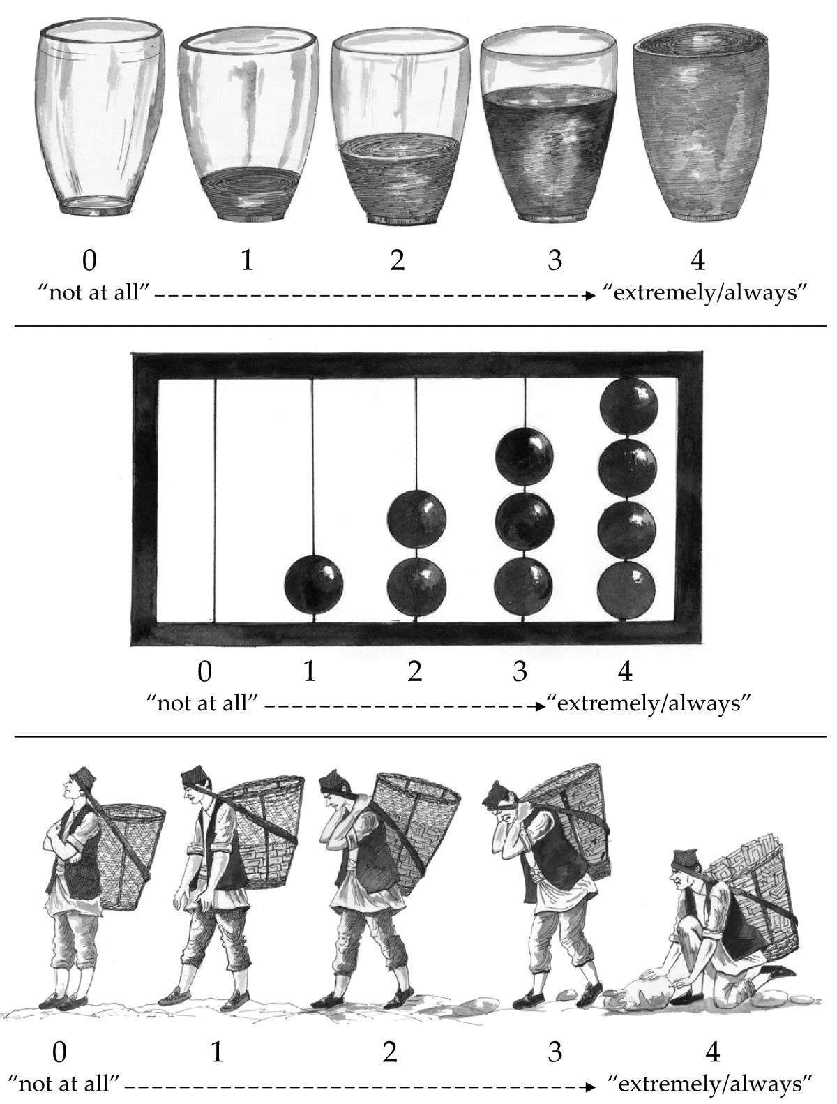
How Should Questions and Responses Be Structured?
Technical equivalence means that the format of questions and response options works the same way across settings. This sounds mechanical, but the Kohrt study shows how easily it can go wrong.
Children in the Nepal focus groups found the DSRS response scale confusing because it ran from 0 (“mostly”) to 2 (“never”)—starting with the most frequent and ending with the least. Every child who was asked said the opposite order made more sense. The team reversed the presentation while keeping the original numeric scoring.
Even more striking: the team tested three pictographic response scales—water glasses, an abacus, and a dhoko-basket scale showing men carrying baskets of bricks (Figure 9.15). The water glasses and abacus were generally understood. The dhoko-basket scale backfired completely. Children consistently identified the empty basket (intended as “not at all”) with sadness and laziness—the boy had no bricks and would earn no money. The full basket (intended as “extremely/always”) was associated with happiness because of the earning potential of carrying more bricks. The researchers intended the scale to represent burden; the children read it as prosperity. The dhoko-basket scale was discarded (Kohrt et al., 2011).
What Does a Score on the Instrument Mean?
This question connects back to the external validation phase discussed earlier. Once you’ve translated and adapted the instrument, you still need to establish that scores predict what they should predict in this population. Kohrt et al. (2011) make an important point for prevalence studies:
Ultimately, for prevalence studies, diagnostic validation is crucial. The misapplication of instruments that have not undergone diagnostic validation to make prevalence claims is one of the most common errors in global mental health research.
Clinical “gold standard” interviews are the ideal comparison, but they may not be feasible in settings that lack mental health specialists. Kohrt and colleagues addressed this by task-shifting the validation process itself—training a psychosocial counselor to conduct structured diagnostic interviews, with supervision from an expatriate psychologist and psychiatrist until concordance was achieved.
9.7 Closing Reflection
Two Psychologists, Four Beers, Episode 32, Measurement Schmeasurement.
This chapter covered a lot of ground. We started with a seemingly simple question—how many people died from COVID-19?—and found that even counting deaths requires judgment calls, modeling assumptions, and imperfect data systems. From there we moved to constructs that are far harder to pin down: depression, empowerment, quality of life. We learned that measuring these constructs well requires careful planning—using conceptual models like DAGs and logic models to identify what to measure, choosing indicators that are defined, relevant, expedient, accurate, measurable, and customary, and deciding how to construct those indicators from raw data.
Then we turned to validation. We walked through three phases of construct validation: asking whether the instrument captures the right content for your population, whether the items behave the way they should statistically, and whether the scores correspond to reality when compared against external criteria. For those working across cultural and linguistic boundaries—which is most of global health research—we saw how easily instruments can break down when constructs, idioms, and response formats don’t travel.
Flake et al. (2020) offer six questions to consider in the design phase: What is your construct? Why and how did you select your measure? What measure did you use to operationalize the construct? How did you quantify your measure? Did you modify the scale? Did you create a measure on the fly?
“Measurement, Schmeasurement” is the title of a great paper by Flake et al. (2020). The subtitle is, “Questionable Measurement Practices and How to Avoid Them.” The authors’ thesis is that measurement is a critical part of science, but questionable measurement practices undermine the validity of many studies and ultimately slow the progress of science.
I’m persuaded by this argument, having been in the room when investigators have spent weeks thinking about research design only to uncritically “throw in” a bunch of measures at the end. The thinking is often, why not, we’re going to the trouble of doing the study, let’s measure everything. In situations like this, the validity of measurement is never at the forefront. Doing it right is hard, and hey, measurement, schmeasurement, right?
Wrong. Your study design can be flawless, your sample size enormous, your analysis plan pre-registered and bulletproof—but if your measure doesn’t capture the construct you think it captures, none of it matters.
Measurement isn’t the last thing to figure out. It’s one of the first.
Anand, Arpita and Chowdhary, Neerja and Dimidjian, Sona and Patel, Vikram. (2013). Healthy Activity Program.
Barnard-Mayers, R. et al. (2022). A case study and proposal for publishing directed acyclic graphs: The effectiveness of the quadrivalent human papillomavirus vaccine in perinatally HIV infected girls. Journal of Clinical Epidemiology, 144, 127–135.
Beck, A. T. et al. (1988). Psychometric properties of the beck depression inventory: Twenty-five years of evaluation. Clinical Psychology Review, 8(1), 77–100.
Beck, A. T. et al. (1996). Manual for the beck depression inventory-II. Psychological Corporation.
Boyle, P. (2021). How are COVID-19 deaths counted? It’s complicated.
CDC. (2020). Reporting and Coding Deaths Due to COVID-19.
Chowdhary, N. et al. (2016). The healthy activity program lay counsellor delivered treatment for severe depression in india: Systematic development and randomised evaluation. The British Journal of Psychiatry, 208(4), 381–388.
Cronbach, L. J. et al. (1955). Construct validity in psychological tests. Psychological Bulletin, 52(4), 281.
Flake, J. K. et al. (2020). Measurement schmeasurement: Questionable measurement practices and how to avoid them. Advances in Methods and Practices in Psychological Science, 3(4), 456–465.
Flake, J. K. et al. (2022). Construct validity and the validity of replication studies: A systematic review. American Psychologist, 77(4), 576.
Flora, D. B. et al. (2017). The purpose and practice of exploratory and confirmatory factor analysis in psychological research: Decisions for scale development and validation. Canadian Journal of Behavioural Science, 49(2), 78.
Gelman, A. (2015). What’s the most important thing in statistics that’s not in the textbooks?
Green, E. P. et al. (2018). Developing and validating a perinatal depression screening tool in kenya blending western criteria with local idioms: A mixed methods study. Journal of Affective Disorders, 228, 49–59.
Hay, I., Simon et al. (2023). Conflicting COVID-19 excess mortality estimates – Authors’ reply. The Lancet, 401(10375), 433–434.
Karyotaki, E. et al. (2022). Association of task-shared psychological interventions with depression outcomes in low-and middle-income countries: A systematic review and individual patient data meta-analysis. JAMA Psychiatry.
Kohrt, B. A. et al. (2011). Validation of cross-cultural child mental health and psychosocial research instruments: Adapting the depression self-rating scale and child PTSD symptom scale in nepal. BMC Psychiatry, 11(1), 1.
Kroenke, K. et al. (2002). The PHQ-9: A new depression diagnostic and severity measure. Psychiatric Annals, 32(9), 509–515.
Loevinger, J. (1957). Objective tests as instruments of psychological theory. Psychological Reports, 3(3), 635–694.
Matthay, E. C. et al. (2020). A graphical catalog of threats to validity: Linking social science with epidemiology. Epidemiology, 31(3), 376.
McNeish, D. (2018). Thanks coefficient alpha, we’ll take it from here. Psychological Methods, 23(3), 412.
McNeish, D. et al. (2020). Thinking twice about sum scores. Behavior Research Methods, 52, 2287–2305.
Olken, B. A. (2005). Monitoring corruption: Evidence from a field experiment in indonesia. National Bureau of Economic Research.
Our World in Data. (2023). Coronavirus (COVID-19) Deaths.
Patel, V. et al. (2008). Detecting common mental disorders in primary care in india: A comparison of five screening questionnaires. Psychological Medicine, 38(2), 221–228.
Patel, V. et al. (2014). The effectiveness and cost-effectiveness of lay counsellor-delivered psychological treatments for harmful and dependent drinking and moderate to severe depression in primary care in India: PREMIUM study protocol for randomized controlled trials. Trials, 15, 101.
Patel, V. et al. (2017). The healthy activity program (HAP), a lay counsellor-delivered brief psychological treatment for severe depression, in primary care in india: A randomised controlled trial. The Lancet.
Puffer, E. S. et al. (2021). Development of the family togetherness scale: A mixed-methods validation study in kenya. Frontiers in Psychology, 12, 662991.
Rutstein, S. O. et al. (2004). The DHS wealth index (DHS Comparative Reports No. 6). ORC Macro.
Shadish, W. R. et al. (2002). Experimental and quasi-experimental designs for generalized causal inference. Cengage Learning.
Stevens, S. S. (1946). On the theory of scales of measurement. Science, 103(2684), 677–680.
UNDP. (n.d.). Human Development Index.
United Nations. (2023). SDG indicators.
Whittaker, C. et al. (2021). Under-reporting of deaths limits our understanding of true burden of covid-19. BMJ, 375.
WHO. (2018). Global reference list of 100 core health indicators. World Health Organization.
World Health Organization. Maternal mortality ratio (per 100 000 live births).
World Health Organization. (2021). WHO civil registration and vital statistics strategic implementation plan 2021-2025.
This is true in many other nations as well.↩︎
The coding is designed to match the International Classification of Diseases (ICD-10) coding system.↩︎
The authors don’t indicate this in their manuscript.↩︎
Patel et al. (2017) excluded one item about sex for cultural reasons, so they used a modified BDI-II with 20 of the 21 questions.↩︎
The possible range is 0 to 60 in the case of Patel et al. (2017) because they purposively omitted one item.↩︎
It’s customary for women in this culture to marry and live with her husband’s family.↩︎