
5 How to Read Scientific Articles
The Cochrane Collaboration, founded in 1993 and named in his honor, now produces systematic reviews that inform health policy worldwide.
In 1972, a Scottish epidemiologist named Archie Cochrane published a slim book called Effectiveness and Efficiency that would revolutionize medicine (Cochrane, 1972). His argument was blunt: most medical practice wasn’t based on evidence. Doctors did what they were taught, what their mentors did, what seemed reasonable, but rarely what had been rigorously tested. Cochrane called for medicine to ground itself in randomized controlled trials, and for someone to actually synthesize all that evidence so clinicians could use it.
Two decades later, a group of physicians at McMaster University in Canada took Cochrane’s challenge seriously. Gordon Guyatt coined the term “evidence-based medicine” in 1991, and alongside David Sackett and others, began teaching a new approach: clinicians should learn to find, appraise, and apply research evidence to patient care (Sackett et al., 1996). Not blindly follow guidelines, but actually read the studies and judge for themselves.
This created a problem. Most clinicians had never been taught to read research critically. They could read a paper, sure, but could they tell whether the findings were trustworthy? Whether the methods were sound? Whether the conclusions followed from the data? The evidence-based medicine movement realized that reading scientific literature wasn’t just reading. It was critical appraisal, a skill that had to be taught.
That’s what this chapter is about: how to pick up a scientific paper and systematically evaluate whether you should believe what it claims. This isn’t about memorizing jargon or decoding statistical notation (though we’ll cover both). It’s about developing the judgment to distinguish solid evidence from dressed-up speculation.
By the time you finish this chapter, you’ll know how to classify studies by type so you’re asking the right questions from the start. You’ll learn to read methods sections first and to identify the key features that determine whether a study’s findings are credible: research design, sampling, measurement, and potential biases. You’ll be able to interpret effect sizes and confidence intervals rather than fixating on p-values. And you’ll develop practical strategies for reading efficiently, because nobody has time to deeply analyze every paper they encounter.
Critical appraisal isn’t cynicism. It’s not about finding reasons to dismiss research. It’s about reading with your eyes open and appreciating what a study can tell you while recognizing its limitations. Every study has limitations. The question is whether those limitations undermine the conclusions.
Let’s begin with the first skill: figuring out what kind of paper you’re actually looking at.
5.1 Get Your Bearings Quickly: What Kind of Paper Is This?
Don’t worry if you can’t yet explain the details of each design. We’ll cover specific study types in depth in later chapters. For now, you just need to identify the design.
Before you dive into any paper, take 30 seconds to figure out what species of study you’re dealing with. Look at the title and methods section just long enough to classify the study type.
Why does this matter so much? Because different study types require different reading strategies. You wouldn’t evaluate a qualitative study on community health worker experiences the same way you’d evaluate a randomized controlled trial of a malaria vaccine. They’re answering different questions using different logic. Knowing the study type tells you which critical appraisal toolbox to reach for.
A QUICK CLASSIFICATION GUIDE
Don’t assume all studies with control groups are RCTs. The defining feature of an RCT is random assignment, not the presence of a comparison group.
Experimental studies randomly assign participants to conditions. The gold standard is the randomized controlled trial (RCT), where researchers actively intervene and randomize who gets what treatment. If you see words like “randomized,” “randomly allocated,” or “experimental group,” you’re probably looking at an experimental design.
When you encounter a quasi-experimental study, don’t just note “quasi-experimental” and move on. Identify the specific design because you’ll need to assess whether its assumptions are plausible.
Quasi-experimental studies attempt to estimate causal effects of some manipulation without random assignment. Look for designs like difference-in-differences, interrupted time series, or regression discontinuity. These are common in global health because true randomization isn’t always ethical or feasible.
Observational studies observe existing groups without intervention. The big three include cohort studies (follow people over time from exposure to outcome), case-control studies (start with outcomes and look backward at exposures), and cross-sectional studies (capture a snapshot at one moment).
Qualitative studies explore experiences, meanings, and processes through interviews, focus groups, or observation. Look for words like “thematic analysis,” “phenomenology,” “grounded theory,” or “ethnography.”
Systematic reviews and meta-analyses, as you now know, synthesize findings across multiple studies. They’re identified by explicit search strategies, inclusion criteria, and (for meta-analyses) pooled effect estimates.
Economic evaluations assess costs and benefits—look for terms like cost-effectiveness, cost-utility, cost-benefit, or quality-adjusted life years (QALYs).
Implementation research examines how interventions work in real-world settings, often using frameworks like RE-AIM (Reach, Effectiveness, Adoption, Implementation, Maintenance) or CFIR (Consolidated Framework for Implementation Research).
There are too many research designs to list here, but these are the main categories. You’ll learn more about each one in Part III of this book.
A WORKED EXAMPLE: CLASSIFYING A PAPER IN 60 SECONDS
Let me walk you through how I classify a paper quickly. Imagine I’ve just downloaded a paper titled “Impact of community health workers on maternal health outcomes in rural Kenya: A mixed methods evaluation.”
Step 1 (10 seconds): Scan the title. Key words: “community health workers,” “impact,” “mixed methods,” “evaluation.” This tells me the study is assessing an intervention’s effects using both quantitative and qualitative approaches.
Step 2 (20 seconds): Jump to the Methods section. Look for design description. I see: “We conducted a quasi-experimental study comparing villages with trained CHWs to villages without CHWs, alongside in-depth interviews with 30 CHWs and 45 community members.”
Step 3 (15 seconds): Confirm the classification in the abstract. This is a quasi-experimental design (the quantitative component) plus qualitative research (the interview component). It’s not an RCT; villages weren’t randomly assigned to receive CHWs. The comparison is between villages that happened to have CHWs and those that didn’t.
Step 4 (15 seconds): Note what I’ll need to evaluate. Determine which criticial appraisal and reporting guidelines could help me evaluate the study.
Total time: 60 seconds. I now know what species of study I’m dealing with and what questions to ask.
This rapid classification becomes automatic with practice. You’re not trying to understand everything about the study in 60 seconds. You’re just getting your bearings so you know which appraisal lens to apply.
5.2 Read the Methods First: The Core of Critical Appraisal
Critical appraisal means systematically assessing whether a study’s methods, results, and conclusions are trustworthy, meaningful, and relevant. It’s about understanding what a study can and cannot tell us.
And the Methods section is where critical appraisal begins.
I want you to try something counterintuitive: the next time you pick up a paper, skip the abstract and introduction entirely. Go straight to Methods. Read it carefully. Only then go back and read the rest of the paper. You’ll be amazed how differently everything else reads when you already understand what the researchers actually did.
This “methods first” approach takes practice. Your instinct will be to start at the beginning. Resist it—at least until you’ve trained yourself to evaluate methods before getting swept up in the narrative.
Here are the foundational questions to ask of every Methods section:
WHAT IS THE RESEARCH QUESTION?
Can you articulate the study’s central question in one sentence? If you can’t, that’s a problem—either with the paper’s clarity or with your understanding. Don’t move forward until you can state what the study is trying to learn.
Look for the question in several places: the final paragraph of the introduction, the first paragraph of methods, or sometimes explicitly labeled as “research question” or “objective.” Many papers state objectives rather than questions, but you can convert them: “The objective was to evaluate the effect of X on Y” becomes “Does X affect Y?”
Practice articulating research questions in plain language. Not “To examine the association between socioeconomic factors and treatment adherence outcomes in the context of differentiated service delivery models for HIV care” but rather “Do poorer patients have worse adherence when HIV care is delivered differently?”
DOES THE STUDY DESIGN MATCH THE QUESTION?
At this stage, you’re not evaluating design details, just checking basic alignment. If the research question asks whether an intervention causes an outcome, is the design capable of addressing causation? If the question explores how patients experience a phenomenon, is the methodology suited to capturing subjective experience?
In contrast, watch for mismatches. A cross-sectional survey can’t tell you whether an intervention caused outcomes, no matter how sophisticated the statistical adjustment. A qualitative study with three participants can’t tell you about prevalence. These are limitations that should shape how you interpret findings.
WHO ARE THE PARTICIPANTS AND HOW WERE THEY SELECTED?
We’ll dig into these issues in Chapter 8 and ?sec-sampling.
This matters enormously for interpreting what the study means. Consider:
- Target population: There’s the study sample—who participated—but then there’s the larger group the authors are trying to say something about. Who’s in this larger group?
- Sampling strategy: Random sampling? Convenience sampling? Purposive selection?
- Inclusion/exclusion criteria: Who was eligible? Who was excluded and why?
- Recruitment context: Where and how were participants found?
- Representativeness: How similar are participants to the population you care about?
WHAT COMPARISONS ARE BEING MADE?
Many studies make claims by comparing things. What’s being compared to what?
- Treatment vs. control groups?
- Exposed vs. unexposed populations?
- Before vs. after an intervention?
- Different doses or intensities?
The comparison structure determines the causal logic. A study comparing patients who received an intervention to patients who didn’t receive it can only support causal claims if the groups are otherwise comparable. Pay attention to what makes groups different—beyond the thing being studied.
HOW WERE OUTCOMES MEASURED?
We’ll explore measurement validity in depth in Chapter 9. For now, just note whether the paper tells you how outcomes were measured and whether that measurement seems reasonable.
The validity of findings depends in part on whether outcomes were measured well. Ask:
- How are key outcomes defined? (Is “treatment success” defined the same way you would define it?)
- Are measurements valid (measuring what they claim to measure) and reliable (consistent across time and raters)?
- Are outcomes self-reported or objectively measured? (Both have their place, but implications differ.)
- How was missing data handled?
WHERE COULD BIAS ENTER?
Bias sounds like an accusation, but in research it’s a technical term for systematic error that threatens validity. The “big three” biases to watch for:
Confounding: When a third variable affects both the exposure and outcome, creating a spurious association. (A study finds smartphone ownership predicts child survival—but wealth causes both. Wealth is the confounder.)
Selection bias: When participation in the study is related to both the exposure and outcome. (A study of exercise and depression recruits from gyms—but people who go to gyms are already less depressed on average, regardless of exercise.)
Measurement bias: When the measurement of exposure or outcome is systematically inaccurate. Were outcome assessors blinded? Were instruments validated? Self-reported outcomes can be biased by social desirability; objective measurements can be biased by equipment calibration or rater training.
NoteConfounding vs. Selection Bias: A Common Source of Confusion
These terms trip people up because different disciplines use them differently, and they can produce similar-looking problems.
Confounding is fundamentally about what you didn’t account for in your analysis. A third variable (the confounder) causes both the exposure and the outcome, creating a spurious association. The classic example: coffee drinking is associated with lung cancer, but both are caused by smoking. Coffee doesn’t cause cancer; smoking confounds the relationship. Confounding can often be addressed through statistical adjustment, if you measured the confounder.
Selection bias is fundamentally about who ended up in your study. If the process that determines study participation is related to both the exposure and outcome, your sample won’t represent the population you’re trying to study. The classic example: studying the relationship between occupation and health using hospital patients. Certain occupations might make people more likely to seek hospital care regardless of their actual health, distorting the relationship. Selection bias can’t be fixed by statistical adjustment. The problem is baked into who you’re studying.
Here’s a practical distinction: If you’re worried you didn’t measure or adjust for something important, that’s confounding. If you’re worried the wrong people ended up in the study (or completed the study), that’s selection bias.
Economists sometimes use “selection bias” more broadly to include what epidemiologists call confounding. When reading across disciplines, pay attention to how authors define their terms.
You don’t need to identify every possible bias. You’re developing pattern recognition. The more papers you read, the more easily you’ll spot where bias could creep in.
HOW WAS THE ANALYSIS DONE?
This is the hardest step in the critical appraisal process for many people. It gets easier as you read more and gain more training in analysis.
You don’t need to fully understand every statistical method. What you need is alignment: Does the analysis approach match the study design and research question?
If the study is a cluster-randomized trial, does the analysis account for clustering? (Outcomes from the same clinic aren’t independent; patients at the same facility share contextual factors.) If it’s a matched case-control study, does the analysis account for matching? If there’s substantial missing data, is the approach to handling it described and justified?
Look for sensitivity analyses—alternative analytical approaches that test whether conclusions hold under different assumptions. Their presence suggests the researchers thought carefully about uncertainty.
ARE THE METHODS AND DECISIONS TRANSPARENT?
Finally, look for signs that the researchers made their decision-making visible:
- Was the study pre-registered or did it follow a published protocol?
- Is there a flow diagram showing participant recruitment and retention?
- Is attrition reported—how many participants dropped out and why?
- Are sensitivity analyses described to test robustness of findings?
- Are ethics approvals and conflicts of interest disclosed?
- Are the data and analysis code available?
Transparency doesn’t guarantee quality, but its absence is a warning sign. Studies that report CONSORT compliance for trials or follow STROBE guidelines for observational studies are at least attempting systematic transparency (Campbell et al., 2004).
A METHODS READING WALKTHROUGH
Let me demonstrate how to work through a Methods section, including the questions that pop up and the things that stay fuzzy on a first pass. I’ll use a real example: a study of the RTS,S/AS01E malaria vaccine in Ghana, Kenya, and Malawi (Asante et al., 2024).
Reading the research question: The study aimed to assess feasibility, safety, and impact of the vaccine when delivered through routine immunization programs. Three objectives. That’s ambitious. My first question: Are these weighted equally, or is one primary? The Methods clarify that impact on severe malaria is the main focus, with safety signals from earlier trials as key secondary concerns.
Identifying the design: The abstract says “158 geographical clusters… were randomly assigned to early or delayed introduction of RTS,S.” Okay, cluster-randomized trial; areas, not individuals, were randomized. But wait—why not randomize children individually? I had to dig for this. The authors explain that you can’t offer a vaccine to one child at a clinic but refuse the next child in line. Randomizing districts solves this, though I know it introduces analytical complexity. Question for deeper reading: How did they handle the non-independence of outcomes within clusters?
Understanding the sampling: Surveillance covered children aged 1–59 months. By April 2021, over 650,000 children had received at least one dose. Coverage was 73–79% for dose one, dropping to 62–66% for all three primary doses. This raised a flag: If only two-thirds completed the series, how does that affect the comparison? This is actually important. It means the “implementation vs. comparison area” analysis is diluted. Not everyone in implementation areas actually got vaccinated. I’d want to return to the supplement to see how they handled partial vaccination.
Identifying the comparison: Here’s where I had to slow down. They don’t simply compare vaccinated to unvaccinated children. That would introduce selection bias (families who vaccinate might differ systematically). Instead, they compare age-eligible children in implementation areas to age-eligible children in comparison areas. Then they use something called a “double ratio” method. Honestly, I didn’t fully grasp this on first read. The basic idea: compare the ratio of events between eligible and non-eligible age groups, and see if that ratio differs between implementation and comparison areas. It controls for baseline differences between areas. For a thorough read, I’d need to work through their statistical appendix.
Examining outcomes: Primary outcomes include hospital admission with severe malaria, meningitis, cerebral malaria, and all-cause mortality. Why meningitis and cerebral malaria specifically? The phase 3 trial had shown concerning signals for these outcomes—more cases in vaccinated children. So this study was partly designed to see if those signals appeared in real-world use. That context matters for interpretation.
Spotting potential biases: Several questions came to mind:
- Were clusters balanced at baseline? They used “constrained randomization” to ensure balance, but on which variables? I’d need to check the supplement.
- Could children cross between areas? Some contamination is possible if families travel for care, but probably limited.
- Was outcome measurement comparable across areas? They checked this using “tracer conditions” unlikely to be affected by the vaccine. Clever. Rates were similar, which is reassuring.
Assessing transparency: Pre-registered (NCT03806465), published statistical analysis plan, independent data safety monitoring board. Conflicts disclosed; several authors worked on earlier RTS,S trials. Does that bias them toward favorable results? Possible, but the pre-registration and independent oversight help. I’d want to compare the published analysis to the pre-registered plan.
Reading the results: RTS,S introduction was associated with a 32% reduction in hospital admission with severe malaria (IRR 0.68, 95% CI 0.49–0.95) and a 9% reduction in all-cause mortality (IRR 0.91, 95% CI 0.82–1.00). That mortality confidence interval just barely touches 1.00—how robust is that finding? Importantly, no evidence of the safety signals from the phase 3 trial. But absence of evidence isn’t evidence of absence. Was this study powered to detect those rare outcomes?
This first pass took about 15 minutes. I now understand the study’s basic architecture, but several questions would require returning to the Methods and supplement. A first read orients you; subsequent reads deepen understanding.
5.3 Understanding Results: Effect Sizes, Confidence Intervals, and Significance
This section focuses on quantitative studies. Qualitative research uses different approaches to presenting and interpreting findings—we’ll address those in Chapter 13.
Once you understand what a study did, you need to understand what it found. Let me show you how to read a quantitative result by breaking down an example from the same RTS,S malaria vaccine study.
UNPACKING A RESULT: A WORKED EXAMPLE
Here’s what the authors reported (Asante et al., 2024):
RTS,S introduction was associated with a 32% reduction in hospital admission with severe malaria (IRR 0.68, 95% CI 0.49–0.95).
If you’re new to reading research, this sentence might look like alphabet soup. But it contains everything you need to evaluate the finding. Let’s break it down piece by piece.
The effect size: IRR 0.68
IRR stands for incidence rate ratio—the ratio of event rates between two groups. An IRR of 0.68 means the vaccinated areas had 68% of the hospitalization rate seen in comparison areas. Put another way, there was a 32% reduction (1 - 0.68 = 0.32).
Is 0.68 meaningfully different from 1.0 (no difference)? That’s where the confidence interval comes in.
The precision: 95% CI 0.49–0.95
The confidence interval tells you the range of effect sizes compatible with the data. Here, the data support effects ranging from a 51% reduction (0.49) to only a 5% reduction (0.95). The entire interval falls below 1.0, meaning even the most conservative estimate suggests some benefit.
What this result tells us—and what it doesn’t
From this single line, we learn:
- Direction: The vaccine reduced severe malaria hospitalizations (IRR < 1.0)
- Magnitude: A point estimate suggesting a 32% reduction, our best estimate
- Uncertainty: We can’t rule out that the effect falls between 5% and 51% reduction
- Precision: The interval is fairly wide, spanning a 5-fold range of effect sizes
We can’t tell from this line alone whether a 32% reduction is clinically meaningful, cost-effective, or worth the implementation challenges. Those are separate questions requiring additional context. But we now have the building blocks to ask them.
WHY EFFECT SIZES AND CONFIDENCE INTERVALS MATTER MORE THAN P-VALUES
Notice something important: the authors didn’t report a p-value. They didn’t need to. Because the confidence interval excludes 1.0 entirely, we know the result would be “statistically significant” at conventional thresholds. If you’re curious, you can derive an approximate p-value from the reported CI (it works out to roughly 0.02 under standard assumptions). But notice how much more the confidence interval tells you. Knowing p = 0.02 confirms the result is unlikely due to chance if the null hypothesis of no difference is true; knowing the interval spans 0.49 to 0.95 tells you the effect could be anywhere from modest to substantial. The CI does everything the p-value does, and more.
The RTS,S study did not report a p-value on this comparison, but MANY studies do. So what is a p-value? A p-value tells you how surprising your data would be if there were truly no effect—nothing more. We’ll explore the deeper meaning of p-values, their controversies, and alternatives in Chapter 6. For now, what matters for critical reading is this: a “statistically significant” result can be trivially small, and a “non-significant” result can reflect an important effect that the study was too small to detect. p-values do not tell you how big or important an effect is.
TYPES OF EFFECT SIZES
Effect sizes quantify the magnitude of a finding. They answer: “How big is this?” The RTS,S study used an incidence rate ratio, but you’ll encounter many types depending on the study design and outcome.
Incidence rate ratio: Similar to a risk ratio, but compares rates (events per person-time) rather than risks (proportions). Rates account for different follow-up durations. If one person is followed for 2 years and another for 6 months, rates handle this appropriately. An IRR of 0.68 means the intervention group experienced events at 68% the rate of the comparison group.
Risk ratio (relative risk): In epidemiology, risk is the probability that an event (like getting sick or dying) occurs over a defined time period—the proportion of people who experience the outcome. A risk ratio compares the risk in one group to the risk in another. A risk ratio of 2.0 means the exposed group has twice the risk; a risk ratio of 0.5 means the exposed group has half the risk.
Risk differences are often more clinically interpretable than risk ratios. A 50% relative risk reduction sounds impressive, but if it’s a reduction from 2% to 1%, the absolute difference is only 1 percentage point. You’d need to treat 100 people to prevent one event.
Risk difference (absolute risk reduction): The arithmetic difference in risk between groups. If 10% of the control group and 5% of the treatment group experience an outcome, the risk difference is 5 percentage points. This tells you how many people per 100 are helped (or harmed).
Odds ratio: The ratio of odds in one group to odds in another. Odds are the probability of an event divided by the probability of no event—if 25% get sick, the odds are 0.25/0.75 = 0.33, or “1 to 3.” Odds ratios are common in case-control studies and logistic regression. They’re often similar to risk ratios when outcomes are rare, but can be misleading for common outcomes. If 50% of the treatment group and 25% of the control group have an outcome, the risk ratio is 2.0, but the odds ratio is 3.0.
One more caution: published effect sizes tend to be inflated. Studies with larger effects are more likely to be published, so the literature systematically overestimates true effect sizes.
NoteRisk vs. Rate vs. Odds: A Quick Guide
These terms confuse even experienced researchers. Here’s the key distinction:
- Risk = events \(\div\) people at risk (a proportion, like 10 cases out of 100 people = 10%)
- Rate = events \(\div\) person-time (accounts for follow-up duration, like 10 cases per 100 person-years)
- Odds = probability of event \(\div\) probability of no event (if risk is 10%, odds are 0.10/0.90 = 0.11)
When outcomes are rare, risk ratios and odds ratios are nearly identical. When outcomes are common, they diverge—sometimes substantially.
Correlation coefficient: Measures the strength of association between two continuous variables, ranging from -1 (perfect negative correlation) to +1 (perfect positive correlation), with 0 indicating no linear relationship.
Mean difference: The difference in average values between groups. Used when outcomes are continuous (blood pressure, weight, test scores). A mean difference of -5 mmHg means the treatment group’s blood pressure was, on average, 5 mmHg lower than the control group’s.
NoteDoes Size Matter?
Sometimes researchers just want to know if there’s any effect. Some cognitive psychology studies, for instance, aim to demonstrate that a phenomenon exists at all. But in global health, we usually care about magnitude. A weight loss intervention reported statistically significant weight reduction compared to controls, but the absolute difference was only 1 kilogram (95% CI: -2.0 to -0.03 kg) (Glasgow et al., 2013). Is one kilogram clinically meaningful? That’s a question p-values can’t answer, but the effect size helps you judge.
That said, small effects aren’t automatically dismissible. An intervention with a modest effect size might still be worth implementing if delivery costs are low and the result is cost-effective at scale. The question isn’t just “how big?” but “big enough to justify the investment?”
STANDARDIZED EFFECT SIZES
The effect sizes we’ve discussed so far—risk ratios, mean differences, incidence rate ratios—are unstandardized: they’re expressed in the original units of measurement. A 7-point reduction on a depression scale, a 32% reduction in hospitalizations. These are often the most interpretable effect sizes because they connect directly to the outcome you care about.
But sometimes you need to compare effects across studies that measured outcomes differently. One depression trial used the BDI-II (0-63 scale), another used the PHQ-9 (0-27 scale). How do you compare a 7-point reduction on one to a 4-point reduction on the other? This is where standardized effect sizes come in.
Cohen’s d is just one example of a standardized mean difference.
Cohen’s d expresses the difference between groups in standard deviation units. You calculate it by dividing the mean difference by the pooled standard deviation of the groups. If the treatment group’s mean is 5 points lower than the control group’s, and the pooled SD is 10, then d = 0.5. This puts different scales on a common metric.
You may have encountered Cohen’s benchmarks: d = 0.2 is “small,” 0.5 is “medium,” 0.8 is “large.” Treat these with skepticism. As Lakens (2022) argues, these labels are essentially arbitrary. Cohen derived them from patterns in psychology research decades ago, and they carry no inherent meaning. A “small” effect of d = 0.2 on suicide prevention would be enormously important; a “large” effect of d = 0.8 on a trivial outcome might not matter at all. Context determines meaning, not benchmarks.
Standardized effect sizes are genuinely useful for:
- Comparing findings across studies using different measures
- Pooling results in meta-analysis
- Planning sample sizes for new studies
CONFIDENCE INTERVALS
A 95% confidence interval provides a range of values compatible with the data. It tells you both about the magnitude of the effect and the precision of the estimate. (The formal statistical interpretation of confidence intervals is subtler than this—we’ll explore it in Chapter 6—but for practical paper reading, think of the interval as the range of plausible effect sizes given the data.)
A narrow confidence interval suggests precise estimation; a wide interval indicates substantial uncertainty. A systematic review of cervical cancer screening in LMICs found that visual inspection with acetic acid had specificity of 74.5% with a wide 95% CI of 56.9-86.6% (Smith et al., 2023). That wide interval tells you there’s substantial heterogeneity across studies. Specificity might be as low as 57% or as high as 87% depending on context. You can’t act as if specificity is precisely 74.5% when the data are consistent with values anywhere in that range.
Key interpretation principles:
- If a 95% CI for a risk ratio excludes 1.0, the effect is “statistically significant” at p < 0.05
- If a 95% CI for a mean difference excludes 0, same interpretation
- But focus on the range of plausible values, not just whether it crosses the null
Here’s a worked example: A study reports a risk ratio of 0.70 (95% CI: 0.55-0.90). This means the intervention reduced risk by 30% (1 - 0.70 = 0.30), with the true effect plausibly ranging from a 45% reduction to a 10% reduction. Because the entire interval is below 1.0, the effect is “statistically significant.” But note that the range from 10% to 45% is quite wide—you’re fairly certain there’s some benefit, but the magnitude is uncertain.
Now consider a study with risk ratio 0.80 (95% CI: 0.60-1.05). The point estimate suggests a 20% reduction, but the interval includes 1.0, so the effect is not “statistically significant.” Yet look at the range: the data are consistent with a 40% reduction, a 20% reduction, no effect, or even a 5% increase in risk. The non-significant result doesn’t tell you the intervention doesn’t work. It tells you the study couldn’t distinguish between benefit, no effect, and modest harm.
PRACTICAL VS. STATISTICAL SIGNIFICANCE
A large, well-powered study might find a “statistically significant” effect that’s too small to matter clinically. A small pilot study might find a large effect but with wide confidence intervals that include clinically meaningful and clinically trivial possibilities.
Your job is to judge importance, not just significance. Ask:
- Is the effect size large enough to matter in practice?
- Is the confidence interval narrow enough to be informative?
- Would this effect justify the costs, risks, and effort of an intervention?
COMMON MISTAKES IN INTERPRETING RESULTS
Mistake 1: Treating p = 0.05 as a bright line. A p-value of 0.049 is not meaningfully different from a p-value of 0.051. The arbitrary threshold creates false certainty.
Mistake 2: Interpreting non-significance as evidence of no effect. “Not statistically significant” means you can’t rule out chance with the desired confidence. It doesn’t mean the effect is zero, especially in underpowered studies.
Mistake 3: Ignoring confidence intervals. Two studies might both find “significant” effects with identical point estimates, but one has a narrow CI (precise estimate) while another has a wide CI (imprecise estimate). They’re not equivalent.
Mistake 4: Misinterpreting composite outcomes. When mortality and hospitalization are combined into a single endpoint, a “significant” reduction might be driven entirely by fewer hospitalizations while deaths are unchanged. Always check component outcomes.
Mistake 5: Comparing p-values across studies. “Study A found p = 0.01 and Study B found p = 0.08, so Study A found a larger effect” is wrong. The p-value reflects sample size and variability, not effect magnitude. Compare effect sizes and confidence intervals, not p-values.
Mistake 6: Assuming overlapping confidence intervals mean no significant difference. If Group A’s mean is 50 (95% CI: 45-55) and Group B’s mean is 52 (95% CI: 47-57), the intervals overlap. But this does NOT mean the difference is non-significant. What matters is the confidence interval around the difference between groups, not the overlap of individual CIs. Two groups can have overlapping CIs for their individual means while the CI for their difference still excludes zero. Always look at the CI for the comparison, not the individual estimates.
NUMBER NEEDED TO TREAT: A MORE INTUITIVE MEASURE
When evaluating interventions, one particularly useful effect size is the Number Needed to Treat (NNT)—the number of patients you need to treat with the intervention for one additional patient to benefit, compared to the control condition.
A common error: calculating NNT from relative risk rather than absolute risk reduction. If relative risk is 0.70, NNT is NOT 1/0.30 = 3.3. You need to know the baseline risk in the control group to calculate absolute risk reduction first.
NNT is calculated as 1 divided by the absolute risk reduction. If an intervention reduces mortality from 10% to 5% (absolute risk reduction = 5% or 0.05), the NNT is 1/0.05 = 20. You need to treat 20 patients for one additional patient to survive who would have died without the intervention.
Why is NNT useful? It translates statistical findings into clinical intuition:
- NNT of 5: A very effective intervention—treat 5 patients, one benefits
- NNT of 50: Modest effectiveness—treat 50 patients, one benefits
- NNT of 500: Low effectiveness—treat 500 patients, one benefits
NNT also facilitates comparisons across interventions. If Intervention A has NNT of 10 and Intervention B has NNT of 40, Intervention A is four times as efficient at producing benefit (assuming similar costs and harms).
However, NNT has limitations. It depends on baseline risk. The same relative risk reduction produces different NNTs in high-risk versus low-risk populations. It doesn’t account for severity of outcomes. An NNT of 10 for preventing death is very different from an NNT of 10 for preventing mild headache. And it doesn’t incorporate harms. You should also consider the Number Needed to Harm (NNH) for adverse effects.
5.4 Reading Qualitative Studies: A Different Kind of Rigor
For a deep dive into qualitative methods themselves, see Chapter 13. Here we focus on what you need to critically read qualitative research.
Everything we’ve covered so far—effect sizes, confidence intervals, p-values—applies to quantitative research. But what do you do when you encounter a phenomenological study of patient experiences, a grounded theory analysis of health worker decision-making, or an ethnography of hospital culture? The numbers disappear, and different questions take their place.
Qualitative research isn’t trying to measure how much or how often. It’s trying to understand how and why: the meanings people make, the processes they navigate, the contexts that shape their experiences. This requires different methods, and critically appraising those methods requires different questions.
WHAT TO LOOK FOR IN QUALITATIVE METHODS
When you turn to the Methods section of a qualitative study, here’s what matters:
Sampling strategy and rationale. Qualitative studies aim for informational richness, not statistical representativeness. Look for purposive sampling (deliberately selecting participants who can inform the research question), theoretical sampling (selecting participants based on emerging analysis), or maximum variation sampling (seeking diverse perspectives). The key question: Did the researchers recruit people who could actually illuminate the phenomenon under study?
Data saturation is reached when new interviews or observations stop generating new insights. It’s the qualitative equivalent of “enough data”. Unlike sample size calculations, however, there’s no formula. Experienced researchers develop judgment about when they’ve heard enough.
Sample size and saturation. Qualitative studies typically have smaller samples than quantitative ones. Sometimes only a couple dozen participants, sometimes fewer. This can reflect the depth of analysis required, but look for evidence that the researchers collected data until they reached saturation—the point where new data stops generating new insights. If a study interviewed only 6 people and doesn’t mention saturation, that’s a concern. We’ll return to this discussion in ?sec-power-sample-size.
Data collection methods. How did researchers actually gather data? In-depth interviews? Focus groups? Participant observation? Document analysis? Each method has strengths and limitations. Interviews capture individual perspectives but may miss group dynamics. Focus groups reveal social interaction but may suppress minority viewpoints. Observation captures behavior but not internal meaning. Good studies often triangulate by using multiple methods to build a richer picture.
The interview guide or observation protocol. Did the researchers share their questions or observation framework? This transparency helps you assess whether they asked about what matters and whether their approach was systematic.
Reflexivity means researchers examining how their own background, assumptions, and position might shape the research. It’s not about eliminating bias—that’s impossible—but about making it visible.
Researcher positionality. Who conducted the research, and how might their background shape what they saw and heard? A physician interviewing patients about treatment experiences occupies a different position than a community member doing the same. Neither is inherently better, but the relationship matters. Look for reflexivity—evidence that researchers considered how their own perspectives influenced the work.
Analytic approach. How did researchers move from raw data to findings? Common approaches include thematic analysis (identifying patterns across data), grounded theory (building theory inductively from data), phenomenology (exploring lived experience), and framework analysis (applying a pre-existing framework). The specific approach matters less than whether it’s clearly described and consistently applied.
ASSESSING TRUSTWORTHINESS
Lincoln and Guba’s criteria—credibility, transferability, dependability, and confirmability—are the qualitative parallels to internal validity, external validity, reliability, and objectivity.
Quantitative research asks about validity and reliability. Qualitative research uses different language: trustworthiness. The classic framework from Lincoln and Guba (1985) identifies four criteria:
Credibility (analogous to internal validity): Are the findings believable? Look for:
- Member checking: Did researchers share findings with participants to verify accuracy?
- Triangulation: Did they use multiple data sources, methods, or analysts?
- Negative case analysis: Did they actively look for data that contradicted their emerging interpretations?
- Prolonged engagement: Did they spend enough time in the field to understand the context?
Transferability (analogous to external validity): Can findings apply elsewhere? Qualitative research doesn’t claim statistical generalizability, but it can offer conceptual generalizability—insights that transfer to other contexts. This requires thick description: enough contextual detail that readers can judge whether findings might apply to their own settings.
Dependability (analogous to reliability): Would another researcher reach similar conclusions? Look for:
- Clear documentation of methods and decisions
- An audit trail showing how analysis proceeded
- Consistency in applying analytic procedures
Confirmability (analogous to objectivity): Are findings grounded in data rather than researcher bias? Evidence includes:
- Direct quotes from participants supporting each theme
- Transparency about the researchers’ perspective
- Clear links between data and interpretations
READING QUALITATIVE FINDINGS
Qualitative results look different from quantitative ones. Instead of tables of numbers, you’ll mostly find themes, categories, or theoretical models illustrated with participant quotes. Here’s how to evaluate them:
Beware of qualitative studies that read like quantitative ones—reporting that “70% of participants mentioned Theme X.” Counting isn’t the point. The point is understanding what Theme X means and how it operates.
Are themes well-supported? Each theme should be illustrated with multiple quotes from multiple participants. A “theme” supported by one quote from one person isn’t a theme, it’s an anecdote. Look for evidence that the pattern appears across your data.
Is there thick description? Good qualitative research brings themes to life with rich, contextualized detail. You should feel like you understand not just what participants said, but what they meant.
Are negative cases addressed? If everyone in a study says the same thing, be suspicious. Real social phenomena are messy. Strong qualitative research identifies and grapples with contradictions, outliers, and complexity.
Is the interpretation grounded? The researchers’ interpretation should flow logically from the data they present. If findings feel like a leap from the quotes provided, the analytic connection may be weak.
Are quotes doing real work? Participant quotes should illuminate, not just decorate. Watch for studies that present a theme, offer a quote that merely restates it, then move on. The best qualitative writing uses quotes to reveal something you couldn’t have anticipated.
REPORTING GUIDELINES FOR QUALITATIVE RESEARCH
Just as CONSORT guides reporting of trials, qualitative research has its own reporting standards:
COREQ (Consolidated Criteria for Reporting Qualitative Research) is a 32-item checklist covering the research team, study design, and analysis. It prompts researchers to report things like interviewer characteristics, relationship with participants, data saturation, and coding approach.
SRQR (Standards for Reporting Qualitative Research) offers 21 items organized around title, abstract, introduction, methods, results, and discussion. It emphasizes transparency about the qualitative approach and reflexivity.
When a qualitative study follows these guidelines, you can more easily assess its rigor. When key information is missing, you’re left guessing.
5.5 How to Read Tables, Figures, and Statistical Models
Data presentation matters. Critical readers evaluate not just whether findings are presented, but whether presentations accurately communicate results accurately.
The examples in this section come from a cohort study of linezolid interruption and rechallenge among patients with rifampicin-resistant tuberculosis in South Africa (Oelofse et al., 2026). Linezolid is an antibiotic used to treat multidrug-resistant and extensively drug-resistant tuberculosis. It can cause bad side effects, so some patients need to pause and then restart (rechallenge) the medication. This study looks at what happens when patients interrupt then rechallenge treatment. It’s a useful exemplar—an observational study with a baseline characteristics table, regression output, a participant flow diagram, and Kaplan–Meier curves.
TABLE 1 (BASELINE CHARACTERISTICS)
Almost every quantitative paper includes a “Table 1” showing participant characteristics at baseline. This table does critical work:
- It tells you who was actually in the study (not just who was targeted)
- It reveals potential confounders that might affect results
- In trials, it shows whether randomization achieved balance between groups
- It helps you assess generalizability to your population of interest
When reading Table 1, ask:
Are the groups similar on important characteristics? In an RCT, substantial imbalances despite randomization suggest either small sample size (chance imbalance) or problems with the randomization process. In observational studies, baseline differences signal potential confounding.
What’s the profile of the study population? Average age 35 in a malaria prevention trial means something different from average age 65. Predominantly male samples may not transport to females. Urban tertiary hospitals serve different populations than rural primary care facilities.
What’s missing? Table 1 can only show you variables the researchers collected. If socioeconomic status, education, or comorbidities aren’t reported, you can’t assess whether groups differed on these potentially important confounders.
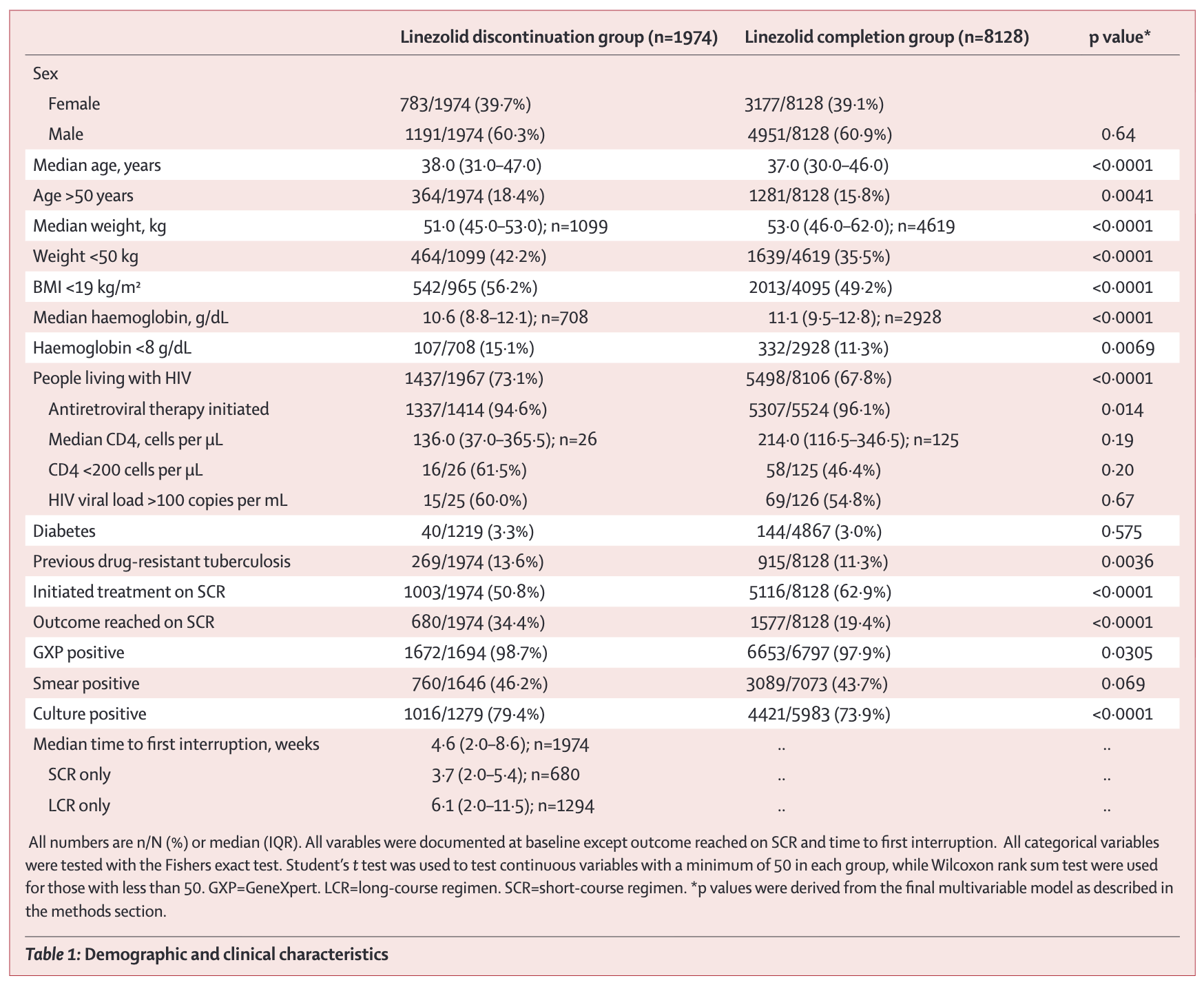
This is an observational study, not a trial, so the two groups weren’t formed by randomization. They differ on almost everything: age, weight, anemia, HIV positivity, prior drug-resistant TB. The p-values flag where differences this large would rarely arise from sampling alone if the two groups were truly equivalent. Note also the shifting denominators (1,099 of 1,974 for weight, 708 for haemoglobin), a clue that missing data is substantial (Oelofse et al., 2026). Without adjusting for these baseline differences, you’d confuse the effect of interruption with the effect of being sicker to start with.
REGRESSION TABLES (TABLE 2)
Regression output can look intimidating, but the core elements are interpretable:
Coefficients estimate the association between each predictor and the outcome. In linear regression, they represent the change in outcome per unit change in predictor (holding other variables constant). In logistic regression, exponentiated coefficients give odds ratios.
Standard errors indicate precision. Larger standard errors mean more uncertainty. You can approximate a 95% confidence interval as the coefficient \(\pm\) 2 \(\times\) standard error.
Confidence intervals provide a range of plausible values for each coefficient.
P-values test the null hypothesis, typically that the true coefficient is zero.
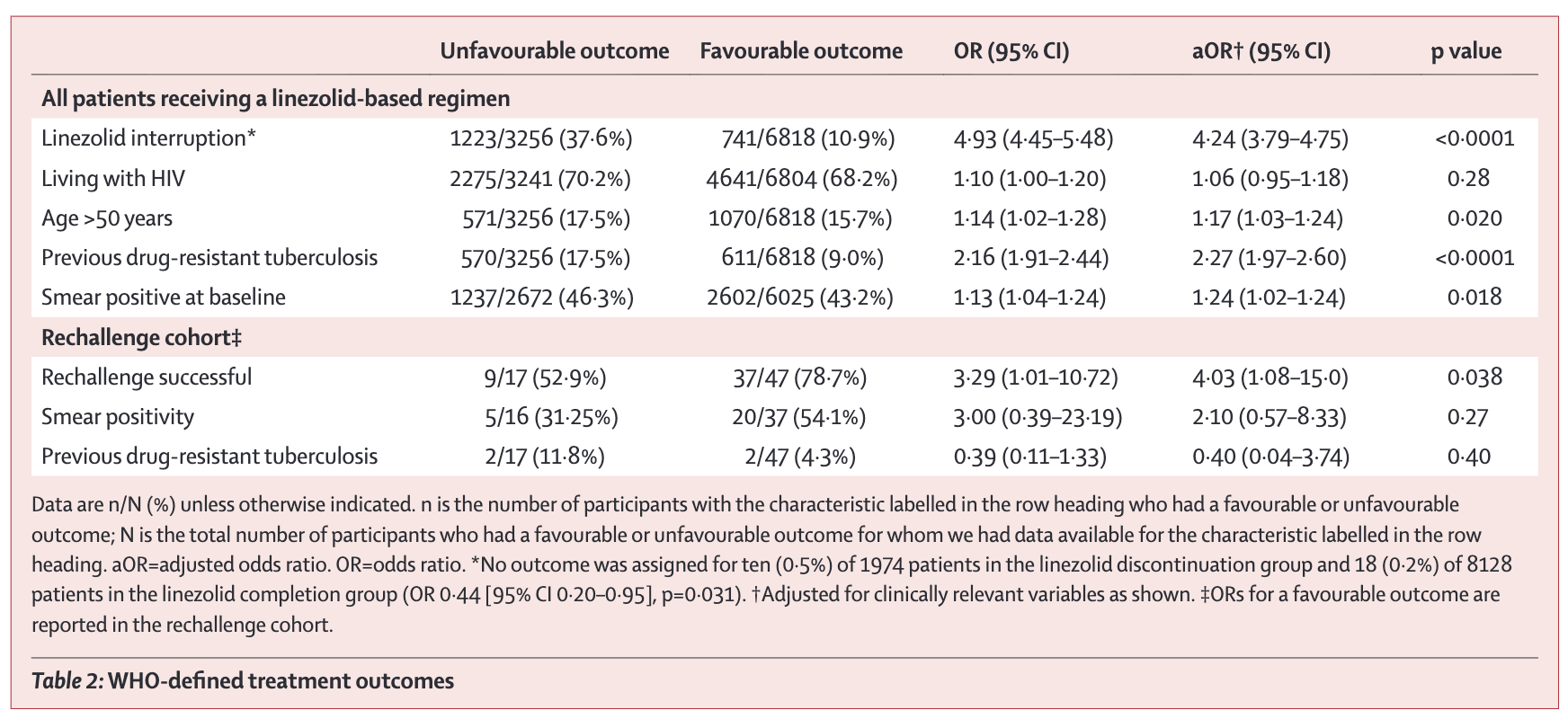
Read across the columns. The unadjusted OR for linezolid interruption is 4.93, meaning patients who interrupted had almost five times the odds of an unfavourable outcome (Oelofse et al., 2026). The adjusted OR (4.24) accounts for age, HIV status, previous drug-resistant TB, and smear positivity. Adjustment shrinks the estimate slightly but the effect remains large, and the 95% CI (3.79–4.75) is narrow because the sample is large. Now compare the rechallenge row at the bottom. The aOR for rechallenge success is 4.03, but the CI runs from 1.08 to 15.0. Same method, far fewer patients (n=64), and the precision falls apart.
KAPLAN-MEIER CURVES
Kaplan-Meier curves show the probability of survival (or remaining event-free) over time. The y-axis shows proportion event-free; the x-axis shows time. Curves step down as events occur. Key features:
- Separation between curves indicates differential outcomes between groups. Curves that diverge and stay apart suggest sustained differences.
- Numbers at risk (typically shown below the plot) indicate how many participants remain in follow-up at each time point. Steep drops in numbers signal potential bias from loss to follow-up.
The Oelofse study used Kaplan–Meier curves to compare time to unfavourable outcome and time to culture conversion between patients who interrupted linezolid and those who completed the course.
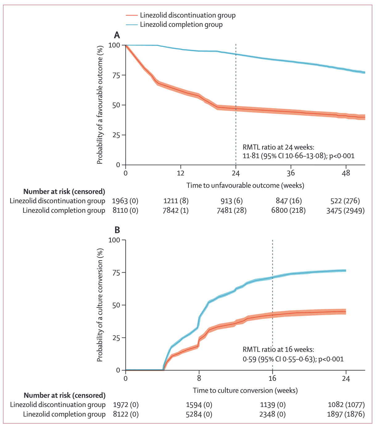
Two things stand out (Oelofse et al., 2026). First, the separation: by 24 weeks the completion group still has roughly 75% favourable outcomes while the discontinuation group has dropped near 50%. The gap opens early and persists. Second, the “Number at risk” row below the plot. Censored counts (in parentheses) grow rapidly past 36 weeks, so estimates at the right edge of the curve depend on fewer and fewer patients. Be cautious about reading too much into the tails.
One more subtlety. The authors couldn’t summarize this with a hazard ratio because the proportional hazards assumption failed (Schoenfeld test, p<0.001) (Oelofse et al., 2026). The relationship between the two groups changes over time, so a single HR can’t describe it. They reported the restricted mean time lost (RMTL) ratio instead. Assumption checks shape what statistics you can honestly report.
STUDY FLOW DIAGRAMS
Study flow diagrams trace participants from the source population through to the analyzed sample. The exact form depends on the study design. Randomized trials use CONSORT diagrams, which follow participants through screening, randomization, allocation, follow-up, and analysis. Observational studies use simpler flow diagrams that trace eligibility, exclusions, and subgroup splits without the randomization step. Across designs, you’re looking for the same things: how many people were screened versus enrolled, how the sample narrowed at each stage, how many were lost to follow-up and why, and how many ended up in the analysis. If a study enrolled 500 participants but analyzed only 200, that’s a potential attrition bias problem worth investigating.
The Oelofse example below is from an observational study, so it doesn’t show randomization, but the same questions apply: where did people drop out, and what does each exclusion do to generalizability?
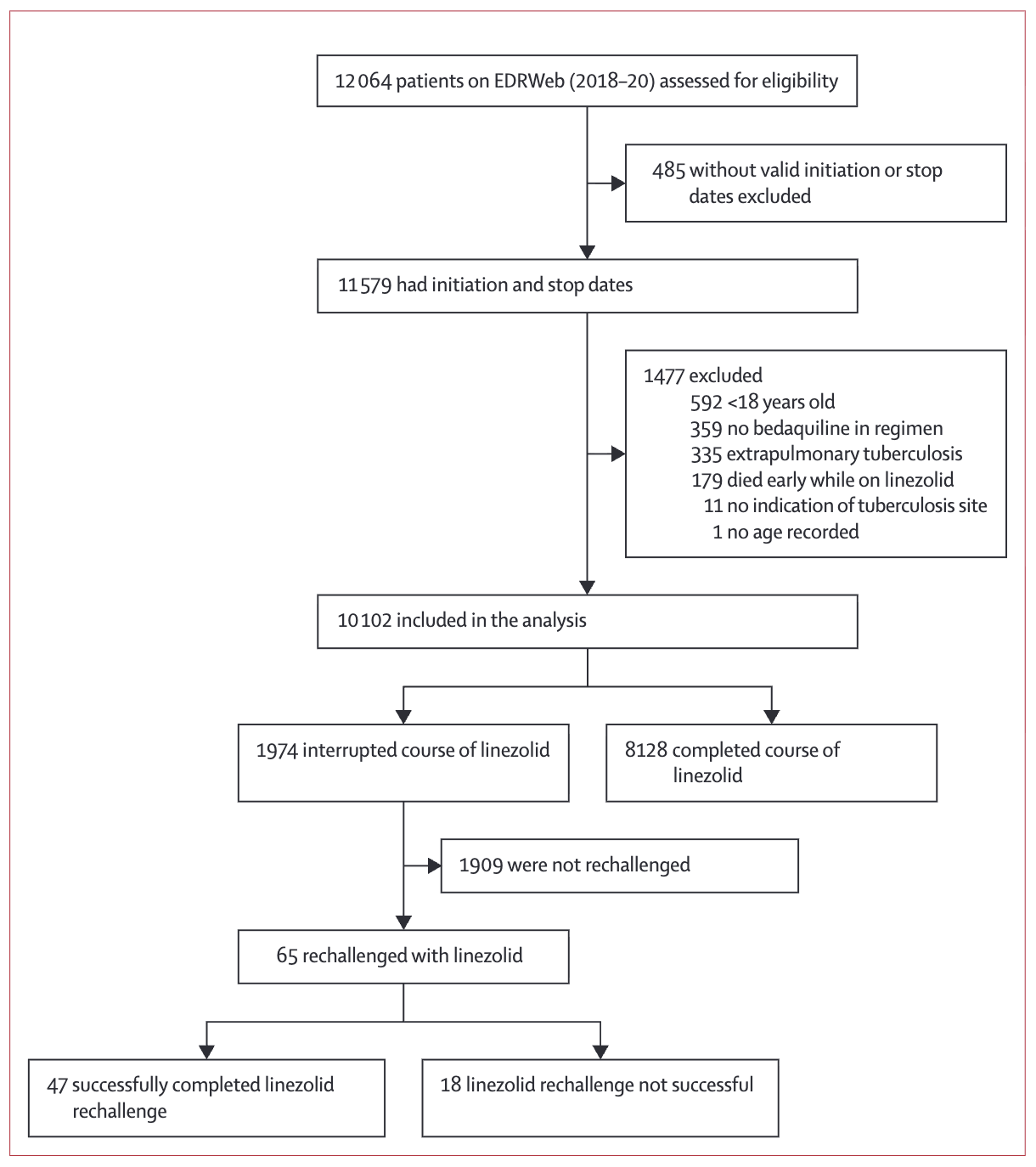
Trace the path top to bottom (Oelofse et al., 2026). The study began with 12,064 patients on the national register and ended with 10,102 in the analysis, after excluding cases with missing dates, children, patients without bedaquiline, extrapulmonary TB, and early deaths. Each exclusion is defensible but each one narrows generalizability. The findings apply to adults with pulmonary disease who survived long enough to potentially interrupt linezolid, not to the original 12,064.
Look down the rechallenge branch. Only 65 of 1,974 interrupters (3.3%) were rechallenged at all (Oelofse et al., 2026). That branch is the rate-limiting subgroup for any conclusion about rechallenge, and a thin branch like this should make you ask whether the study has enough cases there to support its claims.
FOREST PLOTS
Forest plots display effect estimates from multiple studies or subgroups. Each line represents a study, with a square showing the point estimate and horizontal lines showing the confidence interval. A diamond at the bottom represents the pooled estimate.
Forest plots appear in nearly every meta-analysis, and learning to read them unlocks a powerful way of understanding synthesized evidence. Let me walk you through interpreting one using a real example from the Cochrane review of antimalarials for preventing malaria during pregnancy (Radeva-Petrova et al., 2014) that we encountered in Chapter 4.
Figure 5.5 shows the effect of preventive antimalarials versus placebo or no intervention on maternal death. Once you can read this forest plot, you can read any forest plot.
Reading the columns:
- Study: Author, year, and country
- Antimalarial n/N: Events and total participants in the treatment group (e.g., 1/518 means 1 death among 518 women)
- Control n/N: Events and total participants in the control group
- Weight: How much each study contributes to the pooled estimate (larger studies get more weight)
- RR [95% CI]: The numerical risk ratio and confidence interval
Reading the forest plot:
- Squares: Point estimates for each study. The square’s position shows the risk ratio.
- Horizontal lines: 95% confidence intervals showing the range of plausible values.
- Vertical line at 1.0: The line of no effect. Studies whose confidence intervals cross this line are not statistically significant.
- Diamond: The pooled estimate combining all studies.
Reading individual studies:
Look at Greenwood 1989 (Gambia). The square sits at 0.34, meaning the risk of maternal death was 66% lower in the antimalarial group. But the horizontal line extends from 0.04 to 3.27—a huge range that crosses 1.0. This study had only 1 death in the intervention group and 3 in the control group—too few events to draw confident conclusions. The wide confidence interval tells you the estimate is imprecise.
Reading the pooled estimate:
The diamond at the bottom represents the pooled effect across all four studies. It’s centered at 0.84 (95% CI: 0.25-2.74). Because this interval includes 1.0, the pooled effect is not statistically significant—we can’t conclude that antimalarials reduce maternal mortality based on this evidence.
When heterogeneity (I²) is high, the pooled estimate becomes less meaningful. A pooled average of very different effects may not represent any real-world intervention. Focus on understanding why studies differ.
So what does this forest plot tell us? Maternal death is thankfully rare, so even with thousands of participants enrolled across these trials, there are very few events to analyze. Few events mean wide confidence intervals. The individual point estimates range from 0.34 to 3.00, with some studies suggesting benefit and others suggesting harm. When events are rare, random variation alone can produce swings this large.
The pooled estimate (0.84, 95% CI 0.25–2.74) is therefore inconclusive. The interval includes substantial benefit, no effect, and substantial harm. We can’t tell from this evidence whether antimalarials affect maternal mortality. And that’s the key reading lesson: absence of evidence is not evidence of absence. This plot doesn’t show that antimalarials don’t reduce maternal mortality. It shows we don’t yet have enough data to know.
WATCH FOR MISLEADING VISUALIZATIONS
Data visualizations can mislead, sometimes intentionally and sometimes carelessly. A systematic examination found that pie charts are the most frequently misused graphic, with problems including incorrect proportions that don’t sum to 100%, three-dimensional graphics that distort perception, and counterintuitive color choices (Nguyen et al., 2021). Another systematic review catalogued common pitfalls in graphical presentation: line plots used for categorical variables (implying false continuity), bar charts without error bars, overcrowded graphs that obscure key patterns, and truncated y-axes that exaggerate small differences (Sperandei, 2014).
When you encounter a figure, run a quick check. Does the y-axis start at zero, or has it been truncated to make small differences look dramatic? Are error bars or confidence intervals shown, and if not, why not? Could the same data be shown more clearly in a different format, or would a table communicate it more precisely?
SUBGROUP AND SENSITIVITY ANALYSES
Sophisticated papers don’t just report one main result. They test whether findings hold across different conditions.
Subgroup analyses divide participants by characteristics and estimate effects within each group. A trial might report effects separately for children under 5 versus children 5–15, urban versus rural settings, or studies with high versus low risk of bias. When you read a subgroup analysis, ask whether the subgroups were pre-specified or explored after seeing the data, whether each subgroup has enough participants for a reliable estimate, whether the authors tested for interaction (whether the effect truly differs between groups rather than just appearing to), and whether the results make clinical sense. Be cautious. With enough subgroups, you’re likely to find some “significant” differences by chance. Pre-specified subgroups based on biological or clinical reasoning are more credible than exploratory ones.
Sensitivity analyses test whether conclusions change under different assumptions. Authors might exclude studies with high risk of bias, refit the model with a different statistical specification, drop outliers, or redefine the outcome. If conclusions hold across these analyses, you can have more confidence in the findings. If conclusions flip depending on analytic choices, the evidence is more fragile. Sensitivity analyses are often relegated to an appendix, but they’re worth reading.
5.6 Assessing External Validity and Relevance
A study with strong internal validity for making causal claims might have limited use if its findings don’t apply to the populations and settings you care about. External validity asks: Do these findings generalize beyond the study context?
We devote an entire chapter to external validity (Chapter 8) because it’s one of the most important—and most neglected—challenges in global health research. Here we cover what you need for critical reading; the dedicated chapter goes deeper into frameworks and reasoning.
When reading a paper, ask yourself three questions:
1. WHO WAS ACTUALLY STUDIED?
Look past the abstract’s claims to the actual study population:
- Demographics: Age, sex, socioeconomic status, education
- Geography: Urban vs. rural, specific countries or regions
- Health system context: Primary care, hospitals, specialty clinics
- Disease severity: Mild vs. severe, early vs. advanced
Studies with very restrictive eligibility criteria likely have limited external validity. A diabetes trial enrolling only patients aged 40-60 in urban tertiary hospitals might tell you, a physician-scientist serving rural adolescents, little in the way of actionable evidence.
2. COULD THIS WORK IN YOUR SETTING?
Even effective interventions may not transfer across contexts. Consider:
- Infrastructure: Does the intervention require electricity, cold chain, or laboratory capacity you lack?
- Workforce: Are the required skills and supervision structures available?
- Cultural fit: Do beliefs about illness, help-seeking behavior, or gender norms differ?
- Cost: Is the intervention affordable in your financing context?
3. WAS THIS A “REAL-WORLD” TEST?
Trials sit on a spectrum from pragmatic to explanatory:
- Pragmatic trials recruit broadly, use typical providers, and compare to usual care—findings more likely to generalize to routine practice
- Explanatory trials restrict to ideal participants, use specialized staff, and compare to placebo—findings may not survive contact with the real world
Neither is better; they answer different questions. But knowing where a study falls on this spectrum helps you judge applicability.
THE BOTTOM LINE
The question isn’t “Does this evidence apply?” (binary) but “Under what conditions does this evidence apply, and how well do those conditions match my context?” (nuanced). For a systematic framework to reason through this question—including the UTOS framework and five principles of generalization—see Chapter 8.
5.7 Reading the Discussion Section Like a Skeptic (But Not a Cynic)
The Discussion section is where authors interpret their findings, connect their work to the broader literature, acknowledge limitations, and make claims about importance. Your job is to evaluate whether their interpretation matches the data.
ARE THE CONCLUSIONS SUPPORTED BY THE DATA?
Watch for logical leaps between results and conclusions. The most common move is to slip from “associated with” to “leads to” without acknowledging the gap. An observational study finding that A is associated with B does not establish that A causes B without a clear strategy for causal inference. A second common overreach is extrapolating far beyond the study population. A study conducted among urban, educated young adults shouldn’t draw conclusions about rural, less-educated, older populations without explicitly acknowledging the leap. Authors also tend to attribute effects to mechanisms that weren’t tested: if a study found that an intervention improved outcomes but didn’t measure the hypothesized mechanism, the mechanism remains speculation, not established fact. Finally, small effects get inflated into practical importance. Statistically significant doesn’t mean clinically significant.
It’s ok for authors to speculate, but it needs to be clearly labeled as such.
ARE ALTERNATIVE EXPLANATIONS CONSIDERED?
Good discussions entertain alternative explanations for findings. Did the authors consider confounding variables they couldn’t control? Selection bias in who participated? Chance findings from running many comparisons? Temporal trends that might explain pre-post differences? Reverse causality, where the outcome caused the exposure rather than the other way around?
The hardest challenge in causal inference—and maybe in all of research—is ruling out plausible alternative explanations.
ARE LIMITATIONS ACKNOWLEDGED?
Every study has limitations. The question is whether authors acknowledge them honestly.
Look for proportionality. Do the stated limitations match the design weaknesses you noticed while reading the methods? Consider a pilot study of group prenatal care in Malawi and Tanzania, which concluded cautiously: “the results should be interpreted with caution because the sample size was small and implementation occurred in only three health facilities” (Patil et al., 2017). The authors went further, stating that “to address these weaknesses, the next step is to seek funding for a large RCT.” That’s appropriate humility. The authors named the weaknesses and used them to direct future research.
A journal editor once told me my limitations section at the end of the paper makes the reader less interested in the paper. It was bad for the vibes, as the youths might say.
Other discussion sections bury limitations in a brief paragraph at the end or dismiss them as unlikely to affect conclusions. When the stated limitations are vague or thin compared to what you can see in the methods, treat the conclusions with extra caution.
ARE POLICY IMPLICATIONS REALISTIC?
When authors recommend policy changes or clinical practice shifts, ask whether the evidence base is strong enough to warrant the recommendation. Were important implementation barriers considered? What would adoption actually require in practice? And who would bear the costs versus who would receive the benefits?
Policy recommendations are not a requirement of every paper. Your N of 7 manuscript can contribute something valuable without suggesting how we change national policy.
IS UNCERTAINTY COMMUNICATED HONESTLY?
Acknowledging uncertainty is not a weakness. It’s an honest reflection of the state of evidence at a moment in time. Science corrects itself over time, and the only way that process works is if each study reports clearly what it does and doesn’t know. No model is perfect. No sample fully captures the world. No measurement tool is free of error. The best discussions name those limits, explore where the findings might not hold, and resist the temptation to overclaim.
Be more suspicious of discussions that project certainty than of those that sit with ambiguity. A paper that quantifies its uncertainty, reports its sensitivity analyses, and tells you where its conclusions might break is doing the harder, more useful work.
5.8 Practical Tools: Heuristics and Checklists
After reading hundreds of papers, certain questions become automatic. Here’s a quick appraisal guide to get you started.
TEN CORE QUESTIONS FOR ANY STUDY
What is the research question? (If you can’t state it clearly, neither can you evaluate the answer.)
What type of study is this? (RCT, cohort, qualitative, systematic review, etc.)
Who was studied and how were they selected? (Is this population relevant to you?)
What comparison was made? (Treatment vs. control? Exposed vs. unexposed?)
How were outcomes measured? (Valid? Reliable? Blinded?)
What is the effect size and precision? (Not just p-values—actual magnitude and confidence intervals.)
What could have gone wrong? (Confounding, selection bias, measurement bias, attrition)
Are results consistent across subgroups and sensitivity analyses? (Or do findings depend heavily on specific assumptions?)
Do conclusions match the data? (Are authors appropriately cautious?)
Does this apply to my context? (External validity for your population and setting)
ESTABLISHED CHECKLISTS
Several validated tools exist for systematic critical appraisal:
Reporting checklists exist for nearly every major study design. The EQUATOR Network maintains a comprehensive library: CONSORT for randomized trials, STROBE for observational studies, PRISMA for systematic reviews, SPIRIT for trial protocols, and dozens more. CONSORT, for example, specifies the items that should appear in any RCT report: randomization methods, allocation concealment, blinding, and outcome reporting (Campbell et al., 2004). Extensions cover cluster RCTs, pragmatic trials, and other variants. When a study’s reporting hits these marks, it’s at least attempting systematic transparency.
ROBINS-I (Risk of Bias in Non-randomized Studies of Interventions) assesses risk of bias in non-randomized studies across domains including confounding, selection, intervention measurement, departures from intended interventions, missing data, and outcome measurement (De Cassai et al., 2025).
RE-AIM evaluates implementation research across Reach (who participated), Effectiveness (what outcomes occurred), Adoption (who delivered it), Implementation (how was it delivered), and Maintenance (was it sustained) (Glasgow et al., 2013).
CFIR (Consolidated Framework for Implementation Research) provides comprehensive structure for understanding implementation across intervention characteristics, outer setting, inner setting, individual characteristics, and process (Konrad et al., 2022).
GRADE (Grading of Recommendations, Assessment, Development and Evaluation) assesses certainty of evidence when synthesizing findings, considering study design, risk of bias, consistency, directness, precision, and publication bias (De Cassai et al., 2025).
You don’t need to memorize these tools. But knowing they exist—and that serious appraisal follows systematic approaches—helps you understand what rigorous evaluation looks like.
ETHICAL CONSIDERATIONS
Critical appraisal includes evaluating whether research was conducted ethically—particularly important in global health given historical concerns about exploitation and power imbalances. Look for evidence of appropriate ethical oversight, meaningful informed consent, community engagement, and equitable partnerships. For a full discussion of research ethics and what to look for, see ?sec-research-ethics.
5.9 Closing Reflection
Throughout this chapter, I’ve emphasized the importance of critical appraisal—systematically evaluating the quality of evidence. But I want to close with a note about humility.
We’ll think about how to communicate your critical appraisal to colleagues in ?sec-publishing when we talk about peer review.
Every study we evaluate was conducted by researchers who worked hard, faced constraints, and made difficult tradeoffs. Critical appraisal is not about finding reasons to dismiss their work. It’s about understanding what we can learn from imperfect evidence.
In global health, resources are limited and contexts are complex. The alternative to imperfect evidence is often no evidence at all, and decisions must still be made.
The goal of critical appraisal is calibrated confidence. It’s about knowing when to act on findings, when to wait for more data, and when to proceed with caution.
The papers you read represent our collective effort to understand how to improve health. Read them critically, but also read them generously, recognizing the genuine contributions even imperfect studies make to our understanding.
At the same time, don’t shy away from providing honest feedback. Some grant proposals should not be funded, some manuscripts not published. Whenever possible, pair critical appraisal with constructive feedback intended to move the idea forward.
Asante, K. P. et al. (2024). Feasibility, safety, and impact of the RTS, s/AS01E malaria vaccine when implemented through national immunisation programmes: Evaluation of cluster-randomised introduction of the vaccine in ghana, kenya, and malawi. The Lancet, 403(10437), 1660–1670.
Campbell, M. K. et al. (2004). CONSORT statement: Extension to cluster randomised trials. BMJ (Clinical Research Ed.).
Cochrane, A. L. (1972). Effectiveness and efficiency: Random reflections on health services.
Cooper, H. (2019). Research synthesis and meta-analysis: A step-by-step approach (5th ed.). Sage Publications.
De Cassai, A. et al. (2025). Methodological standards for conducting high-quality systematic reviews. Biology.
Glasgow, R. E. et al. (2013). Use of RE-AIM to address health inequities: Application in a low-income community health center based weight loss and hypertension self-management program. Translational Behavioral Medicine.
Konrad, L. M. et al. (2022). Evaluating the implementation of the active life improving health behavior change program "BCP-VAMOS" in primary health care: Protocol of a pragmatic randomized controlled trial using the RE-AIM and CFIR frameworks. Frontiers in Public Health.
Lakens, D. (2022). Improving your statistical inferences.
Lincoln Yvonna, S. et al. (1985). Naturalistic inquiry. Beverly Hills: Sage Publications.
Nguyen, V. T. et al. (2021). Examining data visualization pitfalls in scientific publications. Visual Computing for Industry, Biomedicine, and Art.
Oelofse, S. et al. (2026). Association of linezolid interruption and rechallenge with clinical outcomes in patients with rifampicin-resistant tuberculosis in South Africa, 2018–22: An observational cohort study. The Lancet Global Health, 14(4), e579–e588.
Patil, C. L. et al. (2017). Implementation challenges and outcomes of a randomized controlled pilot study of a group prenatal care model in malawi and tanzania. International Journal of Gynaecology and Obstetrics.
Radeva-Petrova, D. et al. (2014). Drugs for preventing malaria in pregnant women in endemic areas: Any drug regimen versus placebo or no treatment. Cochrane Database of Systematic Reviews, 10.
Sackett, D. L. et al. (1996). Evidence based medicine: What it is and what it isn’t. BMJ, 312(7023), 71–72.
Smith, S. K. et al. (2023). Performance of screening tools for cervical neoplasia among women in low- and middle-income countries: A systematic review and meta-analysis. PLOS Global Public Health.
Sperandei, S. (2014). The pits and falls of graphical presentation. Biochemia Medica.