11 Quasi-Experimental Designs
London, 1854. Cholera was tearing through the city, and most physicians were sure they knew why: miasma, the foul air rising from the Thames and the city’s open sewers. Bad air made people sick. It was obvious.
John Snow had a different idea. He suspected cholera spread through contaminated water, not air. But he couldn’t run an experiment. He couldn’t randomize which Londoners drank from which source. So he found the next best thing.
Two water companies served overlapping neighborhoods in south London, and one had recently moved its intake pipe upstream of the city’s sewage outflows while the other hadn’t. Households on the same street, in the same conditions, were drinking water from different sources for reasons that had nothing to do with their health. Snow compared death rates and found that households served by the company still drawing from the contaminated section of the Thames died at roughly eight times the rate of those with cleaner water.
No randomization. No experiment. But a powerful causal claim, built on the logic that an accident of infrastructure had created comparison groups almost as good as anything a trial could produce. Snow’s investigation is one of the earliest examples of what we now call a quasi-experimental design.
Quasi-experimental designs are research methods that attempt to establish causality without random assignment to treatment and comparison groups.
We often find ourselves in Snow’s shoes. We want to estimate the effect of conflict on child malnutrition, but we can’t randomize wars. We ask if air pollution causes asthma in children, but we wouldn’t randomly assign families to breathe dirty air. Sometimes randomization is technically possible but nobody with decision-making authority will agree to it. And sometimes the question is retrospective: the exposure already occurred, and you’re working with the data history left behind.
In Chapter 7, I introduced two broad strategies for causal inference from non-experimental data: confounder control, which closes backdoor paths through statistical adjustment, and design-based approaches, which isolate front-door variation that mimics randomization. This chapter is about the latter.
11.1 The Credibility Revolution
In 1983, the economist Edward Leamer published a devastating critique of his own field. Empirical results, he argued, were fragile—change the specification, the sample, or the set of control variables, and the conclusions changed too. “Hardly anyone takes data analysis seriously,” he wrote. “Or perhaps more accurately, hardly anyone takes anyone else’s data analysis seriously” (Leamer, 1983).
He was right. For most of the 20th century, the standard approach to causal questions in the social sciences was to collect observational data, run a regression, “control for” confounders, and call it causal. The problem wasn’t that researchers lacked statistical tools. It was that they lacked credible reasons to believe their estimates were causal rather than confounded. You could always add another control variable, try another functional form, argue about logs versus levels. The results often shifted with each choice, and there was no principled way to decide which specification was right.
The tools for a different approach already existed (Shadish et al., 2002). Economists had instrumental variables. Campbell and his collaborators had cataloged threats to validity and offered a taxonomy of designs to counter them. Education researchers had formalized regression discontinuity. But these were curiosities, not standard practice.
Identification strategy refers to the research design and assumptions that allow you to isolate a causal effect from observational data. It’s the answer to the question: “Why should I believe this estimate is causal?”
What changed—in what Angrist and Pischke (2010) call the credibility revolution—was less about inventing new techniques than about demanding new standards. Researchers began asking a simple question: What is your identification strategy? What feature of your research design—not your statistical model—gives you a credible claim to causality? A natural experiment, a policy discontinuity, a sharp eligibility threshold, an interrupted time series with a clear break point. The idea that design should come first, and that without a credible identification strategy your findings were hard to trust, was the revolution. The best contemporary design-based studies make both an institutional case (here is why this variation is plausibly exogenous) and an empirical one (here are the tests that support that claim).
This isn’t a rejection of confounder control. DAGs and modern causal inference frameworks (see Chapter 7) have made statistical adjustment far more principled than the old “throw variables into a regression” approach. Design-based and confounder-control strategies are complementary tools, not rivals. We return to confounder control in Chapter 12.
This chapter introduces six quasi-experimental approaches, arranged roughly from simplest to most sophisticated: single group pre-post designs, multiple group post-test only designs, difference-in-differences, interrupted time series, regression discontinuity, and instrumental variables.
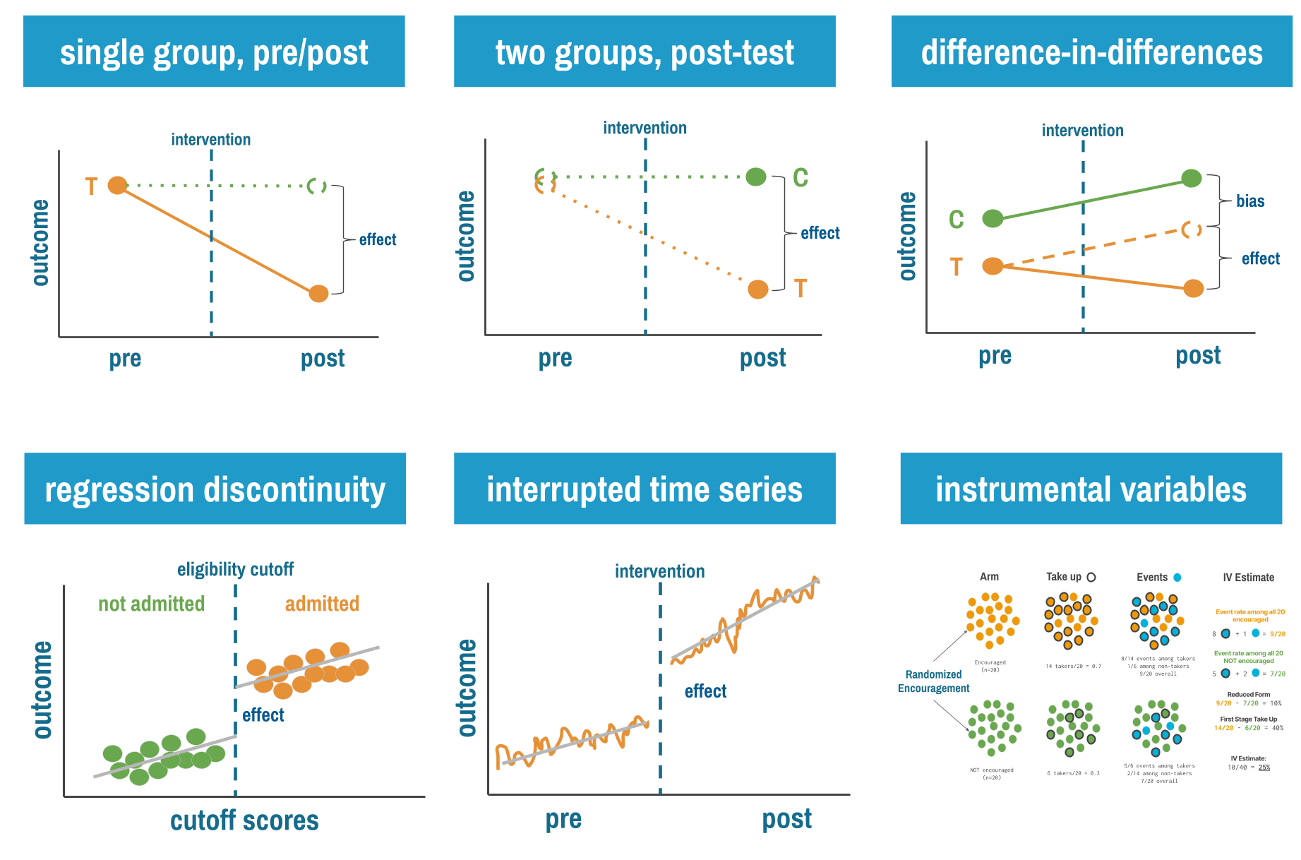
11.2 Single Group Pre-Post Designs
Let’s start with the simplest (and weakest) quasi-experimental design: measure an outcome before an intervention, implement the intervention for everyone, then measure the outcome again. If the outcome improved, the intervention worked. Right?
If only it were that simple.
THE LOGIC
Single group pre-post designs (sometimes called “before-after” studies) follow this structure:
- Pre-test: Measure your outcome of interest at baseline (time 0)
- Intervention: Implement your program or policy with everyone
- Post-test: Measure the same outcome after the intervention (time 1)
- Comparison: Calculate the change from pre to post
The pre-intervention outcome stands in for what would have happened without treatment. That’s your counterfactual. The causal claim rests on a simple subtraction—post minus pre equals effect—and it holds only if nothing else changed between the two measurements. The world held still while your intervention played out. That’s the key assumption, and it rarely holds.
THREATS TO VALIDITY
Imagine you’re evaluating an educational program to reduce stigma against mental health conditions in a low-income country. You measure stigma levels in January, implement a six-month education campaign, then measure stigma again in July. Stigma decreased by 15%. Success?
Maybe. But what else happened between January and July? Perhaps a celebrity disclosed their mental health struggles, sparking national conversation. Maybe the government launched an unrelated anti-stigma campaign. Perhaps seasonal employment patterns changed people’s stress levels and attitudes. Or maybe people just got more comfortable with your survey over time and reported their true (less stigmatized) attitudes in the second measurement.
The fundamental threat to single group pre-post designs is confounding by time: any other factor that changed between pre and post measurements can masquerade as a treatment effect.
This is the Achilles heel of pre-post designs: you can’t distinguish the intervention’s effect from everything else that happened during the same period. Statisticians call these history effects—not history in the sense of long ago, but in the sense of “what other events occurred during this period?”
Beyond history effects, single group pre-post designs face several other validity threats:
Maturation: Natural changes over time that would occur even without intervention. Childhood development programs face this constantly. Children’s language skills improved after your intervention, but they improve anyway as children age.
Regression to the mean: If you select participants because they’re at an extreme (say, communities with the highest malaria rates), they’ll likely move closer to average on the next measurement simply due to random variation, not your intervention.
Testing effects: Sometimes the act of measuring changes the outcome. If you survey people about handwashing practices, they may become more aware and change their behavior before the intervention even starts.
Instrumentation: Changes in how you measure the outcome can create false effects. If you switch from self-reported data to observer ratings, any differences might reflect measurement changes, not real changes.
Ask yourself: What would have happened to the outcome if I had done nothing? This question—the counterfactual—is at the heart of all causal inference.
WHEN TO CONSIDER THIS DESIGN
Shadish, Cook, and Campbell (2002) argue that designs without comparison groups can be useful under specific conditions.
You understand the outcome’s natural behavior. The strongest case for a pre-post design is when you have deep background knowledge about what the outcome does without intervention. Consider newborn screening for phenylketonuria (PKU). Before screening, untreated PKU caused severe intellectual disability in virtually every affected child. After universal screening and dietary treatment, affected children developed normally. No comparison group was needed because the natural history was so well established and so invariant that any departure was clearly attributable to the intervention.
Effects are immediate and dramatic. When an intervention produces a sharp, sudden change in an outcome that was previously stable, alternative explanations lose plausibility. If hospital-acquired infection rates held steady at 2-3% for five years, then dropped to 0.5% within weeks of a new hygiene protocol, history and maturation become hard sells. The larger and more abrupt the effect, the fewer threats remain credible (but only if the pre-intervention trends are well documented and stable).
Alternative explanations are known and implausible. Sometimes you can’t eliminate threats to validity by design, but you can reason through them. If you can enumerate the plausible alternatives and show why each is unlikely in your specific context, a pre-post design gains credibility. This requires honesty and domain expertise, not just statistical technique.
Exploratory research in understudied areas. Sometimes you don’t know enough about a topic to design a controlled study. You’re working in a new context, with a new population, or on a problem that hasn’t been well characterized. A pre-post design lets you start somewhere. You learn what the outcome looks like before and after, how feasible measurement is, what the variability looks like, and whether there’s a signal worth pursuing with a stronger design. This isn’t a weakness. It’s the scientific process working as intended.
Formative evaluation. When your goal is program improvement rather than causal claims, pre-post measurement is entirely appropriate. Are participants learning? Is behavior changing in the expected direction? Pre-post data can guide refinement even when it can’t prove causality.
HOW TO STRENGTHEN THE DESIGN
Shadish, Cook, and Campbell (2002) describe three principles for quasi-experimentation that apply with special force to pre-post designs: (i) identify plausible threats to validity; (ii) prioritize control by design over control by statistics; and (iii) look for coherent patterns across multiple sources of evidence. Several design enhancements put these principles into practice.
Add a double pretest. Collect the outcome at two time points before the intervention. If scores are stable across both pretests, maturation and regression to the mean become less plausible explanations for any post-intervention change. If scores are already trending upward before you intervene, you know the change isn’t yours to claim.
Measure a nonequivalent dependent variable. Choose a second outcome that should not be affected by the intervention but would be affected by the most plausible threats. If your hygiene training improves handwashing compliance but doesn’t change an unrelated behavior measured the same way, testing effects and social desirability become less convincing alternatives.
Remove and reintroduce the treatment. If you can withdraw the intervention and the outcome reverts, then reintroduce it and the outcome improves again, you’ve created a powerful pattern that’s hard to attribute to history or maturation. This is the logic behind A-B-A-B designs in behavioral research, and it’s available whenever the intervention is reversible.
Extend follow-up with multiple post-measurements. One post-intervention measurement is weak. Multiple measurements let you see whether effects persist, fade, or grow, and whether the trajectory changed at the point of intervention rather than drifting gradually.
Look for dose-response relationships. If communities with more intensive implementation show larger effects, that pattern is more convincing than a simple before-after comparison.
This is like hitting a multi-leg parlay. The payout is larger than a single bet because it’s harder to hit on all legs.
Practice coherent pattern matching. The goal is to assemble multiple pieces of evidence that, taken together, point to the same conclusion. No single element is decisive. But if the double pretest is stable, the nonequivalent dependent variable doesn’t change, the effect appears immediately after intervention, and the dose-response relationship holds, the causal claim becomes difficult to dismiss.
None of these are rules you can follow mechanically. They are arguments you have to make, and make well, to a skeptical audience. A double pretest doesn’t automatically license a causal claim. A nonequivalent dependent variable doesn’t inoculate you against all threats. Each design enhancement narrows the list of plausible alternatives, but it’s your job to convince readers that the alternatives that remain are implausible in your specific context. The standard isn’t perfection. It’s honesty. Don’t fool yourself into seeing a treatment effect where the evidence is ambiguous, and don’t write up exploratory findings as though you’ve established causation. If you’re using a pre-post design for rigorous causal inference, you need to earn that claim.
LIMITATIONS
The pre-post design’s greatest strength is also its most common misuse: it’s feasible when nothing else is. It costs less and demands less infrastructure than controlled designs. But the design is only as strong as your knowledge of the counterfactual. Without additional design features, you cannot separate the intervention’s effect from history, maturation, or secular trends. Regression to the mean is a constant threat when you select extreme cases. Testing and instrumentation effects can masquerade as real change. And the systematic evidence is clear: pre-post designs tend to produce larger effect estimates than controlled designs studying the same interventions, which should give you pause.
REAL-WORLD EXAMPLE
Parenting to Prevent Child Abuse in South Africa
When Cluver and colleagues (Cluver et al., 2016) set out to study whether a parenting program could reduce child abuse among adolescents in low- and middle-income countries, there was no existing evidence. They needed to start somewhere, but the evidence base was so thin that designing a full randomized trial would have meant guessing at nearly every parameter.
They chose a pre-post design deliberately. The Sinovuyo Teen Programme enrolled 115 adolescent-caregiver dyads in rural Eastern Cape, South Africa—one of the country’s poorest provinces. Families were recruited through schools, welfare services, and door-to-door community sampling with no exclusion criteria. The 12-week program was delivered by local NGO childcare workers, not trained psychologists.
The results were striking. Adolescent-reported abuse dropped from an average score of 4.33 to 1.33 (p < 0.001). Caregiver-reported abuse fell from 11.32 to 1.68 (p < 0.001). Positive parenting improved. Depression decreased in both adolescents and caregivers. No harmful effects were detected on any outcome.
But the researchers didn’t claim they’d proven the program works. They called their findings “indicative of potential programme results” and were explicit that a pre-post design “cannot determine causality.” The study served three purposes that a pre-post design handles well: it established that the program was safe, it generated the effect size estimates needed to power a future trial, and it revealed an unexpected finding—program diffusion through communities—that directly shaped the next study’s design. Families were spontaneously teaching program content to neighbors, in churches, and on shared taxi-buses. This meant an individually randomized trial would be contaminated, so the team pivoted to a cluster randomized design.
This is a pre-post study used exactly as intended: not as a final word on causality, but as the essential first step in a research program. The team invested in construct validity (standardized measures from both adolescent and caregiver perspectives) and external validity (real-world delivery conditions, no exclusion criteria) rather than internal validity. That was a deliberate tradeoff, and they were transparent about it.
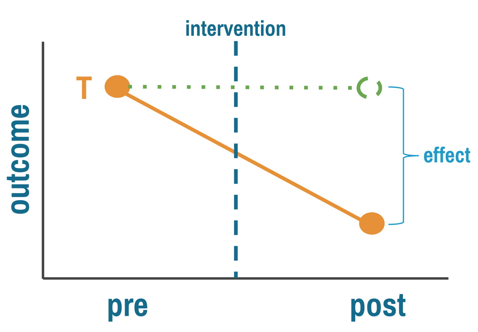
11.3 Multiple Group Post-Test Only Designs
The pre-post design’s fatal flaw is that you can’t easily separate your intervention from everything else that changed over the same period. One way around this: instead of comparing one group to itself over time, compare two different groups at the same point in time. One got the intervention, one didn’t. If the groups are comparable, any difference in outcomes is your estimate of the treatment effect. That’s a big “if.” In an RCT, randomization makes the groups comparable by design. Here, nobody randomized anything.
THE LOGIC
By comparing groups at the same point in time, you eliminate the history effects that plague pre-post designs. Both groups experienced the same historical events, seasonal patterns, and broader social changes.
But you’ve introduced a new problem: selection bias. How did groups end up in treatment or control? If assignment wasn’t random, the groups might differ in ways that affect the outcome, and those differences get confused with the treatment effect.
Consider evaluating two malaria prevention strategies in different villages. Village A received insecticide-treated bed nets (ITNs) plus indoor residual spraying (IRS). Village B received only ITNs. You measure malaria incidence three months later and find Village A has 40% lower incidence.
Was it the combination intervention? Maybe. But what if Village A was selected for the intensive intervention because it had better health infrastructure, making implementation easier? Or what if Village A residents were more health-conscious (that’s why they were chosen), and they would have had lower malaria incidence anyway? Or what if Village A is at higher elevation with fewer mosquitoes?
You see the problem: without random assignment, you don’t know if the groups were comparable before the intervention.
The comparison group’s outcome stands in for what the treatment group would have experienced without the intervention. The key assumption is that the two groups were similar enough before treatment that any post-treatment difference reflects the intervention, not pre-existing differences.
THREATS TO VALIDITY
Selection bias takes many forms in global health research:
Geographic selection: Interventions often roll out first in areas with better infrastructure, stronger political support, or more engaged community leaders. These areas likely have better health outcomes anyway.
Volunteer bias: When individuals self-select into programs (like health insurance enrollment or voluntary testing), they differ systematically from non-participants. The worried well enroll in insurance. The health-conscious seek testing. These aren’t random samples.
Administrative selection: Programs target “high-need” populations—which sounds equitable but creates selection bias. If you compare high-need intervention communities to average-need comparison communities, differences might reflect baseline need rather than intervention effects.
Implementer selection: NGOs and implementing organizations choose sites based on feasibility, relationships, or strategic priorities. Village A gets the intensive intervention not because of randomization but because the implementing partner has an established relationship with village leaders.
Each of these is confounding by another name. The factor that determined who got the intervention also affects the outcome, creating a backdoor path (see Chapter 7) that makes it impossible to isolate the treatment effect from the selection process.
Selection bias rule of thumb: If you can easily explain why certain groups got the intervention (beyond “we randomly chose them”), you have selection bias to worry about.
WHEN TO CONSIDER THIS DESIGN
The most common reason is the most straightforward: you’re evaluating something that already happened. The program launched before anyone thought to collect baseline data. A policy changed and now a funder wants to know if it worked. An emergency intervention was deployed and the question of impact comes later. Shadish, Cook, and Campbell (2002) note that this design is frequently used “if a treatment begins before the researcher is consulted so that no pretest is possible.” You can’t go back in time, but you can compare treated and untreated groups now.
Post-test comparisons also make sense when selection into treatment is plausibly random or at least well-understood. Natural experiments sometimes create quasi-random assignment—geographic boundaries, timing of rollouts, or administrative cutoffs that aren’t related to outcomes. When you can make a credible case that assignment was unrelated to the outcome, a post-test comparison gains real traction. Without that case, you’re hoping the groups were comparable, and hope is not a research design.
Finally, resources matter. Collecting data at a single time point is cheaper and faster than longitudinal designs. When the alternative is no evaluation at all, a well-designed post-test comparison is better than nothing—as long as you’re honest about what it can and can’t tell you.
HOW TO STRENGTHEN THE DESIGN
The solution isn’t to abandon comparison groups. It’s to think hard about selection and try to account for it.
Make the groups as comparable as possible. If you can’t randomize, try to approximate what randomization would have given you. Match treatment and comparison units on observable characteristics—population size, baseline health indicators, geographic features—either by selecting matched pairs or through statistical methods like propensity score matching, covariate adjustment, or inverse probability weighting. These approaches differ in mechanics but share the same logic: use what you can measure to make the groups look similar, on the assumption that similarity on observed characteristics makes similarity on unobserved ones more plausible. The critical limitation is obvious: these methods only address confounding from variables you measured. If unmeasured factors influence both treatment assignment and outcomes—and they almost always do—bias remains.
Investigate selection mechanisms. Understand how groups ended up receiving different interventions. Sometimes this reveals natural experiments where assignment was essentially random. Other times it reveals exactly why your comparison is compromised. Either way, the investigation strengthens your paper.
Look for dose-response relationships. If communities with higher intervention intensity show larger effects, that pattern is harder to explain by selection alone. It doesn’t eliminate confounding, but it adds a piece to the puzzle.
REAL-WORLD EXAMPLE
The Millennium Villages Project
The Millennium Villages Project (MVP) is one of the most ambitious—and most debated—development interventions of the 21st century (Mitchell et al., 2018). Launched in 2005 across ten sub-Saharan African countries, the project poured integrated investments into rural villages: agriculture, nutrition, education, health infrastructure, water and sanitation. The goal was to achieve the Millennium Development Goals within a decade. Hundreds of millions of dollars were spent. But no randomized evaluation was planned, and no comparison villages were selected at the outset.
By the time Mitchell and colleagues (Mitchell et al., 2018) designed the endline evaluation, the project had been running for ten years. This is a textbook case of the most common reason for a post-test only design: the intervention started before the evaluation was designed. The researchers couldn’t go back in time to collect baseline data from comparison villages, so they retrospectively selected matched villages using Demographic and Health Survey data, geographic information systems, and indices of wealth, education, and health. They then surveyed both project and comparison villages in 2015 and compared outcomes across 40 indicators.
The results were largely favorable. Impact estimates for 30 of 40 outcomes were significant, all favoring the project villages. The strongest effects were in agriculture and health—consistent with where the project invested most. Under-5 mortality was 23 deaths per 1,000 livebirths lower in project villages (95% UI 6–40). But effects on poverty, nutrition, and education were less conclusive.
The study is honest about its limitations. MVP sites were selected for high undernutrition, agroecological diversity, and local political buy-in—all factors that could confound the comparison. The matched villages looked similar on measured characteristics, but without baseline data from before the project started, there’s no way to verify they were truly comparable ten years earlier. Previous evaluations of the MVP had been criticized for exactly this problem: earlier reports presented before-after differences within project villages as “impacts,” conflating pre-post change with causal effects. This endline evaluation improved on those efforts by adding a comparison group and using rigorous matching, but the fundamental limitation remains. A post-test comparison, no matter how carefully matched, cannot prove that groups were equivalent before treatment.
STRENGTHS AND LIMITATIONS
The post-test only design’s main advantage is that it eliminates history effects by comparing groups at the same point in time. It’s faster and cheaper than longitudinal designs, can leverage natural variation in intervention exposure, and is sometimes the only option when baseline data doesn’t exist.
But the design lives or dies on the comparability of your groups. Without pre-intervention data, you have no way to verify that groups were similar before treatment. Selection bias is the dominant threat, and statistical adjustment can only address confounding from variables you measured. The result is a design that trades speed for uncertainty: you get quick answers, but you can never be sure whether differences reflect the intervention or pre-existing group differences.
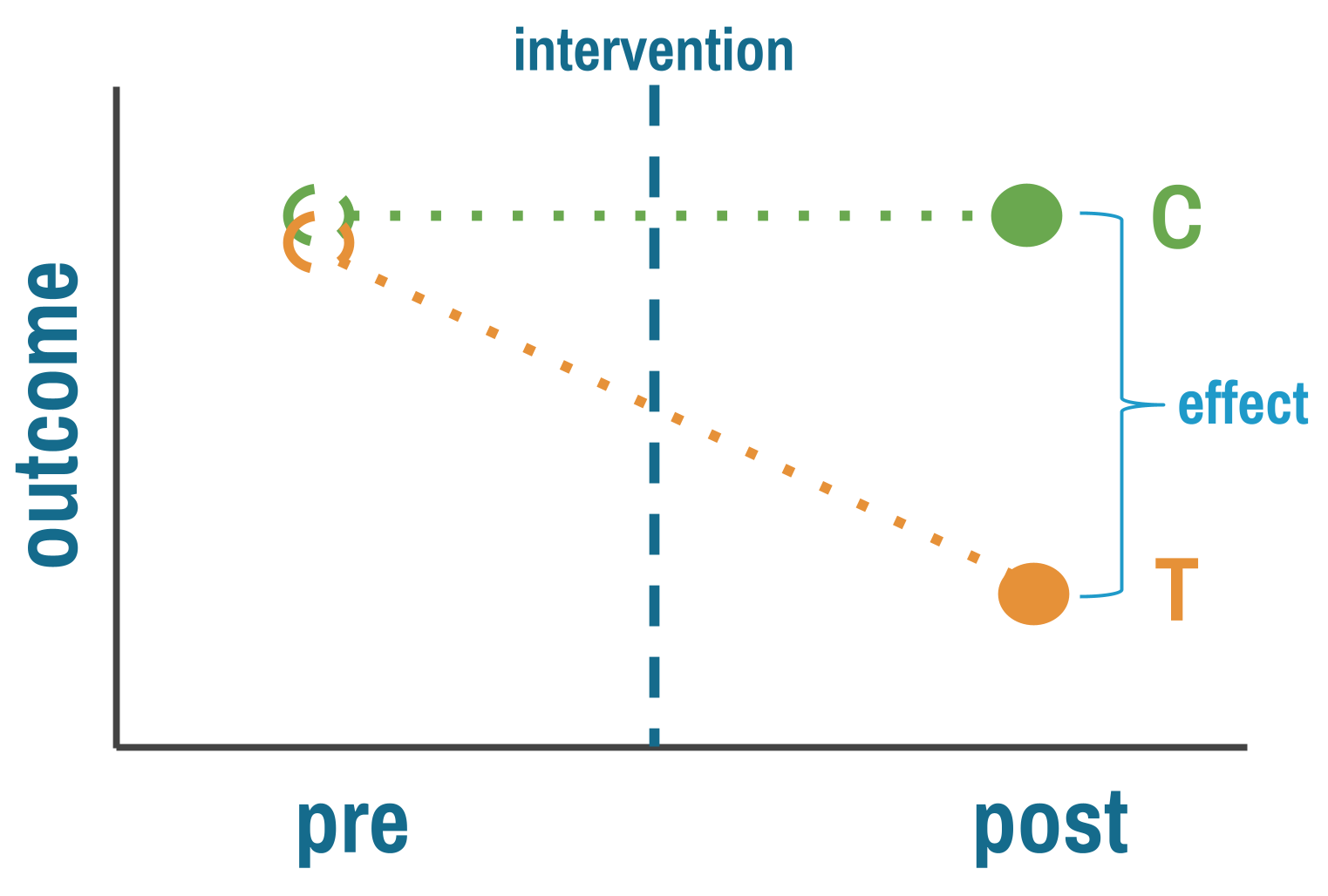
11.4 Difference-in-Differences
Difference-in-differences (DiD) combines the best features of pre-post and between-group designs while mitigating some weaknesses of each. It has become a workhorse method in policy evaluation and program impact assessment.
THE LOGIC
The logic is elegant. Measure outcomes in both treatment and comparison groups, both before and after the intervention. Calculate how much the treatment group changed. Calculate how much the comparison group changed over the same period. The difference between those two changes is your estimate of the treatment effect.
The comparison group is doing the heavy lifting. Its change over time estimates what would have happened to the treatment group without the intervention—the background trend from seasonal variation, economic shifts, or anything else that affected both groups equally. Subtracting it out leaves you with the treatment effect, in principle. This is why DiD improves on both simpler designs: unlike pre-post, it accounts for time trends; unlike post-only comparisons, it accounts for baseline differences between groups.
THREATS TO VALIDITY
The key assumption is parallel trends: both groups were changing at the same rate before treatment. They don’t have to start at the same level. It’s the slope that matters, not the intercept. And this assumption can’t be tested directly—it’s about what would have happened without treatment. You can only look for evidence against it by checking whether pre-intervention trends were parallel.
Parallel trends is fundamentally untestable. It’s a claim about what would have happened to the treatment group without treatment—a counterfactual you never observe. What you can do is look for indirect evidence that makes the assumption more or less plausible. Researchers do this in two ways.
Check pre-treatment outcome trends. Plot the outcome over time for both groups in the periods before the intervention. If the lines are moving together—parallel slopes, not necessarily the same level—the assumption has visual support. If they’re converging, diverging, or one group is already trending differently, you have a problem no regression can fix.
One pre and one post measurement gives you only two points per line. You can’t assess parallel trends from two points. Multiple pre-intervention measurements are essential.
Imagine you’re evaluating a conditional cash transfer program that rolled out in some districts but not others. Maternal health visits increase more in treatment districts after the program starts. But if you plot the pre-intervention years, you see that treatment districts were already improving faster—perhaps because the government was expanding clinic hours in those same districts independently of the cash transfer. DiD would attribute the faster improvement to the program when the real cause was a separate policy change. The pre-trend plot catches this.
But here’s the critical nuance: parallel pre-trends don’t prove the assumption holds. Just because trends were parallel before treatment does not logically require they would have stayed parallel afterward. Something could have changed at the same time as the intervention that differentially affected the treatment group. Pre-trend balance is necessary but not sufficient.
Check covariate balance. The second diagnostic asks whether treatment and comparison groups are similar on characteristics that predict the outcome—demographics, economic conditions, health infrastructure. If expansion districts are systematically wealthier, more urban, or have better-resourced clinics, those differences could drive differential outcome trends even without the intervention. Researchers sometimes assume these baseline differences “get differenced out” by DiD. They don’t—not if those characteristics predict outcome trends, not just levels. A district with higher baseline income might experience faster mortality declines regardless of the program, and that differential trend is exactly what parallel trends rules out.
When covariate imbalance is present, you can sometimes rescue the design by arguing that parallel trends holds conditional on those covariates—that within groups of districts with similar income, demographics, and infrastructure, the trends were parallel. This conditional parallel trends assumption is weaker than requiring unconditional parallel trends across all units, and methods exist to estimate DiD under it. But it adds complexity and requires enough overlap between groups across covariate values.
Spillovers are a separate threat. If treatment villages share information with comparison villages—if health workers trained in the intervention area start advising families across the border—the comparison group improves too, and the DiD estimate understates the true effect. Compositional changes create a subtler problem: if who’s being measured shifts differently across groups over time (families migrating out of treatment areas, or sicker patients dropping out of one group but not the other), you’re no longer comparing the same populations at endline as at baseline. And measurement changes that affect groups differently—a new data system in treatment clinics but not comparison clinics—can create spurious effects even when nothing real changed.
WHEN TO CONSIDER THIS DESIGN
DiD is a natural choice when you have outcome data for both treatment and comparison groups before and after an intervention, and when those groups share enough context that parallel trends is plausible. Groups in the same country, under the same health system, experiencing the same economic conditions are stronger candidates than groups separated by geography, policy environment, or institutional capacity. The more pre-intervention time points you have, the better—you need them to assess whether trends really were parallel, and two points per group isn’t enough to satisfy most reviewers.
The design also requires knowing when treatment started. In the simplest case, all treated units get the intervention at the same time. But many real programs roll out in stages—different districts or clinics start in different years. This staggered rollout is fine for DiD as long as you know each unit’s start date and use methods designed for it (see the staggered rollout discussion in HOW TO STRENGTHEN below). What causes real problems is when the intervention within a unit phases in gradually—a policy announced in January, partially implemented by March, fully operational by September—because then the pre/post line is blurred and there’s no clear moment to anchor the analysis.
HOW TO STRENGTHEN THE DESIGN
Beyond the visual and covariate diagnostics described above, formalize your pre-trend assessment with an event study specification that estimates separate effects for each time period before and after the intervention. Pre-intervention coefficients should hover near zero. Significant pre-intervention effects are a red flag. You can also run placebo tests—apply the DiD analysis at fake treatment dates in the pre-period where no intervention occurred. If you find “effects” where none should exist, your method is picking up something other than the treatment.
When choosing comparison groups, match on pre-intervention trajectories, not just baseline levels. Two groups that were improving at the same rate before treatment are a far stronger comparison than two groups that happened to have similar levels at a single point in time. If covariate imbalance is present, match or adjust to make conditional parallel trends more plausible.
When parallel trends clearly fails, you have options: restrict to a shorter time window where trends look more similar, try a different comparison group, or consider synthetic control methods that construct a weighted comparison from multiple untreated units. Sometimes none of these work, and you have to acknowledge that DiD isn’t appropriate for your setting.
REAL-WORLD EXAMPLE
Maternal Health Vouchers in Bangladesh
Starting in 2006, the government of Bangladesh rolled out the Maternal Health Voucher Scheme (MHVS) across dozens of upazilas—subdistricts that serve as the basic unit of local governance. The program gave pregnant women vouchers they could exchange for antenatal care, skilled delivery, and postnatal services at public or private providers. The goal was straightforward: reduce financial barriers, increase facility-based deliveries, and ultimately reduce maternal and neonatal deaths.
The program wasn’t randomized. Upazilas were selected based on poverty, literacy, and the presence of health workers to administer the program. By design, treated areas were poorer and more rural than untreated ones. Before the voucher scheme, only 7.2% of women in treated upazilas delivered in a health facility, compared to 15.3% in control areas. This is exactly the kind of baseline imbalance that makes a simple post-treatment comparison unreliable.
Nandi and colleagues (2022) used a difference-in-differences design to evaluate the program’s impact, drawing on five rounds of Bangladesh Demographic and Health Survey data (2004, 2007, 2011, 2014, and 2017–2018), covering births from 2000 to 2016. The treatment group was the 55 upazilas that received the MHVS; the comparison group was roughly 456 upazilas that didn’t. Because the program rolled out in stages over about four years, the authors used event study models that estimated separate effects for each two-year period before and after implementation, allowing them to assess both parallel trends and the timing of any effects.
The parallel trends evidence was strong for most outcomes. Figure 11.5 shows the raw trends in treated and control upazilas from 2000 to 2016. For institutional delivery, the two lines track closely through the pre-intervention years, then begin to diverge after the voucher scheme starts—exactly what a credible DiD should look like.
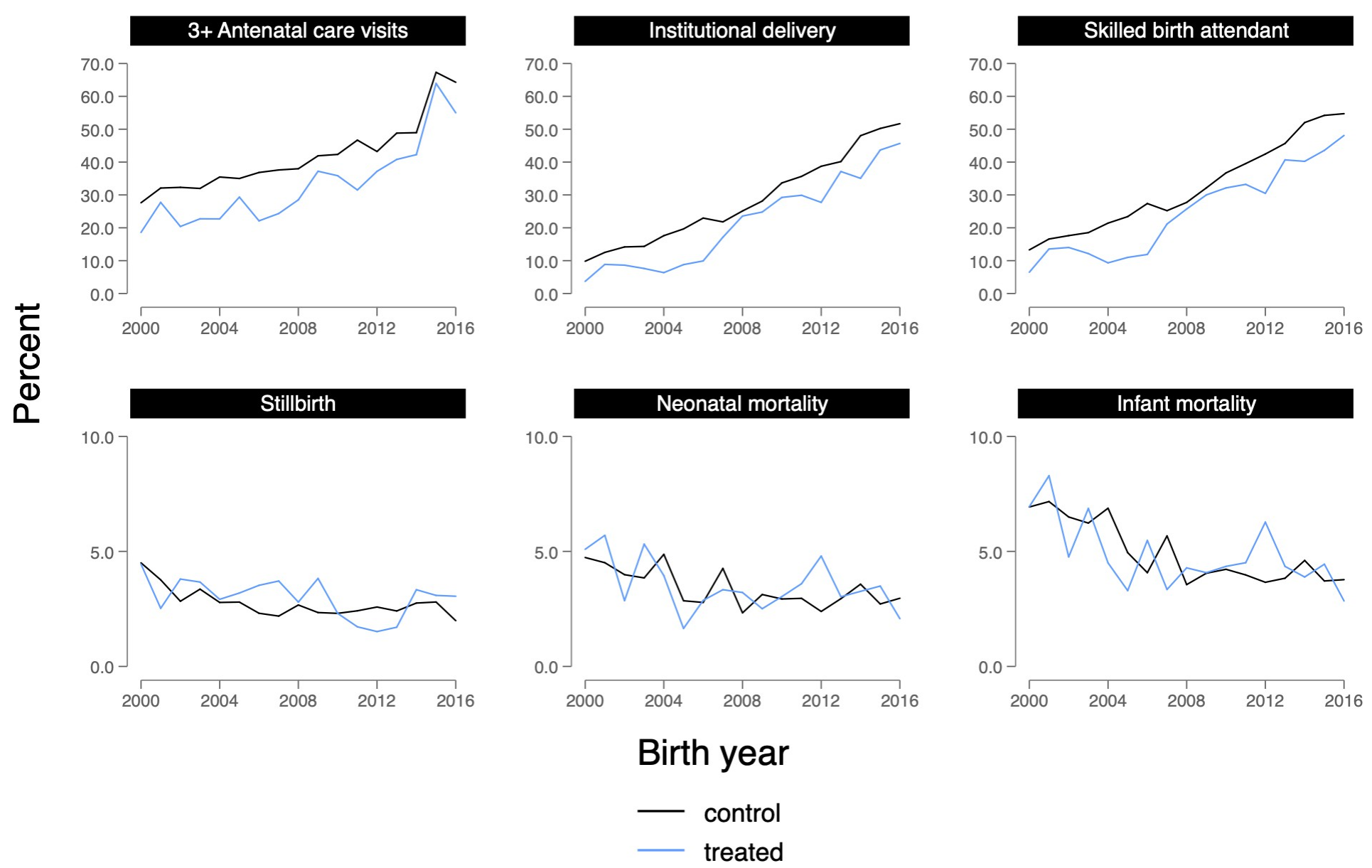
The event study coefficients (Figure 11.6) tell the same story more formally: pre-intervention estimates hover near zero, confirming that treated and control upazilas were on similar trajectories before the program. Effects then emerge gradually, with a lag of two to four years—consistent with a program that takes time to change behavior.
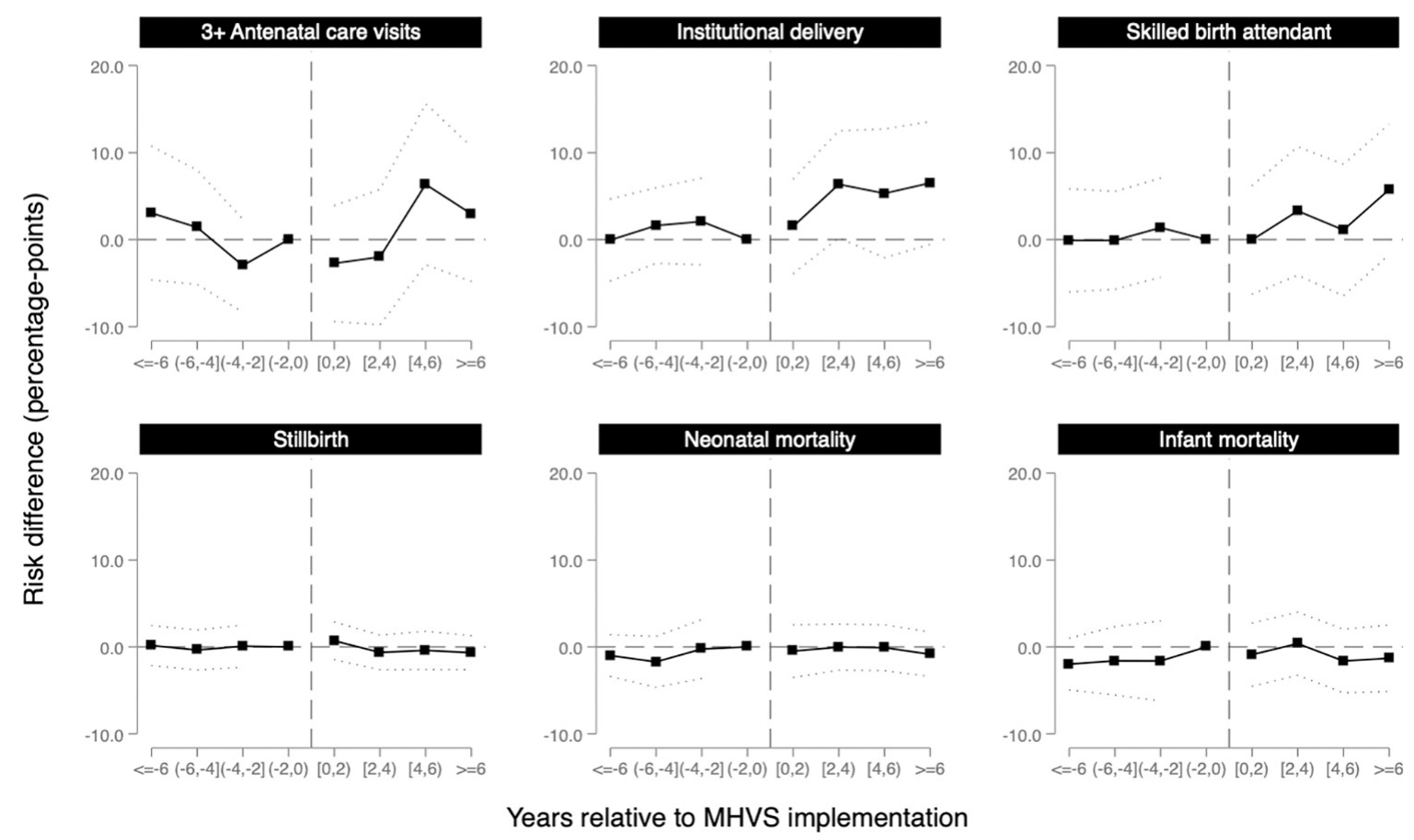
After six years of access to the MHVS, the probability of delivering in a health facility increased by 6.5 percentage points (95% CI: −0.6 to 13.6) and having a skilled birth attendant increased by 5.8 percentage points (95% CI: −1.8 to 13.3) in treated upazilas relative to the comparison group. These are meaningful increases in a context where baseline facility delivery was below 10%.
But here’s the twist. Despite these gains in service utilization, the study found no evidence that the voucher program reduced stillbirth, neonatal mortality, or infant mortality. The estimates were small and imprecise, hovering near zero. More women were delivering in facilities, but babies weren’t surviving at higher rates.
Why? The authors point to several possibilities. The program may not have reached the highest-risk women—eligibility criteria weren’t always enforced, and awareness was uneven. Providers weren’t adequately compensated, potentially reducing quality of care as patient volume increased. And facility birth in Bangladesh is associated with lower breastfeeding initiation, which could offset some of the survival benefits of skilled attendance. The DiD design can tell you that the program changed behavior. It can’t tell you why that change didn’t translate into the outcome that mattered most.
This study illustrates both the power and the limits of DiD. The event study specification provides compelling visual and statistical evidence for parallel trends. The staggered rollout, handled with inverse probability weighting and event study models, allows for dynamic treatment effects that emerge over time. But the design can’t resolve whether the null mortality finding reflects true program failure, insufficient statistical power, or confounding from concurrent changes in treated areas. The authors are transparent about each of these possibilities, which is what good quasi-experimental research looks like.
STRENGTHS AND LIMITATIONS
DiD is powerful because it controls for both time trends and baseline differences simultaneously, making it more credible than either pre-post or post-only designs alone. It can leverage existing administrative or survey data, and it’s widely accepted in policy evaluation across disciplines.
But the design rests on the parallel trends assumption. If you can’t make a convincing case for it, acknowledge that limitation upfront. DiD also requires knowing when treatment started for each unit, stable group composition over time, and genuine separation between treatment and comparison groups. When groups are interacting, when you can’t pin down the intervention date within a unit, or when who’s being measured changes differentially over time, the design’s logic breaks down.
11.5 Interrupted Time Series
DiD relies on a comparison group to construct the counterfactual. But what if you don’t have one? A national policy that affects every district simultaneously. A hospital system that changes its protocol everywhere at once. A country-wide ban on a class of antibiotics. There’s no untreated group to compare against.
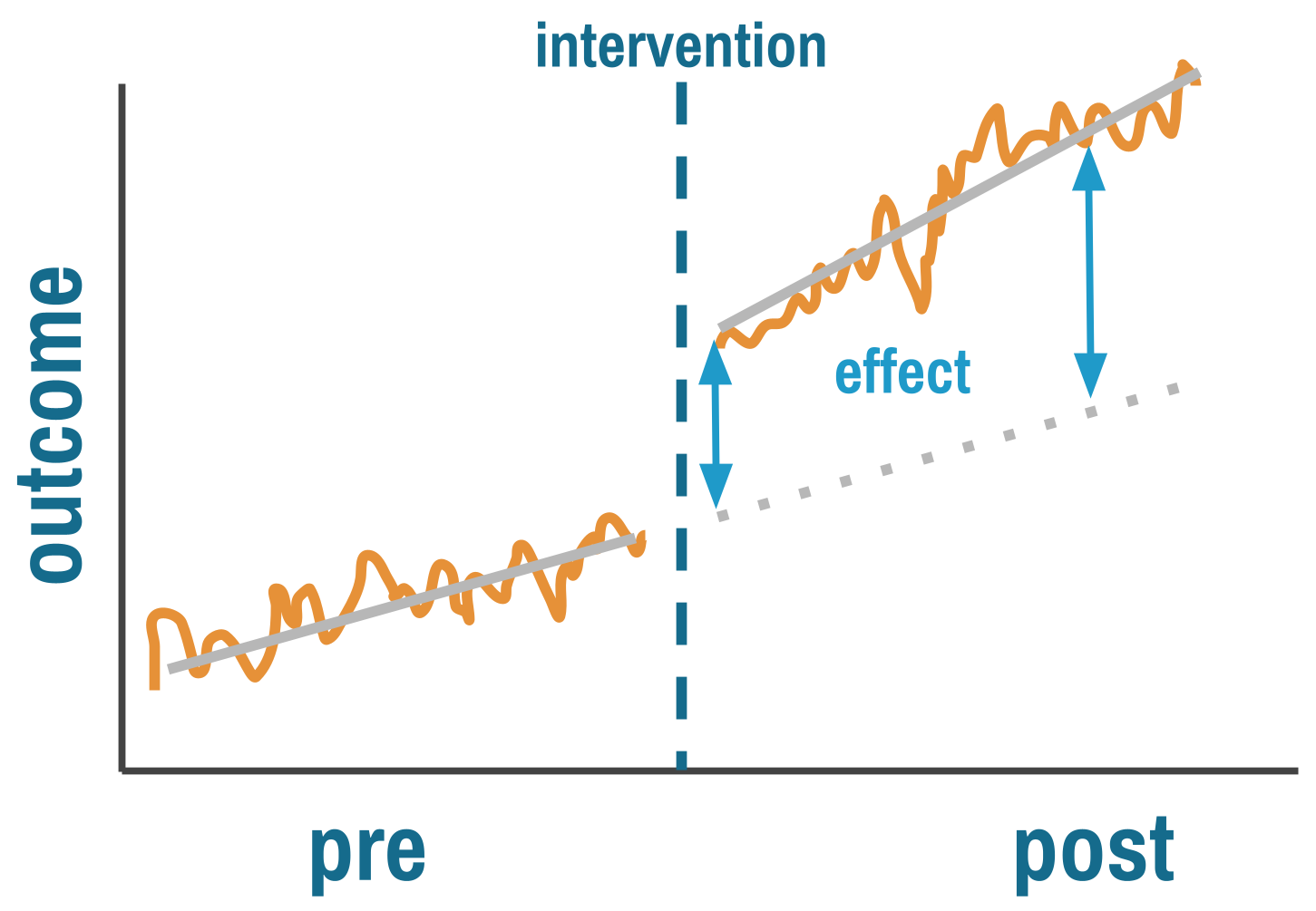
Interrupted time series (ITS) designs handle this by replacing the comparison group with something else: the unit’s own past. If you have enough data points before and after the intervention, you can model the pre-intervention trend and ask whether the intervention interrupted it. Some researchers call this an event study design, particularly when the focus is on estimating dynamic effects around a discrete event. The core logic is the same: use the pre-intervention trajectory as the counterfactual for what would have happened without treatment.
THE LOGIC
ITS answers two questions simultaneously. Did the intervention cause an immediate level change—a sudden jump or drop at the moment it was implemented? And did it cause a trend change—a shift in the slope of the outcome over time?
This is more sophisticated than pre-post comparisons because ITS explicitly models the counterfactual. The pre-intervention trend, extrapolated forward, represents what would have happened without the intervention. The key assumption is that this trend would have continued unchanged, and that nothing else happened at the same time as the intervention that could explain the break.
By fitting a regression line to pre-intervention data and projecting it forward, you estimate what the outcome would have been absent treatment. The treatment effect is the gap between this projected trend and what actually happened.
ITS is typically implemented using segmented regression:
Y_t = β0 + β1*time + β2*intervention + β3*time_after_intervention + ε_tWhere β2 captures the immediate level change and β3 captures the change in slope after intervention.
READING AN ITS PLOT
The classic ITS plot has time on the x-axis, outcome on the y-axis, and a vertical line marking the intervention. Before intervention, data points scatter around a trend line. At the intervention, look for two things: a level change (β2)—does the outcome jump or drop immediately?—and a slope change (β3)—does the trajectory’s angle shift? The dashed gray line in Figure 11.8 shows the counterfactual: where the outcome would have gone if the pre-intervention trend had simply continued. The treatment effect at any point after intervention is the vertical gap between the counterfactual and the observed post-intervention trend.
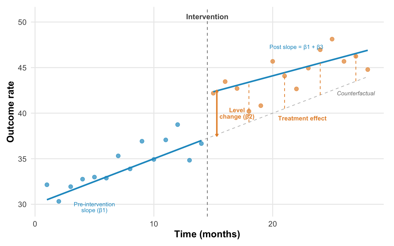
A credible ITS effect looks like a stable pre-intervention trend where points cluster tightly around the fitted line, then a clear discontinuity—a visible jump or drop—followed by a sustained new level or trend confirmed by multiple post-intervention observations. The key word is sustained. A single outlier after intervention doesn’t mean much. A consistent shift across many subsequent data points does.
What does confounding look like? A pre-intervention trend already moving in the direction of the apparent post-intervention “effect”—you’re just seeing continuation, not interruption. Or erratic post-intervention points suggesting other factors are varying simultaneously. Or effects appearing before the intervention line, suggesting the timing in your model doesn’t match the actual implementation. Each of these patterns is a reason to question whether the break in the trend is real.
THREATS TO VALIDITY
The central threat to ITS is concurrent events. Because the counterfactual is the projected pre-intervention trend, anything else that changed at the same time as the intervention becomes an alternative explanation. Imagine evaluating a hand hygiene campaign that launched in March 2020. Any improvement you observe could be the campaign or the pandemic response that started simultaneously. ITS has no way to separate the two without additional information.
The more dramatic the break at the intervention point relative to pre-intervention variability, the more credible the causal claim.
This vulnerability is compounded by several technical challenges. Observations close in time are correlated (autocorrelation), which makes standard errors too small if you don’t account for it—ARIMA models, generalized least squares, or Newey-West standard errors are typical corrections. Outcomes that fluctuate with the seasons require explicit seasonal adjustment, or the model will confuse a seasonal pattern with an intervention effect. And interventions often follow unusual values—implementing safety protocols after an outbreak, for instance—which means regression to the mean can masquerade as a treatment effect. The outbreak was extreme; things would have improved anyway.
Finally, ITS is data-hungry. You need enough pre-intervention observations to establish a reliable trend, and enough post-intervention observations to confirm that any change is sustained rather than a blip. The conventional minimum is 8 time points before and after, though 12 or more on each side is far better. With fewer, you’re fitting a line to noise, and the design offers little advantage over a simple pre-post comparison.
WHEN TO CONSIDER THIS DESIGN
ITS is a natural choice when a policy or intervention affects everyone at once and there’s no untreated group to serve as a comparison. National drug regulations, system-wide clinical protocols, and country-level policy changes are classic candidates. In these settings, the pre-intervention trend is your counterfactual. It’s the best available estimate of what would have happened without the intervention.
The design works best when you have good longitudinal data: many time points collected consistently over a long period, ideally from administrative systems that don’t change their measurement methods midstream. Monthly pharmacy sales data, quarterly hospital admission records, or annual surveillance data going back years before the intervention are ideal. If you have only a handful of measurements before and after, you’re back to a pre-post design with a regression line through it.
You also need a clear intervention date. Abrupt policy changes—a nationwide ban, a new clinical protocol effective on a specific date—produce the cleanest ITS designs. If the intervention phased in gradually within the unit you’re studying, the “interruption” is blurred, and the model can’t cleanly separate the pre-intervention trend from the post-intervention trajectory. Be careful to use the actual implementation date, not the policy announcement. There’s often a gap, and misspecifying the timing biases the estimates.
HOW TO STRENGTHEN THE DESIGN
The single most powerful enhancement is to add a comparison series—a time series from a unit that didn’t experience the intervention. This comparative ITS (CITS) accounts for concurrent events that affect both series equally, applying the same logic that makes DiD more credible than a simple pre-post comparison. If antibiotic sales dropped in Chile after the prescription-only policy but stayed flat in a neighboring country with no policy change, the concurrent-events threat is substantially weakened.
When the intervention didn’t arrive all at once, model multiple phases rather than forcing everything into a single break point. If a hospital system rolled out a new protocol in stages—first electronic dashboards, then patient flow changes, then staffing adjustments—estimate separate effects for each stage rather than collapsing the rollout into a single moment. This granularity can reveal which components drove changes.
Build realistic expectations about timing into your model. Some interventions take time to work. For instance, a new prescribing policy might show no immediate level change if physicians comply gradually rather than all at once. Delayed effects are not evidence of failure; they’re evidence that you need lag structures in your model that match what you know about the intervention’s mechanism.
Finally, examine multiple outcomes, including ones the intervention should not have affected. This is the ITS equivalent of the nonequivalent dependent variable we discussed for pre-post designs. If antibiotic prescriptions dropped after a stewardship policy, but prescriptions for unrelated medications like antihypertensives showed the same drop at the same time, you’d suspect a system-wide change in prescribing behavior rather than an antibiotic-specific effect. If antihypertensive prescriptions didn’t change, that’s another piece of evidence that the drop was caused by the policy.
REAL-WORLD EXAMPLE
Kidney Transplants and Race-Based Algorithms
For decades, the equations used to estimate kidney function included a race coefficient that systematically overstated kidney health in Black patients. The clinical consequence was real: Black patients appeared healthier than they were, leading to later referrals, later listing for transplant, and shorter effective wait times once listed. In 2021, a task force recommended removing the race coefficient. In January 2023, the Organ Procurement and Transplantation Network went further: it mandated retroactive wait time modifications for Black candidates whose listing had been delayed by the old equations. More than 21,000 candidates received modifications, gaining a median of 1.7 additional years of wait time.
Khazanchi and colleagues (2026) used ITS to evaluate whether this policy change actually increased kidney transplants for Black candidates. The design is a clean application of everything we’ve discussed. The outcome is the monthly transplant rate per 1,000 waitlisted candidates. The pre-intervention period establishes the trend: transplant rates were already rising slowly for both Black and non-Black candidates before the policy (about 0.6 transplants per 1,000 per month). The intervention has a known date (January 2023), and the authors excluded a three-month washout period to account for gradual implementation—exactly the kind of careful timing specification we emphasized above.
The ITS estimates tell a clear story. Black candidates experienced an immediate level change of +5.3 transplants per 1,000 listings (95% CI: 3.5–7.0) after the policy, driven almost entirely by deceased donor transplants. The post-intervention slope then declined slightly (−0.10 per month), suggesting the initial jump faded as the backlog of modified candidates was absorbed.
The study also illustrates what ITS can’t tell you. Less than one-third of eligible Black candidates actually received wait time modifications. The beneficiaries were disproportionately those already integrated into the healthcare system—patients who had a nephrologist, who had been referred, who were already listed. The policy corrected algorithmic harm for people the system could see. It couldn’t reach patients who never made it to the transplant list in the first place. ITS can measure the effect of a policy on those it touched. It can’t measure what the policy missed.
STRENGTHS AND LIMITATIONS
ITS can estimate causal effects without comparison groups, which makes it uniquely suited to evaluating national policies and system-wide changes. Unlike simple pre-post comparisons, it accounts for pre-existing trends and can distinguish immediate level changes from gradual slope changes. It works well at the population level and often leverages readily available administrative data.
The data demands are real, though. ITS requires many time points—at minimum 8 before and after intervention, ideally more—and the statistical complications of autocorrelation and seasonality can’t be ignored. Concurrent events are the design’s deepest vulnerability: if something else changed when your intervention started, ITS can’t tell the two apart. And the entire approach rests on the assumption that pre-intervention trends would have continued unchanged, which is itself a strong modeling assumption that you can argue for but never prove.
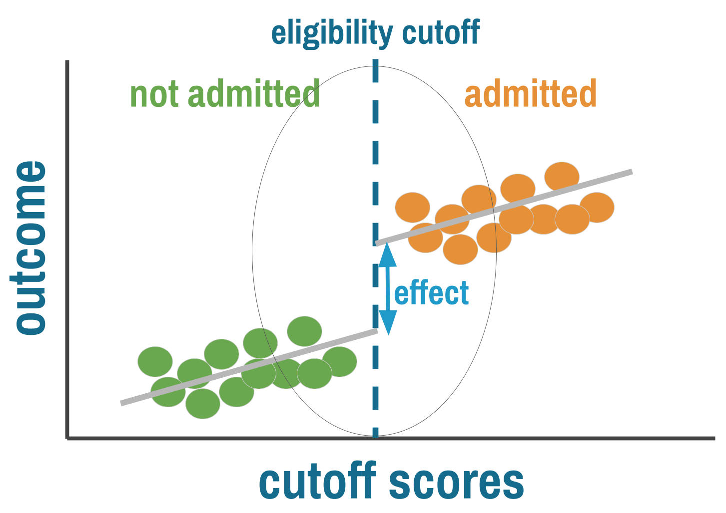
11.6 Regression Discontinuity Designs
Many programs and policies assign treatment based on a threshold. Patients qualify for antiretroviral therapy if their CD4 count falls below a cutoff. Students receive scholarships if their test scores exceed a minimum. Households get subsidies if their income falls below a poverty line. Whenever a continuous measure crosses a bright line and treatment access switches on or off, you have the ingredients for a regression discontinuity (RD) design.
THE LOGIC
Regression discontinuity exploits a simple insight: people just above and just below a threshold should be nearly identical on average. The person with a CD4 count of 495 and the person with a count of 505 differ by a measurement that could easily have gone the other way. In a narrow window around the cutoff, assignment to treatment is effectively arbitrary—not because anyone randomized it, but because the running variable contains enough noise that who lands on which side is close to random. When this holds, comparing outcomes for people just above and just below the cutoff gives you a credible causal estimate, sometimes approaching the rigor of a randomized trial.
RD requires three ingredients: a running variable (some continuous measure like a test score, age, or CD4 count), a cutoff (a known threshold that determines access to treatment), and a discontinuity (treatment probability jumps at that cutoff).
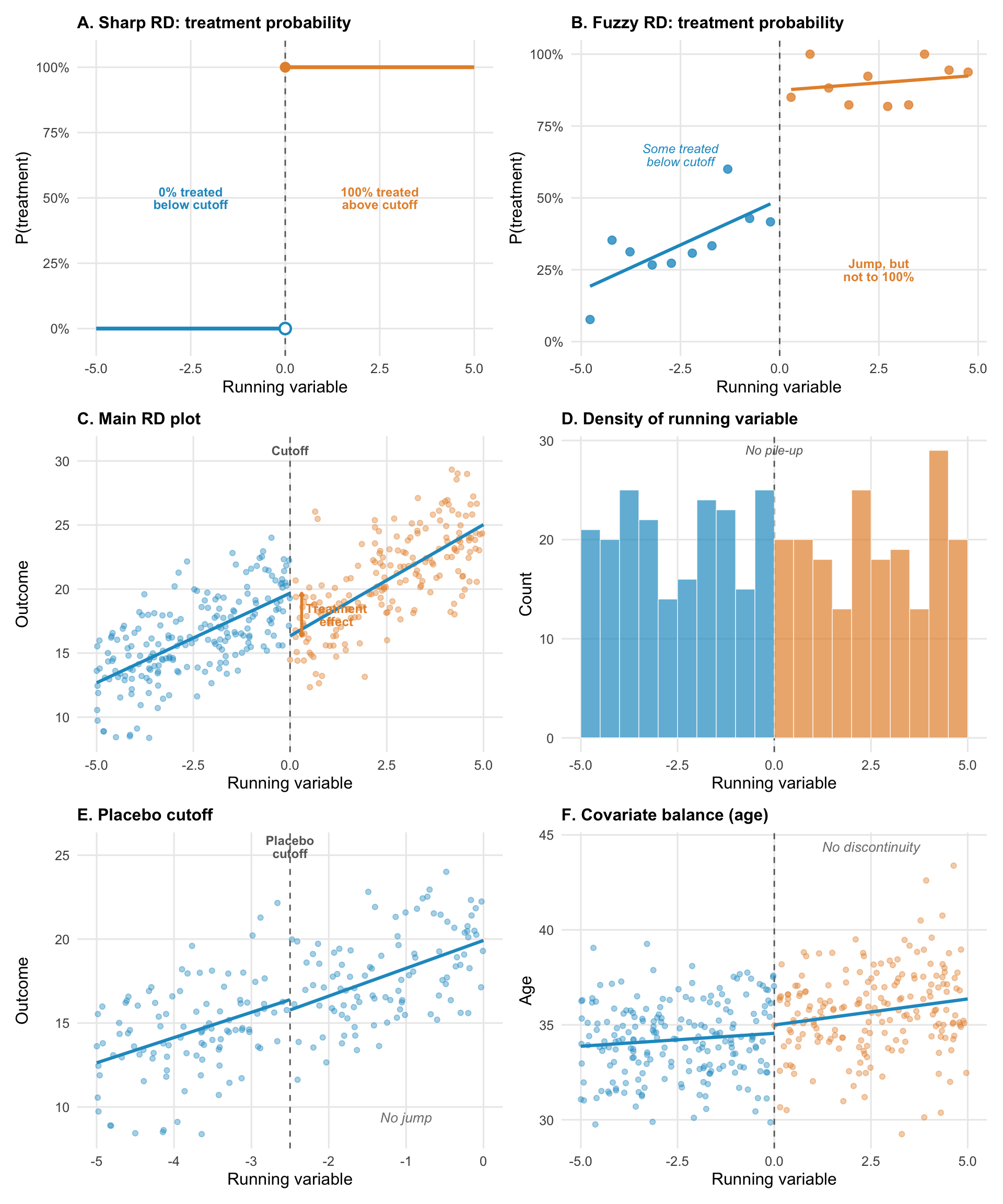
GRAPHICAL DIAGNOSTICS: WHAT TO LOOK FOR
Figure 11.10 illustrates common visualizations you’ll encounter in a regression discontinuity paper.
Panels A and B show the distinction between sharp and fuzzy RD. In a sharp design (A), treatment probability jumps from 0% to 100% at the cutoff. Everyone below is untreated; everyone above is treated. In a fuzzy design (B), the jump is real but incomplete. Some people below the cutoff receive treatment anyway (they found another way in), and some above don’t (they chose not to take up the program). The jump in treatment probability is still there, but compliance is imperfect. Fuzzy RD uses instrumental variables logic to estimate the effect among compliers.
The main RD plot (panel C) should show a clear discontinuity in the outcome at the cutoff, with smooth trends on either side. The jump at the threshold is the treatment effect. The visual should be convincing to someone who knows nothing about regression.
The density plot (panel D) is your manipulation check. The distribution of the running variable should be smooth across the cutoff. A pile-up of observations just below the threshold (or a gap just above) suggests people are gaming the system. This single diagnostic can make or break an RD study.
Placebo cutoffs (panel E) test whether your method is finding real effects or fitting noise. Apply the same RD analysis at fake cutoffs where no treatment change occurred. If you find “effects” at these locations, your method is detecting something other than the treatment.
Covariate balance (panel F) shows that baseline characteristics are continuous across the cutoff. If covariates jump at the threshold, something other than treatment is changing, which undermines the “as-if random” logic.
THREATS TO VALIDITY
The “as-if random” logic of RD depends entirely on people being unable to precisely sort themselves to their preferred side of the cutoff. If they can, the design collapses. A student who expects to score close to the scholarship threshold might study just hard enough to cross it—and that student is systematically different from one who didn’t. Households might underreport income to qualify for a subsidy. Health workers might round a CD4 count down to get a patient into treatment. Whenever the people involved know the cutoff and can influence the running variable, manipulation becomes a threat, and the comparison of people just above and below is no longer comparing similar individuals.
Even without manipulation, the cutoff needs to be the only thing that changes at the threshold. If crossing a poverty line qualifies a household for multiple programs simultaneously—a cash transfer, free school meals, and health insurance—then any jump in outcomes at the cutoff reflects the bundle, not any single program. The treatment has to be the only discontinuity at the cutoff for the estimate to be interpretable.
RD also gives you a fundamentally local estimate. You learn the effect of treatment for people near the threshold, not for the population as a whole. The effect of HIV treatment for patients with CD4 counts near 500 may differ from the effect for patients with counts of 200. This isn’t a flaw in the design—it’s a feature that demands honest reporting about who the estimate applies to.
WHEN TO CONSIDER THIS DESIGN
RD works best when a sharp, known, enforced threshold determines treatment and the running variable is hard to manipulate. The cleanest opportunities come from institutional rules that create bright lines—CD4 count thresholds, age cutoffs for program enrollment, income thresholds for subsidies, policy changes that take effect on exact dates. The running variable matters as much as the cutoff: age and geographic distance are excellent because people can’t precisely control them. Income is trickier because households can underreport. Test scores depend on whether teachers or students can influence the result.
You also need enough data near the cutoff to estimate the discontinuity reliably. Because RD draws its inference from a narrow bandwidth around the threshold, small samples mean imprecise estimates that shift with every specification choice. Large administrative datasets are ideal. If you have a sharp rule but only a few hundred observations clustered far from the cutoff, RD will struggle to give you anything useful.
HOW TO STRENGTHEN THE DESIGN
Start with the manipulation check. Plot the density of the running variable across the cutoff. If the distribution is smooth, people aren’t sorting. If there’s a pile-up just below the threshold or a gap just above, someone is gaming the system. McCrary density tests formalize this, but the visual is often more convincing.
Next, check covariate balance. Plot baseline characteristics—age, sex, education, baseline health—against the running variable. They should be continuous across the cutoff. If covariates jump at the threshold, something other than treatment is changing there, and the “as-if random” logic is compromised. If the groups look different on characteristics that weren’t affected by treatment, the assignment mechanism isn’t working the way you assume.
Then show robustness. Vary the bandwidth (the window around the cutoff), try different functional forms (linear, quadratic, local polynomial), and run the analysis at placebo cutoffs where no treatment change occurred. If your results hold across bandwidths and functional forms but disappear at placebo locations, you have a robust finding. If the estimate swings wildly with each choice, the finding is fragile—it may reflect the specification rather than the treatment.
Finally, be honest about scope. RD gives you the effect for people at the margin of the cutoff. That’s a real, well-identified causal estimate, but it may not generalize to people far from the threshold. Report it for what it is.
REAL-WORLD EXAMPLE
HPV Vaccination and Sexual Behavior in Ontario
When Ontario launched its publicly funded HPV vaccination program for grade 8 girls in September 2007, it created a sharp eligibility cutoff based on birth date. Girls born on or after January 1, 1994, were in grade 8 when the program started and could receive the vaccine at school for free. Girls born before that date were in grade 9 or higher and had to pay roughly $400 out of pocket. Girls born just before December 31, 1993, and girls born just after January 1, 1994, are on average nearly identical in every respect except that one group was eligible for free vaccination and the other wasn’t.
Smith and colleagues (2015) exploited this cutoff to answer a question that had become a barrier to vaccination uptake: does HPV vaccination encourage riskier sexual behavior? Parents worried that vaccinating girls against a sexually transmitted infection would create a false sense of protection and lead to more sexual activity. If true, the vaccine could increase pregnancy and non-HPV STI rates. The concern was plausible enough to suppress vaccination coverage in some jurisdictions.
The running variable is birth date, collapsed into birth-year quarters. The outcome is a composite of pregnancy and non-HPV-related sexually transmitted infections between grades 10 and 12, measured through Ontario’s population-based administrative health databases covering 260,493 girls. The manipulation check is trivially satisfied: no one chose their birth date to qualify for an HPV vaccine that wouldn’t exist for another decade.
The first stage is clear. Among eligible girls, 51% received all three vaccine doses; among ineligible girls, less than 1% did. That discontinuity in vaccination probability at the birth-date cutoff is what makes the RD work. On the outcome side, the researchers found no jump at all. The risk difference was −0.61 per 1,000 girls (95% CI: −10.71 to 9.49), and the relative risk was 0.96 (95% CI: 0.81 to 1.14). Results were similar when pregnancy and STIs were examined separately. The concern that HPV vaccination promotes risky sexual behavior was not supported.
This study illustrates why RD can be so powerful. The running variable (birth date) is impossible to manipulate. The cutoff is sharp, known, and enforced through school enrollment records. The sample is large enough (260,000+ girls) to detect even modest effects. And the administrative data avoids the self-report biases that plagued earlier studies comparing vaccinated to unvaccinated girls directly—a comparison hopelessly confounded by the health beliefs and family characteristics that influence both vaccination decisions and sexual behavior.
STRENGTHS AND LIMITATIONS
When the cutoff is truly sharp and manipulation implausible, RD approaches the credibility of an RCT. It exploits naturally occurring policy variation, works with existing administrative data, and produces results with clear graphical presentation—you can literally see the effect in the jump at the cutoff.
The practical constraints are significant. Sharp, enforced cutoffs are rarer than you’d hope. Manipulation of the running variable is a constant concern. Estimates apply only near the cutoff, and effects for people far from the threshold may differ substantially. Results can also be sensitive to bandwidth and specification choices, which is why robustness checks across multiple bandwidths and functional forms are essential, not optional.
11.7 Instrumental Variables and Natural Experiments
Every design we’ve covered so far requires some form of observable structure: a before and after, a comparison group, a threshold, a time series. But sometimes the confounding is so deep that none of these approaches can help. You want to estimate the effect of education on earnings, but motivation, family background, and cognitive ability all drive both education and earnings, and you can’t measure them. You want to know whether military service affects long-term health, but the people who serve are systematically different from those who don’t. The confounders aren’t just hard to measure—they’re the reason people end up in treatment in the first place.
Instrumental variables (IV) offer a way forward, but it’s a narrow path. The idea is to find some source of variation that pushes people toward or away from treatment for reasons unrelated to the outcome. If that variation exists and you can defend it, IV can identify causal effects in settings where every other method fails. When the instrument is good, IV is powerful. When the instrument is bad, IV produces garbage estimates dressed up in the language of causal inference. The difference between the two is almost entirely about the quality of the argument, not the quality of the statistics.
THE LOGIC
Consider trying to estimate the effect of education on health. People who get more education are different from those who don’t—they might have higher cognitive ability, more supportive families, better health to begin with, or greater motivation. These factors affect both education and health. Even with rich data, you probably can’t measure all these confounders.
Instrumental variables offer a solution: find something that affects treatment but affects the outcome only through its effect on treatment. This “instrument” creates quasi-random variation in treatment that you can exploit for causal inference. In the education example, researchers have used changes in compulsory schooling laws as an instrument. When a country raises the minimum school-leaving age from 14 to 16, some people get more education than they otherwise would have—not because of their motivation or family background, but because the law changed. If the law affects health only by changing how long people stay in school, the variation it creates is the “clean” variation IV needs.
Unlike the other designs in this chapter, the IV counterfactual isn’t about comparing treated to untreated people directly. It’s about comparing what happens when the instrument pushes more people toward treatment versus fewer. The outcome difference between instrument groups, scaled by how much the instrument shifts treatment uptake, reveals the causal effect—but only for the people the instrument actually moved (the “compliers”). The key assumption is that the instrument affects the outcome only by changing treatment, not through any other pathway. If the instrument has a back door to the outcome, the whole strategy collapses.
INSTRUMENTS
A valid instrument must satisfy three conditions:
Relevance: The instrument must actually affect treatment. This is testable—you can check whether the instrument predicts treatment.
Exclusion restriction: The instrument affects the outcome only through its effect on treatment, not through any other pathway. This is the critical assumption and is not testable.
Exchangeability: The instrument is unrelated to confounders (it’s “as-if random”). Also not directly testable.
The hardest part of IV analysis is defending the exclusion restriction: arguing convincingly that the instrument affects the outcome only through treatment. This assumption can never be proven—only made plausible through careful reasoning.
What counts as a good instrument in health research? The bar is high, and the examples that work tend to come from institutional rules, policy variation, or nature rather than from clever variable selection.
Policy changes are among the strongest instruments. Compulsory schooling laws instrument for education. Changes in drug formularies instrument for medication use. Shifts in insurance eligibility—like Medicaid expansions that vary by state and year—instrument for healthcare access. In each case, the policy changes treatment for reasons that have nothing to do with the individual’s health.
Geographic variation can work when it’s plausibly unrelated to the outcome. Distance to a specialty clinic instruments for receiving specialist care, but only if distance doesn’t also affect health through other channels (poverty, remoteness, access to food). This is the exclusion restriction in action, and distance-based instruments fail it more often than researchers acknowledge.
Lotteries and random assignment produce the cleanest instruments. The Vietnam draft lottery is the textbook case. Randomized encouragement designs—where researchers randomly assign encouragement to take up a treatment but can’t force compliance—are the most common IV setup in global health trials.
ENCOURAGEMENT DESIGNS
Encouragement designs deserve special attention because they bridge the gap between RCTs and IV. In a standard RCT, you randomize treatment assignment and (hope) everyone complies. In practice, compliance is rarely perfect. Some people assigned to treatment don’t take it up. Some people assigned to control find a way to get treated anyway. An encouragement design embraces this reality: you randomize encouragement (an invitation, a subsidy, a home visit) rather than treatment itself, and use the randomized encouragement as an instrument for actual treatment.
This is IV with a randomized instrument—the gold standard for instrumental variables because randomization guarantees exchangeability and makes the exclusion restriction more defensible (though not automatic). The encouragement must affect the outcome only through its effect on treatment uptake, not through other pathways. A home visit that encourages vaccination but also provides health education affects health through two channels, violating exclusion.
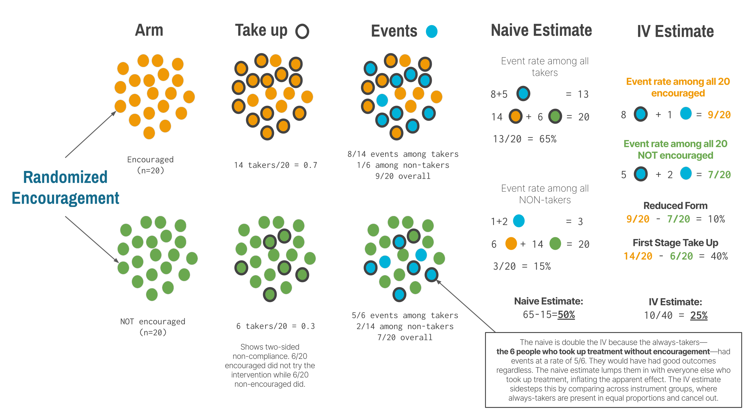
In many trials, noncompliance runs in both directions. Some people encouraged to take treatment don’t (they decline, forget, or can’t access it). Some people not encouraged take it anyway (they seek it out on their own). This two-sided noncompliance creates four types of people: compliers (who take treatment when encouraged and don’t when not), always-takers (who take treatment regardless), never-takers (who refuse regardless), and defiers (who do the opposite of their assignment). IV identifies the treatment effect only for compliers. The always-takers and never-takers provide no information about the effect of treatment because the instrument didn’t change their behavior. This is why IV estimates a local average treatment effect (LATE)—the effect among the people the instrument actually moved.
For LATE to be interpretable, IV requires a monotonicity assumption: the instrument must push everyone in the same direction. If encouragement makes some people more likely to take treatment and others less likely (defiers), the IV estimate becomes an uninterpretable weighted average. In most settings, monotonicity is reasonable—it’s hard to imagine why being offered help with paperwork would cause some households to avoid connecting to the water system. But in designs where the instrument could plausibly cut both ways, the assumption deserves scrutiny.
Whether LATE is useful depends on your policy question. If you want to know “should we expand a voluntary program?” and your instrument is program availability, the effect among compliers is exactly what you need—they’re the people the expansion would reach. If you want to know “what would happen if everyone received treatment?” LATE is less helpful, because it says nothing about always-takers or never-takers.
TWO-STAGE LEAST SQUARES: HOW IV WORKS
When people say “instrumental variables,” they’re usually referring to two-stage least squares (2SLS), the most common IV estimator. Understanding the mechanics helps you interpret IV results and spot problems.
Stage 1 (The first stage): Predict treatment using the instrument. You regress the treatment variable on the instrument (and any covariates). This gives you the part of treatment variation that’s driven by the instrument—the “good” variation that’s plausibly exogenous. In the encouragement design, this is the impact of being encouraged on taking up the treatment.
Stage 2 (The second stage): Regress the outcome on predicted treatment. Now use the predicted treatment values (not the actual treatment) to estimate the treatment effect on the outcome.
Why not just use the reduced form? You could directly regress the outcome on the instrument (the “reduced-form” effect). But 2SLS scales this by how much the instrument affects treatment, giving you the effect per unit of treatment, which is often more interpretable.
This two-step process isolates the quasi-random variation in treatment created by the instrument, throwing away the endogenous variation caused by confounders.
THREATS TO VALIDITY
A first-stage F-statistic should exceed 10 at minimum, though 20 or higher is far better.
The most common way IV fails is through a weak instrument. When the instrument barely predicts treatment, everything goes wrong: standard errors blow up, estimates become biased toward OLS (defeating the entire purpose of IV), and the design becomes sensitive to tiny violations of the exclusion restriction. Weak instruments make the IV estimate unreliable in ways that are hard to detect from the output alone.
The deeper threat is to the exclusion restriction. The instrument must affect the outcome only through treatment, and this assumption is untestable. Distance to a clinic seems like a natural instrument for healthcare use, but remoteness might directly affect health through other channels—access to food, employment, social support. Month of birth has been used to instrument for education, but season of birth affects health outcomes directly through prenatal exposures and childhood illness patterns. These violations are easy to overlook because the instrument looks relevant, and the first stage looks strong. But relevance without exclusion is worse than useless—it gives you a precise estimate of the wrong thing.
Instruments can also fail when they affect multiple pathways to the outcome. If your instrument shifts both treatment and a confounder simultaneously, the IV estimate captures both effects and you can’t separate them. And good instruments don’t come from trying 20 variables and reporting whichever one “works.” That’s p-hacking with extra steps. The best instruments come from institutional knowledge, policy variation, or explicit randomization—settings where you can tell a convincing story about why the instrument creates exogenous variation, not just that it predicts treatment.
WHEN TO CONSIDER THIS DESIGN
IV is the right tool when unmeasured confounding is the primary threat and other designs can’t address it. If you have a threshold, use RD. If you have before-and-after data with a comparison group, use DiD. If you have a long time series with a clear break, use ITS. IV is for the cases where none of these structures exist but you’ve found a source of variation in treatment that is plausibly exogenous.
In global health, the best IV opportunities come from policy changes with sharp timing or geography, arbitrary administrative boundaries that create different treatment environments for otherwise similar populations, or randomized encouragement designs where you can’t force compliance but can randomly assign the nudge. The key in every case is that the source of variation in treatment is plausibly unrelated to the outcome except through its effect on treatment. If you can’t articulate why that’s true in your specific context, IV isn’t going to save you.
Remember that IV identifies a local effect—the effect among compliers, the people whose treatment status actually changed because of the instrument. Whether that’s the effect you care about depends on the policy question. If you’re evaluating whether to scale up a voluntary program, the complier effect is exactly what you need, because compliers are the people the program would reach. If you want to know what would happen under universal treatment, LATE is less informative.
HOW TO STRENGTHEN THE DESIGN
The exclusion restriction is the heart of any IV analysis, and defending it is where most of the intellectual work lives. You must discuss the specific ways your instrument might affect the outcome outside of treatment and explain why each pathway is implausible in your context. Reviewers will focus their scrutiny here, and a paragraph saying “we assume exclusion holds” is not a defense.
Show the first stage prominently. The relationship between the instrument and treatment should be reported as a substantive finding, not buried in a footnote. If the instrument barely moves treatment, your IV estimates are imprecise at best and biased at worst. Always report the first-stage F-statistic and interpret it honestly.
Compare IV to OLS and discuss why they differ. If confounding biases OLS upward, IV should be smaller. If confounding biases OLS toward zero (attenuation from measurement error, for instance), IV should be larger. If the two estimates differ by an order of magnitude or point in opposite directions without a clear story for why, that’s a warning sign.
Present reduced-form estimates alongside the 2SLS results. The reduced form—the direct effect of the instrument on the outcome—is a valid causal estimate in its own right and doesn’t suffer from weak-instrument bias. If the instrument doesn’t predict the outcome in the reduced form but the 2SLS estimate is significant, something might be wrong with the analysis.
REAL-WORLD EXAMPLE
Piped Water and Well-Being in Urban Morocco
In the low-income neighborhoods of Tangiers, Morocco, roughly 845 households lacked a private water connection and couldn’t afford the fee to get piped water into their homes. Most relied on public taps or bought water from neighbors. The utility company Amendis offered interest-free credit to cover the cost, but take-up was low—only about 10% of eligible households applied on their own. The barriers weren’t just financial. The application process required navigating municipal bureaucracy: obtaining authorization from local authorities, providing photocopies of identification documents, and making a down payment at a branch office.
Devoto, Duflo, Dupas, Parienté, and Pons (2012) designed a randomized encouragement trial to study the effects of in-home water connections on household welfare. They randomly assigned 434 households to receive a door-to-door information and facilitation campaign—explaining the credit program and handling the paperwork on the spot—while 411 households served as controls, eligible for the same credit but without the individualized assistance.
This is a textbook encouragement design. The researchers couldn’t force households to connect to the water system. They could only make it easier. The randomized encouragement is the instrument; actual connection to piped water is the treatment. The first stage was strong: by six months, 69% of encouraged households had purchased a connection, compared to 10% of controls. That 59-percentage-point gap in take-up is the leverage IV needs.
The results were surprising. Piped water connections did not improve child health. There was no reduction in waterborne disease, which makes sense: these households already had access to clean water through public taps. The water quality didn’t change—only the convenience of access. But the connections dramatically improved well-being through a different channel. Among households that had been carrying containers to the public tap—about 43% of the sample—the baseline time spent fetching water averaged over seven hours per week, time that a private connection eliminated. That time went to leisure and socializing, not to labor market participation or schooling. Conflict with neighbors over water access dropped. Life satisfaction increased substantially.
The study illustrates several features of good IV practice. The instrument (randomized encouragement) is strong, with a first-stage difference of 59 percentage points. Exclusion is defensible: the information campaign provided no health services, no income, and no goods other than help with paperwork. The researchers checked that treatment and control groups were balanced at baseline across 57 characteristics. And the findings challenge the assumption that water infrastructure improvements work primarily through health—an assumption that would have led to the wrong conclusion if the study had measured only waterborne disease.
The study also demonstrates the power of the encouragement design for global health research. Many interventions can’t be forced on people—you can encourage vaccination, offer subsidies for insurance, or promote facility delivery, but compliance is never perfect. When you randomize the encouragement, you get an instrument that is strong by design and exchangeable by construction. The trade-off is that you estimate the effect for compliers only. In this case, the compliers are households who would connect to the water system if someone helped them navigate the bureaucracy but wouldn’t do it on their own. That’s a policy-relevant group: they’re exactly the people a simplified application process would reach.
STRENGTHS AND LIMITATIONS
IV’s unique strength is that it can address unmeasured confounding—the thing that makes every other non-experimental method vulnerable. When a valid instrument exists, it exploits naturally occurring variation to produce causal estimates without requiring that you measure or even know about every confounder. It can be combined with other quasi-experimental approaches, and some of the most influential studies in health economics and epidemiology rest on IV logic.
It can be fragile, however. The exclusion restriction is untestable and often implausible. Weak instruments produce unreliable estimates that are biased toward OLS. LATE may not generalize to the full population. And finding a valid instrument requires deep contextual knowledge, not statistical technique. Three questions before you trust an IV estimate: Is the instrument strong? Is exclusion plausible? Is LATE the effect you care about? If the answer to any of these is unclear, the estimate is suspect.
A NOTE ON NATURAL EXPERIMENTS
The title of this section pairs instrumental variables with natural experiments, and the two are often discussed as though they’re the same thing. They aren’t. A natural experiment is a setting—an accident of policy, geography, or timing that creates quasi-random variation in who receives treatment. IV is one estimation strategy that can exploit that variation. But natural experiments also underlie other designs in this chapter. The birth-date cutoff in Ontario’s HPV vaccination program is a natural experiment analyzed with RD. The staggered rollout of Bangladesh’s voucher scheme is a natural experiment analyzed with DiD. The kidney transplant policy change is a natural experiment analyzed with ITS. What makes something a natural experiment is the source of variation, not the statistical method used to analyze it.
The strongest IV studies tend to use natural experiments as their instruments—policy lotteries, compulsory schooling laws, draft lotteries, randomized encouragement—because these settings give the exclusion restriction its best chance of holding. But calling a study a “natural experiment” doesn’t automatically make the instrument valid. You still have to defend the assumptions. The label describes where the variation comes from. The credibility comes from how well you argue that the variation is clean.
11.8 Choosing a Design
John Snow didn’t have a name for what he did. He found an accident of infrastructure that created comparison groups nearly as good as randomization, and he used it. Today we have names for these designs, formal assumptions, and statistical machinery to go with them. But the core logic hasn’t changed: find variation in treatment that is plausibly unrelated to the outcome, and use it to estimate a causal effect.
The table below summarizes the six designs in this chapter. Each makes different assumptions about what serves as the counterfactual, and each is vulnerable to different threats.
| Design | Key Assumption | Main Threat | Best For |
|---|---|---|---|
| Pre-Post | Nothing else changed | History, maturation | Exploratory work, formative evaluation |
| Post-Only | Groups comparable | Selection bias | Retrospective evaluation, no baseline data |
| DiD | Parallel trends | Differential trends, spillovers | Policy evaluation with panel data |
| ITS | Trend would have continued | Concurrent events | Population-level policies, no comparison group |
| RD | No sorting at cutoff | Manipulation, bundled treatments | Programs with eligibility thresholds |
| IV | Exclusion restriction | Weak or invalid instruments | Unmeasured confounding with exogenous variation |
Before reaching for any of these, ask seriously whether randomization is possible. Sometimes what seems infeasible becomes feasible with creativity—stepped-wedge designs, encouragement randomization, or phased rollouts with waitlist controls. Randomization eliminates the assumptions this entire chapter is about. When it’s truly off the table, the choice among quasi-experimental designs depends on what data you have, what structure the setting provides, and which assumptions you can most credibly defend.
No design is assumption-free. Parallel trends, exclusion restrictions, no manipulation at the cutoff—these are claims about the world that you have to argue for, not boxes you check. The credibility revolution that opened this chapter was about taking those arguments seriously: demanding that researchers name their identification strategy, defend it with evidence, and test it where possible. The best quasi-experimental studies do all three.
When you read or conduct this kind of research, keep asking the question that ties every design together: What would have happened without the intervention? Your answer is the counterfactual. Your design is the argument for why that answer is credible. And the gap between the counterfactual and what actually happened—if the argument holds—is the effect you’re after.